28

UPDATE: Pantone have replied to my question directly, the answer is below

It stands to reason that no one would want to attempt to name all the Pantone colours (as opposed to referencing them by code).

So why then do some have actual names like "Royal blue", "Serenity", "Cool Grey"? What makes these colours special and deserving of a name?

Right now I am looking for a deep wine red, and when I go back to the client, I think it's so much more convincing to tell them "I suggest we go with Pantone "Red Bud", than if I were to call it "19-1850-TCX"!

However my favourite red thus far only has a colour code (1955 C). No corresponding name :(

Can anyone offer some background on how it came to be this way, and bonus points if anyone knows any reference sites where they only list the "named" colours!

3

5 Answers 5

27

Pantone's (very fast!) reply, which was signed off for publication here by the very friendly tech rep.

Pantone has many different color sets that are designed to specify and communicate color across different industries. The Pantone Plus Series is based on graphics/printing ink and is the well-known Pantone Matching System (PMS) that has been around for 50+ years. These are the colors that are specified with numbers and a suffix such as ‘C’ or ‘U’ which specify the type of paper the ink is printing on. For example, Pantone 100 is the ink color and Pantone 100 C is this printed on Coated paper. There is also Pantone 100 U which is the same color ink but printed on Uncoated paper. The same Pantone color printed on coated and uncoated paper will have quite a different visual appearance. Although there is a variance in ink film thickness, the majority of the difference is attributed directly to the reaction of the ink to the paper.

These colors are all specified with a number only and the suffix for paper type and print process. The exception being the 18 Pantone Basic Colors (base inks) that are used to mix the rest of the colors. These are colors such as Pantone Yellow, Reflex Blue, Black , Green, etc. The other exception is we have colors that fall in the ‘Gray’ and ‘Black’ colors that are named as ‘Warm Gray’ or ‘Cool Gray’ or ‘Black’. These also come with a number association as there are many different shades/hues of these colors. So that is why there is Pantone Cool Gray 1 C. There is 11 Cool Grays and 11 Warm Grays and 7 Blacks.

The other commonly used color system is our Fashion Home + Interiors guides (commonly referred to as FHI). These guides are based on specifying textiles. These come in two formats, Paper (TPG) and Cotton (TCX). The Cotton is a dyed cotton fabric swatch of the colors and the Paper is a lacquer paint/coating on paper. Depending on the product you are working with would determine which guide you would want to visually see the color on, fabric or paper. These are specified as 18-1443 TPG for the Textile Paper guides and 18-1443 TCX for the Textile Cotton guides. So the color is 18-1443 and the TPG or TCX specifies which format of textile guide these are found in. These colors are a separate set of colors to the Pantone Plus Series.

These colors all come with a number format of two digits hyphen four digits and the suffix of TPG or TCX. Being as these colors are separate from the graphics/ink guides and were developed later they have been given ‘names’ to go along with the number specification. This is why colors such as 18-1443 also has the name ‘Redwood’.

I hope this has given you some insight and clarification into why some colors have ‘names’ and while others do not. One thing to keep in mind is we always recommend associating the number and suffix as this will accurately allow accurate color communication. Please let me know if you have any questions.

6
  • It seems I was on to something: the colours in the FHI catalogue are separate from the inks catalogue and have been given names.
    – PieBie
    Commented May 9, 2017 at 7:02
  • @PieBie Yes that's right, it makes sense as you suggested. Interior designers can't go telling people their cushions are going to be 242C :) Commented May 9, 2017 at 7:03
  • BTW, you can accept your own answer, but only after 48h, so you'll have to wait another day.
    – PieBie
    Commented May 9, 2017 at 7:07
  • @PieBie Yes I am going to do that tomorrow, although it feels very mean after all the feedback. But it was suggested via edit that the reply from Pantone should be the accepted answer, which does seem logical. I don't think any of us answered more correctly than the company themselves haha Commented May 9, 2017 at 7:09
  • 3
    There's nothing unfair about it, since you don't gain rep from accepting your own answer. Everyone gains rep from upvotes though, so that's cool. Also, you were the one to actually contact Pantone, which any one of us could have done, so you deserve the accepted answer.
    – PieBie
    Commented May 9, 2017 at 7:11
4

I don't know if I have enough information on all of them to constitute a definitive answer, but according to an online source (*see below) at least one of them pre-dates Pantone and their colour system. Reflex Blue was apparently invented by Ault & Wibrog, a US ink manufacturer in the late 1800s. Pantone didn't come along until after 1962. They adopted the name for the colour.

*Read more here: https://colormetrix.com/blog/name-reflex-blue-come/

1
  • 1
    That very interesting, have an upvote, but I think they are still naming some of them today, so I guess it's not a full explanation, I wonder if I could write to Pantone and ask!? :) Commented May 8, 2017 at 14:49
4

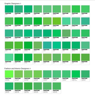
Pantone has a colour finder which is very useful. Let's say for example we really want to use a bright green, something like #2DFF53.

The search will yield this result:


Click for full resolution

As you can see, for "Fashion and Interior Designers" only named colors are returned, whereas for "Graphic Designers" many more colors options are proposed. So I think the answer is two-fold:

  1. Fashion and Interior designers tend to be a bit more poetic in the description of their items than say a web designer. Being honest, I think a Classic Green dress sounds better than a dress in 16-6340 TCX.

  2. Where a monitor can render hundreds of millions of colors, and a printer can mix almost as many, it is totally impractical to have so many different cotton tints. Seeing Pantone lists the colours as available in cotton and paper, I think there are only a limited number of coloured papers and fabrics on the market. These have names, the rest do not. Although I must admit I cannot find a direct source for this claim.

1
  • More great info! So pleased I asked the question. Perhaps in the end it's simply arbitrary and Pantone simply name some for marketing purposes? Perhaps, as you suggest, tending to name more of the one's in the fashion/interior design sector. I really am going to try to contact Pantone directly I think. Commented May 8, 2017 at 16:44
2

This is a partial answer.

Normally the named colors are the basic colors that are used later to be mixed.

I have not a list of named colors, because pantone is no longer providing a complete catalog.

You can google "Pantone Basic Colors": https://www.google.com/search?q=pantone+basic+colors

1

Although I don't have an answer to the question itself, I would like to say something about what you wrote:

Right now I am looking for a deep wine red, and when I go back to the client, I think it's so much more convincing to tell them "I suggest we go with Pantone "Red Bud", than if I were to call it "19-1850-TCX"!

In this case it might work out because they link the name of the red to something positive. But what if this wasn't the case? What if the color was named 'Blood red' and your client is extremely terrified of blood? He might be biased and say no to the red called 'Blood red' while he might say yes to the same color if it was named '19-1850-TXC'. Because it doesn't have any link to anything that might influence the client psychologically.

This is why I never use color names in any of my work, OR, if I'm creating in example a style guide, I will give the colors company appropriate names for ease of use.

6
  • 1
    A very interesting insight, all I can say is that I hadn't thought of that, and must have just been lucky with my "positive" colour choices so far! Your comment definitely resonates though, because right now I am looking at colourlovers.com/color/730202/Hemoglobin_Games (although not a Pantone colour) and I think I'll either rename it myself to "super-success red", or "you chose a great designer claret", or just call it by the hex! :) Commented May 8, 2017 at 14:52
  • 1
    Although there are such colours as 'Oxblood red' or 'Poison green', I don't think there are colour names that can really offend. And if your client is really offended by a colour name, I'd seriously consider firing that client.
    – PieBie
    Commented May 8, 2017 at 16:24
  • @PieBie offending and influencing a choice are two different things...
    – Summer
    Commented May 9, 2017 at 7:27
  • My issue with your answer is two-fold: (1) you don't really answer the question, and (2) your whole answer hinges on a 'what if'. Some people really dislike numbers, so '19-1850-TXC' might influence them more than 'Blood red'. Maybe some are won over by 'Blood red', say for a website for MMA games. I really hope you are able to influence your clients' decisions, otherwise they probably won't be your client for long.
    – PieBie
    Commented May 9, 2017 at 7:43
  • 1
    @PieBie I'm giving my two cents on an issue OP mentioned in his post and share what I have experienced. If you disagree, please downvote.
    – Summer
    Commented May 9, 2017 at 7:48

Your Answer

By clicking “Post Your Answer”, you agree to our terms of service and acknowledge you have read our privacy policy.

Not the answer you're looking for? Browse other questions tagged or ask your own question.