Text adjustments
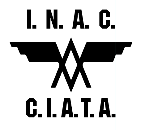
How can I get an even space between the dots and the letters?
I think this is the mistake. Each dot belongs to a letter to describe the abbreviation and that's what must be show to understand it as such. If you are looking for an equivalent space between letter and point, the dots will become a graphic resource instead of being part of the text. This decoration feeling increases if we add a distortion to the typography, since we are moving it away from the original reading sense.
Is there a way to center it correctly with respect to the logo?
Starting from the previous point, the centering should respond tobe the whole text block, taking as unitswhere each single element is the letter with its respective dot.
Is there a general way of doing this to make it look better?
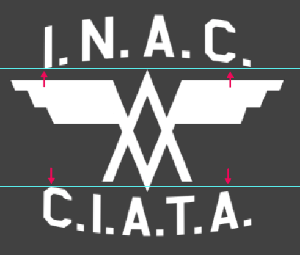
Yes, modifying text tracking individually and the dots size. I have not your font, the following explanation is for the below image example using the font Machine Medium.
- All the dots are reduced a 75% compared to the character size
- All the top dots have a 300% tracking, excepting the last one
- All the bottom dots have a 130% tracking, excepting the last one
- All the top characters have a 50% tracking, except the "C" that has a wider optical space at the bottom, 10% tracking
- The bottom characters have a different tracking each to fit their optical space, in this example:
- C = 0 tracking
- I = 25% tracking
- A = 35% tracking
- T = -10% tracking
- A = 35% tracking
Optical adjustments
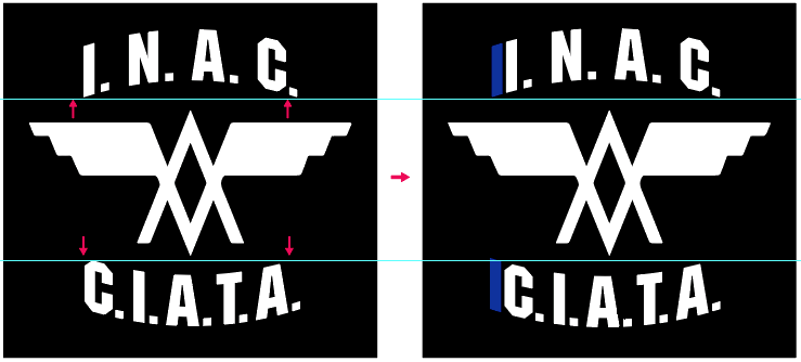
The distortion is made in each block of text, including the dots, this makes the reading reference axis appear distorted: the upper C is floating and the last lower A is falling:
A possible fix is adding an invisible character at the beginning of each text, in this case an "I" (blue in the example)
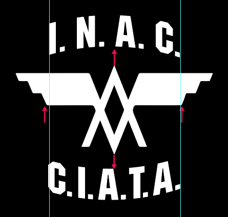
In this final logo, the text is slightly offset to the right to solve the optical space left by the points to appear centered in relation with the image. Using an optical resource and taking advantage of the formal possibilities of the logo, the reference can be to matchmatching the upper and lower A end vertex with those of the image center vertex.
Conclusion
Taking as a starting point that each dot belongs to a letter and they are not a graphic decoration, once the design is done, make the optical adjustments of each element related to each other.

