added 270 characters in body
Source Link
Scott
  • 211.5k
  • 21
  • 297
  • 575

The purpose of a hierarchy is to visual separate contents which may otherwise be confusing.

If there are main topics, then several sub-areas under each topic a visual hierarchy assists the user in distinguishing different topics quickly, then being able to "tunnel down" to more specific subjects related to that main topic.

However, if there are no sub-categories and there are only main topics, any visual hierarchy may lead a user to think some topics are more important than others, when they are not.

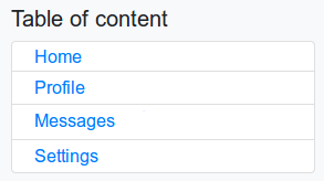
Given the simple list of 4 topics, there is no need for any visual hierarchy beyond the order the topics are stacked. I would remove all indents and nesting. They are entirely unwarranted in my opinion.

enter image description here

Simple, clean, clear.


Additional...

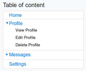
If you were to have sub topics, an easy way to handle it for the web/mobile is via expanding divs with an indicator that the topic expands....

enter image description here

Essentially it all boils down to a menu or navigation tree. That's all a TOC really is. So don't do anything in a TOC that you wouldn't do in a menu.

The purpose of a hierarchy is to visual separate contents which may otherwise be confusing.

If there are main topics, then several sub-areas under each topic a visual hierarchy assists the user in distinguishing different topics quickly, then being able to "tunnel down" to more specific subjects related to that main topic.

However, if there are no sub-categories and there are only main topics, any visual hierarchy may lead a user to think some topics are more important than others, when they are not.

Given the simple list of 4 topics, there is no need for any visual hierarchy beyond the order the topics are stacked. I would remove all indents and nesting. They are entirely unwarranted in my opinion.

enter image description here

Simple, clean, clear.


Additional...

If you were to have sub topics, an easy way to handle it for the web/mobile is via expanding divs with an indicator that the topic expands....

enter image description here

Essentially it all boils down to a menu or navigation tree. That's all a TOC really is. So don't do anything in a TOC that you wouldn't do in a menu.
edited body
Source Link
Scott
  • 211.5k
  • 21
  • 297
  • 575

The purpose of a hierarchy is to visual separate contents which may otherwise be confusing.

If there are main topics, then several sub-areas under each topic a visual hierarchy assists the user in distinguishing different topics quickly, then being able to "tunnel down" to more specific subjects related to that main topic.

However, if there are no sunsub-categories and there are only main topics, any visual hierarchy may lead a user to think some topics are more important than others, when they are not.

Given the simple list of 4 topics, there is no need for any visual hierarchy beyond the order the topics are stacked. I would remove all indents and nesting. They are entirely unwarranted in my opinion.

enter image description here

Simple, clean, clear.

The purpose of a hierarchy is to visual separate contents which may otherwise be confusing.

If there are main topics, then several sub-areas under each topic a visual hierarchy assists the user in distinguishing different topics quickly, then being able to "tunnel down" to more specific subjects related to that main topic.

However, if there are no sun-categories and there are only main topics, any visual hierarchy may lead a user to think some topics are more important than others, when they are not.

Given the simple list of 4 topics, there is no need for any visual hierarchy beyond the order the topics are stacked. I would remove all indents and nesting. They are entirely unwarranted in my opinion.

enter image description here

Simple, clean, clear.

The purpose of a hierarchy is to visual separate contents which may otherwise be confusing.

If there are main topics, then several sub-areas under each topic a visual hierarchy assists the user in distinguishing different topics quickly, then being able to "tunnel down" to more specific subjects related to that main topic.

However, if there are no sub-categories and there are only main topics, any visual hierarchy may lead a user to think some topics are more important than others, when they are not.

Given the simple list of 4 topics, there is no need for any visual hierarchy beyond the order the topics are stacked. I would remove all indents and nesting. They are entirely unwarranted in my opinion.

enter image description here

Simple, clean, clear.

Source Link
Scott
  • 211.5k
  • 21
  • 297
  • 575

The purpose of a hierarchy is to visual separate contents which may otherwise be confusing.

If there are main topics, then several sub-areas under each topic a visual hierarchy assists the user in distinguishing different topics quickly, then being able to "tunnel down" to more specific subjects related to that main topic.

However, if there are no sun-categories and there are only main topics, any visual hierarchy may lead a user to think some topics are more important than others, when they are not.

Given the simple list of 4 topics, there is no need for any visual hierarchy beyond the order the topics are stacked. I would remove all indents and nesting. They are entirely unwarranted in my opinion.

enter image description here

Simple, clean, clear.