added 2 characters in body
Source Link
user120647
user120647

There are many things that can be improved on your logo


In graphic design there aren't many dogmas, but I dare to say one of them is never present a framed logo unless that frame belongs to the design. The grey frames are destroying your three logos. If this were for a client, he/she would wonder how the logo would look like alone, without the grey frame. Or worse, they could ask to change the frame color!!! You are putting the grey frame as another element to consider in your logo when in fact it isn't part of it.

logos


Personally I discovered that it's a signature after reading the question. If I had to gather the main features of a signature are:

  • Fast and thin line
  • Floating in the air or above a dotted or thin line
  • Dark color

None of the three is represented in the signature, which makes it difficult to interpret it immediately.


One of the GestaltGestalt laws is the proximity:

The Law of Proximity states that objects that are near or 'proximate' to each other tend to be grouped together.

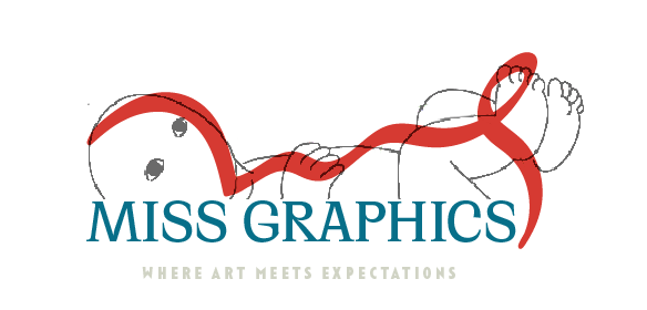
The closeness between the signature and the text makes everything to be interpreted as a single element, taking away the signature's presence. My first impression was a baby lying down.

Baby

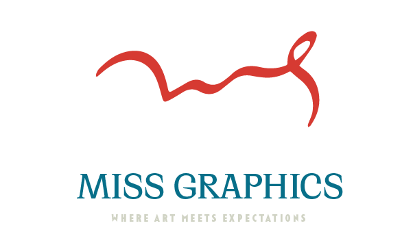
I think it's necessary to extend the distance between the text and the signature so that it's interpreted as such:

Distance

Or make the text have a double reading: as a text and as the signature baseline:

baseline

Finally, if there was a statistic of the ink color we used when signing, we could say 50% black ink, 40% blue ink, a minimum percentage of red ... but baby blue??? yellow????...may be, but the further away from the essential color of a signature is, the less it will look like.


I didn't do any analysis of the small text, you can barely see it. In a logo reduction will disappear completely.

There are many things that can be improved on your logo


In graphic design there aren't many dogmas, but I dare to say one of them is never present a framed logo unless that frame belongs to the design. The grey frames are destroying your three logos. If this were for a client, he/she would wonder how the logo would look like alone, without the grey frame. Or worse, they could ask to change the frame color!!! You are putting the grey frame as another element to consider in your logo when in fact it isn't part of it.

logos


Personally I discovered that it's a signature after reading the question. If I had to gather the main features of a signature are:

  • Fast and thin line
  • Floating in the air or above a dotted or thin line
  • Dark color

None of the three is represented in the signature, which makes it difficult to interpret it immediately.


One of the Gestalt laws is the proximity:

The Law of Proximity states that objects that are near or 'proximate' to each other tend to be grouped together.

The closeness between the signature and the text makes everything to be interpreted as a single element, taking away the signature's presence. My first impression was a baby lying down.

Baby

I think it's necessary to extend the distance between the text and the signature so that it's interpreted as such:

Distance

Or make the text have a double reading: as a text and as the signature baseline:

baseline

Finally, if there was a statistic of the ink color we used when signing, we could say 50% black ink, 40% blue ink, a minimum percentage of red ... but baby blue??? yellow????...may be, but the further away from the essential color of a signature is, the less it will look like.


I didn't do any analysis of the small text, you can barely see it. In a logo reduction will disappear completely.
There are many things that can be improved on your logo


In graphic design there aren't many dogmas, but I dare to say one of them is never present a framed logo unless that frame belongs to the design. The grey frames are destroying your three logos. If this were for a client, he/she would wonder how the logo would look like alone, without the grey frame. Or worse, they could ask to change the frame color!!! You are putting the grey frame as another element to consider in your logo when in fact it isn't part of it.

logos


Personally I discovered that it's a signature after reading the question. If I had to gather the main features of a signature are:

  • Fast and thin line
  • Floating in the air or above a dotted or thin line
  • Dark color

None of the three is represented in the signature, which makes it difficult to interpret it immediately.


One of the Gestalt laws is the proximity:

The Law of Proximity states that objects that are near or 'proximate' to each other tend to be grouped together.

The closeness between the signature and the text makes everything to be interpreted as a single element, taking away the signature's presence. My first impression was a baby lying down.

Baby

I think it's necessary to extend the distance between the text and the signature so that it's interpreted as such:

Distance

Or make the text have a double reading: as a text and as the signature baseline:

baseline

Finally, if there was a statistic of the ink color we used when signing, we could say 50% black ink, 40% blue ink, a minimum percentage of red ... but baby blue??? yellow????...may be, but the further away from the essential color of a signature is, the less it will look like.


I didn't do any analysis of the small text, you can barely see it. In a logo reduction will disappear completely.
added 18 characters in body
Source Link
user120647
user120647

There are many things that can be improved on your logo


In graphic design there aren't many dogmas, but I dare to say one of them is never present a framed logo unless that frame belongs to the design. The grey frames are destroying your three logos. If this were for a client, he/she would wonder how the logo would look like alone, without the grey frame. Or worse, they could ask to change the frame color!!! You are putting the grey frame as another element to consider in your logo when in fact it isn't part of it.

logos


Personally I discovered that it's a signature after reading the question. If I had to gather the main features of a signature are:

  • Fast and thin line
  • Floating in the air or above a dotted or thin line
  • Dark color

None of the three is represented in the signature, which makes it difficult to interpret it immediately.


One of the Gestalt laws is the proximity:

The Law of Proximity states that objects that are near or 'proximate' to each other tend to be grouped together.

The closeness between the signature and the text makes everything to be interpreted as a single element, taking away the signature's presence. My first impression was of a baby profile lying down.

babyBaby

I think it's necessary to extend the distance between the text and the signature so that it's interpreted as such:

Distance

Or make the text have a double reading: as a text and as the signature baseline:

baseline

Finally, if there was a statistic of the ink color we used when signing, we could say 50% black ink, 40% blue ink, a minimum percentage of red ... but baby blue??? yellow????...may be, but the further away from the essential color of a signature is, the less it will look like.


I didn't do any analysis of the small text, you can barely see it. In a logo reduction will disappear completely.

There are many things that can be improved on your logo


In graphic design there aren't many dogmas, but I dare to say one of them is never present a framed logo unless that frame belongs to the design. The grey frames are destroying your three logos. If this were for a client, he/she would wonder how the logo would look like alone, without the grey frame. Or worse, they could ask to change the frame color!!! You are putting the grey frame as another element to consider in your logo when in fact it isn't part of it.

logos


Personally I discovered that it's a signature after reading the question. If I had to gather the main features of a signature are:

  • Fast and thin line
  • Floating in the air or above a dotted or thin line
  • Dark color

None of the three is represented in the signature, which makes it difficult to interpret it immediately.

One of the Gestalt laws is the proximity:

The Law of Proximity states that objects that are near or 'proximate' to each other tend to be grouped together.

The closeness between the signature and the text makes everything to be interpreted as a single element, taking away the signature's presence. My first impression was of a baby profile lying down.

baby

I think it's necessary to extend the distance between the text and the signature so that it's interpreted as such:

Distance

Or make the text have a double reading: as a text and as the signature baseline:

baseline

Finally, if there was a statistic of the ink color we used when signing, we could say 50% black ink, 40% blue ink, a minimum percentage of red ... but baby blue??? yellow????...may be, but the further away from the essential color of a signature is, the less it will look like.


I didn't do any analysis of the small text, you can barely see it. In a logo reduction will disappear completely.

There are many things that can be improved on your logo


In graphic design there aren't many dogmas, but I dare to say one of them is never present a framed logo unless that frame belongs to the design. The grey frames are destroying your three logos. If this were for a client, he/she would wonder how the logo would look like alone, without the grey frame. Or worse, they could ask to change the frame color!!! You are putting the grey frame as another element to consider in your logo when in fact it isn't part of it.

logos


Personally I discovered that it's a signature after reading the question. If I had to gather the main features of a signature are:

  • Fast and thin line
  • Floating in the air or above a dotted or thin line
  • Dark color

None of the three is represented in the signature, which makes it difficult to interpret it immediately.


One of the Gestalt laws is the proximity:

The Law of Proximity states that objects that are near or 'proximate' to each other tend to be grouped together.

The closeness between the signature and the text makes everything to be interpreted as a single element, taking away the signature's presence. My first impression was a baby lying down.

Baby

I think it's necessary to extend the distance between the text and the signature so that it's interpreted as such:

Distance

Or make the text have a double reading: as a text and as the signature baseline:

baseline

Finally, if there was a statistic of the ink color we used when signing, we could say 50% black ink, 40% blue ink, a minimum percentage of red ... but baby blue??? yellow????...may be, but the further away from the essential color of a signature is, the less it will look like.


I didn't do any analysis of the small text, you can barely see it. In a logo reduction will disappear completely.

added 7 characters in body
Source Link
user120647
user120647

There are many things that can be improved on your logo


In graphic design there aren't many dogmas, but I dare to say one of them is never present a framed logo unless that frame belongs to the design. The grey frames are destroying your three logos. If this were for a client, he/she would wonder how the logo would look like alone, without the grey frame. Or worse, they could ask to change the frame color!!! You are putting the grey frame as another element to consider in your logo when in fact it isn't part of it.

logos


Personally I discovered that it's a signature after reading the question. If I had to gather the main features of a signature are:

  • Fast and thin line
  • Floating in the air or above a dotted or thin line
  • Dark color

None of the three is represented in the signature, which makes it difficult to interpret it immediately.

One of the Gestalt laws is the proximity:

The Law of Proximity states that objects that are near or 'proximate' to each other tend to be grouped together.

The closeness between the signature and the text makes everything to be interpreted as a single element, taking away the signature's presence. My first impression was of a baby profile lying down.

baby

I think it's necessary to extend the distance between the text and the signature so that it's interpreted as such:

Distance

Or make the text have a double reading: as a text and as the signature baseline:

baselinebaseline

Finally, if there was a statistic of the ink color we used when signing, we could say 50% black ink, 40% blue ink, a minimum percentage of red ... but lightbaby blue??? yellow????...may be, but the further away from the essential color of a signature is, the less it will look like.


I didn't do any analysis of the small text, you can barely see it. In a logo reduction will disappear completely.

There are many things that can be improved on your logo


In graphic design there aren't many dogmas, but I dare to say one of them is never present a framed logo unless that frame belongs to the design. The grey frames are destroying your three logos. If this were for a client, he/she would wonder how the logo would look like alone, without the grey frame. Or worse, they could ask to change the frame color!!! You are putting the grey frame as another element to consider in your logo when in fact it isn't part of it.

logos


Personally I discovered that it's a signature after reading the question. If I had to gather the main features of a signature are:

  • Fast and thin line
  • Floating in the air or above a dotted or thin line
  • Dark color

None of the three is represented in the signature, which makes it difficult to interpret it immediately.

One of the Gestalt laws is the proximity:

The Law of Proximity states that objects that are near or 'proximate' to each other tend to be grouped together.

The closeness between the signature and the text makes everything to be interpreted as a single element, taking away the signature's presence. My first impression was of a baby profile lying down.

baby

I think it's necessary to extend the distance between the text and the signature so that it's interpreted as such:

Distance

Or make the text have a double reading: as a text and as the signature baseline:

baseline

Finally, if there was a statistic of the ink color we used when signing, we could say 50% black ink, 40% blue ink, a minimum percentage of red ... but light blue??? yellow????


I didn't do any analysis of the small text, you can barely see it. In a logo reduction will disappear completely.

There are many things that can be improved on your logo


In graphic design there aren't many dogmas, but I dare to say one of them is never present a framed logo unless that frame belongs to the design. The grey frames are destroying your three logos. If this were for a client, he/she would wonder how the logo would look like alone, without the grey frame. Or worse, they could ask to change the frame color!!! You are putting the grey frame as another element to consider in your logo when in fact it isn't part of it.

logos


Personally I discovered that it's a signature after reading the question. If I had to gather the main features of a signature are:

  • Fast and thin line
  • Floating in the air or above a dotted or thin line
  • Dark color

None of the three is represented in the signature, which makes it difficult to interpret it immediately.

One of the Gestalt laws is the proximity:

The Law of Proximity states that objects that are near or 'proximate' to each other tend to be grouped together.

The closeness between the signature and the text makes everything to be interpreted as a single element, taking away the signature's presence. My first impression was of a baby profile lying down.

baby

I think it's necessary to extend the distance between the text and the signature so that it's interpreted as such:

Distance

Or make the text have a double reading: as a text and as the signature baseline:

baseline

Finally, if there was a statistic of the ink color we used when signing, we could say 50% black ink, 40% blue ink, a minimum percentage of red ... but baby blue??? yellow????...may be, but the further away from the essential color of a signature is, the less it will look like.


I didn't do any analysis of the small text, you can barely see it. In a logo reduction will disappear completely.

added 129 characters in body
Source Link
user120647
user120647
Loading
Source Link
user120647
user120647
Loading