You are right. A shadow is not a part of a logo, it is an effect applied to a logo.
Effects that will have issues not only when printing, but also when scaling, like thin lines or super small elements are a bad choice.
A logo is different than an illustration. A good logo can be later represented as a 3D object, as an animation, carved in wood, represented as an icon, as 1 color, etc.
But that does not mean that you often need different versions of it. The obvious idea is a vertical and horizontal version; a normal-sized version and a simplified icon for an app.
On your case, yes, it sounds fishy the fact that a gradient needs to be represented as lines in one version and a gradient in another.
When you screen a gradient for print (offset, silk print, etc.) you transform that gradient into dots, either different-sized dots or small dots with different densities (numbers) but that is part of the print process.
If the lines are a good solution, they should have been part of the design, but to indicate part of the idea, speed, transformation, etc.
If they are only there as an effect, as a shadow, that is not part of the logo.
Some good examples of the difference between the "accidents" on a logo (by accident I mean things that are only happening to a logo) are the intro of an Xbox console, lights, movement, and even sound, vs the flat version on the box.
Or a Marvel movie intro. All those characters on the walls of the logo are not part of the logo.
Without seeing your logo, a good version would be a clear element to indicate that "transformation" Perhaps the logo can have 2 colors to indicate that transformation, some flat transparency that can be later printed using 2 inks, or several dots of different sizes.
This google search "bubbles logo" provides some options.
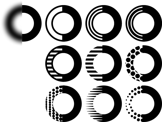
The first image is a representation on what you posted on the comments. And the other images are simply some exercises on what can be done. I do not mean that they work for your case, what I mean is that in some minutes I explored 9 alternatives that are vector files.
You can also explore using 2 colors, to multiply your options.
Of all these images on my original file... only 1 segment is a raster image, guess which is it.
Here are two simulations of what happens to a logo with a gradient when printed.
- Error diffusion. 2. Screening.
That is not part of the logo.


