The ancient Illustrator graph tool works quite differently to everything else in illustrator. Here's a couple of things to understand that make it a bit less of a pain:
The best way to navigate your way around a graph tool chart without breaking it by ungrouping it is with the little-used "Group selection tool"  - the 'white arrow with a plus sign' cunningly hidden behind the regular white arrow Direct Selection tool. It has no keyboard shortcut, so it's worth assigning it one if you use illustrator charts a lot.
Click once, and it selects one object regardless of groups. Click again on that one object, and it selects everything in the last group that object is in, and so on up the tree, a bit like isolation mode in reverse.
The illustrator graph tool expects you to work your way around the groups it creates like this, selecting groups then formatting them. A common frustration with the graph tool is that bits of graphs forget some formatting when the data is updated: if you're careful with how you apply formatting to groups, it's a bit less unpredictable.
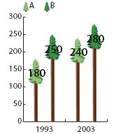
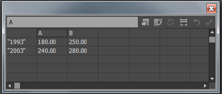
The other thing is how it creates its groups. The examples in the help article are of grouped (aka clustered) column charts, where in the mini-spreadsheet thing there are both rows and columns of data. So, the darker trees are in the same group as each other, as are the lighter trees. For this example graph from the manual...

...the data would look like this:

After you've clicked on one column enough times to get everything that is that column, you click again to get it and every other column on its rowwith the same column (e.g. all the "A"s), and again to get it, everything else on its rowwith the same heading, and the little symbol in the legend. Click again and you get all groups of columns and all legend symbols, and again to get the whole chart, including axis.
Likewise, to neatly format the axis, you work up through the groups: once to get one tick, twice to get all ticks on that axis, three times to get the whole axis including labels and line, and again to get the whole chart.
With that in mind, here's the important bit from the help doc.
0. First create multiple column designs one for each type you want using Object > Graph > Design
Create or import the column design.
Use the Group Selection tool
 to select the columns or bars you want to fill with the design, or select the entire graph.
Choose Object > Graph > Column.
Select a column design type. If you choose the Repeating Column Type, enter a value in the Each Design Represents text box. Also select whether to chop or scale any fractions of the design from the For Fractions pop‑up menu. Chop Design cuts off a fraction of the top design as necessary; Scale Design scales the last design to fit in the column.
Select the design you want to use. A preview of the selected design appears.
Click OK.
Do that once for each column, or, group of columns
