added 16 characters in body
Source Link
Pekka
  • 2.6k
  • 3
  • 28
  • 40

Yes, that is essentially it. essentially itFrom Wikipedia:

In typography, kerning (less commonly mortising) is the process of adjusting the spacing between characters in a proportional font, usually to achieve a visually pleasing result. In a well kerned font, the two-dimensional blank spaces between each pair of characters all have similar area. The related term kern denotes a part of a type letter that overhangs the edge of the type block.

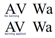
the point of making it looking nicer is the only point, but it can be very important for a clean-looking typeface. The Wikipedia page shows how massive the difference can be:
alt text

Yes, that is essentially it:

In typography, kerning (less commonly mortising) is the process of adjusting the spacing between characters in a proportional font, usually to achieve a visually pleasing result. In a well kerned font, the two-dimensional blank spaces between each pair of characters all have similar area. The related term kern denotes a part of a type letter that overhangs the edge of the type block.

the point of making it looking nicer is the only point, but it can be very important for a clean-looking typeface. The Wikipedia page shows how massive the difference can be:

alt text

Yes, that is essentially it. From Wikipedia:

In typography, kerning (less commonly mortising) is the process of adjusting the spacing between characters in a proportional font, usually to achieve a visually pleasing result. In a well kerned font, the two-dimensional blank spaces between each pair of characters all have similar area. The related term kern denotes a part of a type letter that overhangs the edge of the type block.

the point of making it looking nicer is the only point, but it can be very important for a clean-looking typeface. The Wikipedia page shows how massive the difference can be:

alt text

Source Link
Pekka
  • 2.6k
  • 3
  • 28
  • 40

Yes, that is essentially it:

In typography, kerning (less commonly mortising) is the process of adjusting the spacing between characters in a proportional font, usually to achieve a visually pleasing result. In a well kerned font, the two-dimensional blank spaces between each pair of characters all have similar area. The related term kern denotes a part of a type letter that overhangs the edge of the type block.

the point of making it looking nicer is the only point, but it can be very important for a clean-looking typeface. The Wikipedia page shows how massive the difference can be:

alt text