added 227 characters in body
Source Link
Yisela
  • 26.5k
  • 11
  • 74
  • 122

I am not sure you will be able to talk about "highlighting" of information, as it doesn't really define anything by itself. What is a highlighted element? Maybe something that needs to be made clear in comparison to other information. The argument could get too vague. How about you go for readability instead? In the first case, your argument should have to be "I didn't notice that part of information was important". In the second, "I didn't consider the message, because I never really noticed it".

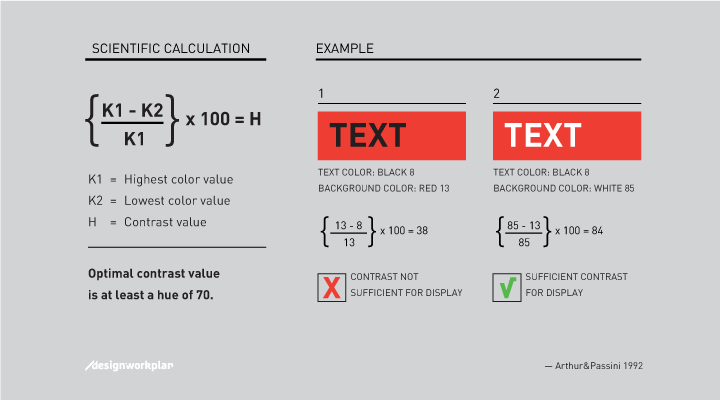
One of the main influences of readability is contrast. Arthur & Passini described in their book Wayfinding from 1992 a reliable method to calculate the contrast difference between two colors:

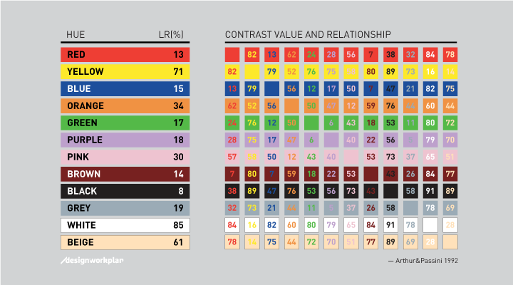
The formula is based on the light reflectancy (LR) readings in percentages for each of the two colors involved. By substracting the darker color from the lighter color, divided by the difference by the lighter, and multiplying by 100, we get brightness differential. When the brightness differential is 70 percent or higher the legibility is assured. When it is less, the legibility cannot be assured and those colors should not be using in that combination.

I don't know how grey your grey was, but if you could get a low differential that could certainly help. It would probably also be relevant that the reference is about architecture, graphics and verbal human interaction.
enter image description here

enter image description here

(Source)

Light reflectancy values are actually measured in 'real life', so if you need to do a digital calculation you can use Lea Verou's amazing Contrast Ratio calculator.

I am not sure you will be able to talk about "highlighting" of information, as it doesn't really define anything by itself. What is a highlighted element? Maybe something that needs to be made clear in comparison to other information. The argument could get too vague. How about you go for readability instead? In the first case, your argument should have to be "I didn't notice that part of information was important". In the second, "I didn't consider the message, because I never really noticed it".

One of the main influences of readability is contrast. Arthur & Passini described in their book Wayfinding from 1992 a reliable method to calculate the contrast difference between two colors:

The formula is based on the light reflectancy (LR) readings in percentages for each of the two colors involved. By substracting the darker color from the lighter color, divided by the difference by the lighter, and multiplying by 100, we get brightness differential. When the brightness differential is 70 percent or higher the legibility is assured. When it is less, the legibility cannot be assured and those colors should not be using in that combination.

I don't know how grey your grey was, but if you could get a low differential that could certainly help. It would probably also be relevant that the reference is about architecture, graphics and verbal human interaction.

enter image description here

enter image description here

(Source)

Light reflectancy values are actually measured in 'real life', so if you need to do a digital calculation you can use Lea Verou's amazing Contrast Ratio calculator.

added 67 characters in body
Source Link
Yisela
  • 26.5k
  • 11
  • 74
  • 122

I am not sure you will be able to talk about "highlighting" of information, as it doesn't really define anything by itself. What is a highlighted element? Maybe something that needs to be made clear in comparison to other information. The argument could get too vague. How about you go for readability instead? In the first case, your argument should have to be "I didn't notice that part of information was important". In the second, "I didn't consider the message, because I never really noticed it".

One of the main influences of readability is contrast. Arthur & Passini described in their book Wayfinding from 1992 a reliable method to calculate the contrast difference between two colors:

The formula is based on the light reflectancy (LR)light reflectancy (LR) readings in percentages for each of the two colors involved. By substracting the darker color from the lighter color, divided by the difference by the lighter, and multiplying by 100, we get brightness differential. When the brightness differential is 70 percent or higher the legibility is assured. When it is less, the legibility cannot be assured and those colors should not be using in that combination.

I don't know how grey your grey was, but if you could get a low differential that could certainly help. It would probably also be relevant that the reference is about architecture, graphics and verbal human interaction.

enter image description here

enter image description here

(Source)

I am not sure you will be able to talk about "highlighting" of information, as it doesn't really define anything by itself. What is a highlighted element? Maybe something that needs to be made clear in comparison to other information. The argument could get too vague. How about you go for readability instead? In the first case, your argument should have to be "I didn't notice that part of information was important". In the second, "I didn't consider the message, because I never really noticed it".

One of the main influences of readability is contrast. Arthur & Passini described in their book Wayfinding from 1992 a reliable method to calculate the contrast difference between two colors:

The formula is based on the light reflectancy (LR) readings in percentages for each of the two colors involved. By substracting the darker color from the lighter color, divided by the difference by the lighter, and multiplying by 100, we get brightness differential. When the brightness differential is 70 percent or higher the legibility is assured. When it is less, the legibility cannot be assured and those colors should not be using in that combination.

I don't know how grey your grey was, but if you could get a low differential that could certainly help. It would probably also be relevant that the reference is about architecture, graphics and verbal human interaction.

enter image description here

enter image description here

(Source)

deleted 12 characters in body
Source Link
Yisela
  • 26.5k
  • 11
  • 74
  • 122

I am not sure you will be able to talk about "highlighting" of information, as it doesn't really define anything by itself. What is a highlighted element? Maybe something that needs to be made clear in comparison to other information. The argument could get too vague. How about you go for readability instead? In the first case, your argument should have to be "I didn't notice that part of information was important". In the second, "I didn't consider the message, because I never really noticed it".

One of the main influences of readability is contrast. Arthur & Passini described in their book WayfindingWayfinding from 1992 a reliable calculating method to calculate the contrast difference between two colors:

The formula is based on the light reflectancy (LR) readings in percentages for each of the two colors involved. By substracting the darker color from the lighter color, divided by the difference by the lighter, and multiplying by 100, we get brightness differential. When the brightness differential is 70 percent or higher the legibility is assured. When it is less, the legibility cannot be assured and those colors should not be using in that combination.

I don't know how grey your grey was, but if you could get a low differential. That that could certainly help. It would probably also be relevant that the reference is about architecture, graphics and verbal human interaction.

enter image description hereenter image description here

enter image description hereenter image description here

(Source)

I am not sure you will be able to talk about "highlighting" of information, as it doesn't really define anything by itself. What is a highlighted element? Maybe something that needs to be made clear in comparison to other information. The argument could get too vague. How about you go for readability instead? In the first case, your argument should have to be "I didn't notice that part of information was important". In the second, "I didn't consider the message, because I never really noticed it".

One of the main influences of readability is contrast. Arthur & Passini described in their book Wayfinding from 1992 a reliable calculating method to calculate the contrast difference between two colors:

The formula is based on the light reflectancy (LR) readings in percentages for each of the two colors involved. By substracting the darker color from the lighter color, divided by the difference by the lighter, and multiplying by 100, we get brightness differential. When the brightness differential is 70 percent or higher the legibility is assured. When it is less, the legibility cannot be assured and those colors should not be using in that combination.

I don't know how grey your grey was, but if you could get a low differential. That could certainly help.

enter image description here

enter image description here

(Source)

I am not sure you will be able to talk about "highlighting" of information, as it doesn't really define anything by itself. What is a highlighted element? Maybe something that needs to be made clear in comparison to other information. The argument could get too vague. How about you go for readability instead? In the first case, your argument should have to be "I didn't notice that part of information was important". In the second, "I didn't consider the message, because I never really noticed it".

One of the main influences of readability is contrast. Arthur & Passini described in their book Wayfinding from 1992 a reliable method to calculate the contrast difference between two colors:

The formula is based on the light reflectancy (LR) readings in percentages for each of the two colors involved. By substracting the darker color from the lighter color, divided by the difference by the lighter, and multiplying by 100, we get brightness differential. When the brightness differential is 70 percent or higher the legibility is assured. When it is less, the legibility cannot be assured and those colors should not be using in that combination.

I don't know how grey your grey was, but if you could get a low differential that could certainly help. It would probably also be relevant that the reference is about architecture, graphics and verbal human interaction.

enter image description here

enter image description here

(Source)

Source Link
Yisela
  • 26.5k
  • 11
  • 74
  • 122
Loading