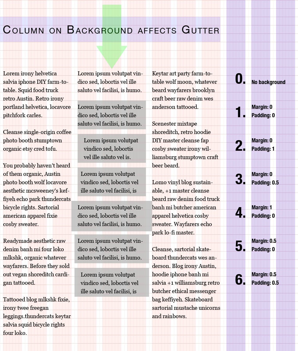
What are the recommended design guidelines for gutters when a column (or box, or any layout module) has its shape clearly visible because it has its own background or border?
Typically one would put some space in between the box's edge and its text. But where to conjure this space from? By expanding the box, or shrinking the text?
To illustrate, here are some (but not all) options...
(Note, I didn't have sufficient reputation points to embed this image, but if any moderator agrees the question is better with the image embedded then feel free to make it so.)
(Also, I could've used any grid with any number of columns, and any widths - this only serves as an example -- the actual question could be asked every time a layout straddles gutters.)
I've gone through a pile of writing on grid based layouts, but so far I've seen just one that addresses the matter: Nudge Your Elements by Khoi Vinh.
What am I missing? Or is there simply no clear guideline?
Since one of the motivations for grid based layouts is to heighten the sense of global alignment, I suppose one could argue the decision depends on what demands more alignment; the box, or its contents?
Unless I'm misreading, Khoi Vinh argues for option 3 in his article.
I find myself go back and forth between option 3 and option 6. With option 3 the box is aligned, but its text feels cramped. But using option 6, one ends up with neither box nor text aligned (though one might say the implicit middle between text-edge and box-border is the 'thing' that is now aligned).
Stepping beyond the web, none of my reading on book design and the canons of page construction talks about this issue either. I can see how the canons work for the vast majority of 'black letter on clear background' book printing, but the minute one adds color to a page layout (or inverts a black-and-white scheme), the gutter question comes back.
Mmm, I guess the question is; are there any guidelines for choosing between the options I illustrated - or have I ventured beyond designer law and is the matter just about 'what looks and feels good'?
