added 4 characters in body
Source Link
Littlemad
  • 2.4k
  • 1
  • 16
  • 19

It depends on the media that you are using, the audience and the amount of information that you have to display, and the relevance that you want to give.

More a page is cluttered, and less is easy to distinguish in a text a particular word or phrase or in a graphic a specific elements.

I normally make the example of newspapers and adverts in fashion magazines especially when I think about the "audience" factor.

Compare the The Sun (english tabloid about scandals or petty news) the sun
with a fashion advertise of Channel Channel

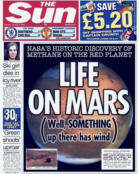
The first it is a newspaper, and its target is the common people. They always fill the page as much as possible not leaving much white space available.

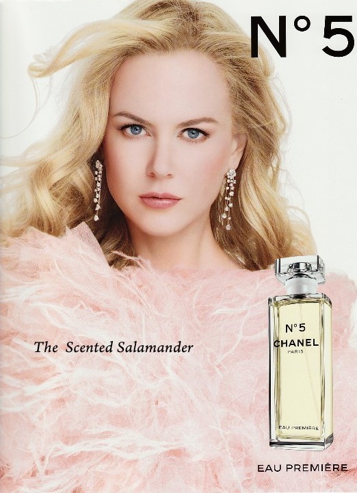
Instead Channel targets are the rich people, where you can see that there is no message at all, leaving a lot of white space around the photo,the product and the logo.

Each one of them has a niche that they target, the standard of cheap things it is "clutter how much information is possible (with things like the advertise "save 5.20 pounds" in the sun image), while white-space permits to focus more and give more importance or relevance on subject depending on the amount of white-space around the info/graphic.

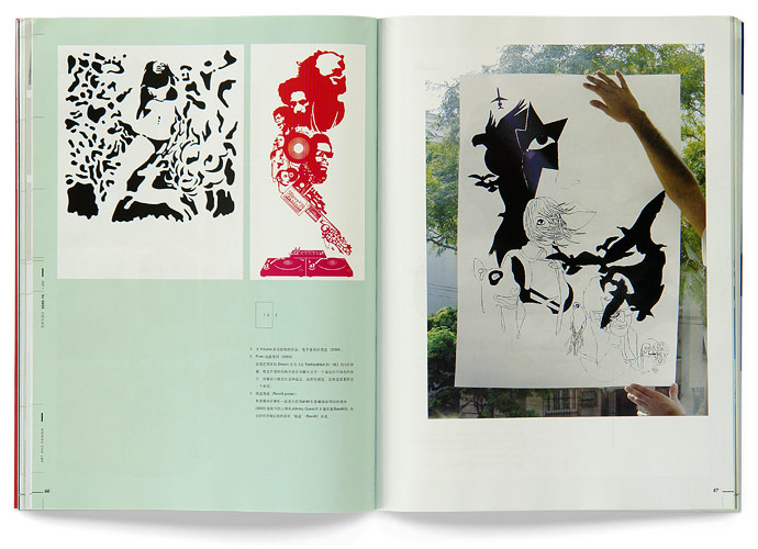
Another example quite common are the graphic design & photography books. you can see that white-space is largely used to exalt the graphic that it is showing.
Arts and Design Magazine

The only people that I ever head that "white space should not be used" were clients that wanted more things in a short amount of space, thinking that white-space it is the equivalent of "empty space", which is not.

As a clean web/graphic designer I love the minimalist approach of the architect Lars von Trier "Less is More" (less design means:more exaltation of the few elements displayed, enhance of aesthetic, more readability).

Arts and Design Magazine

It depends on the media that you are using, the audience and the amount of information that you have to display, and the relevance that you want to give.

More a page is cluttered, and less is easy to distinguish in a text a particular word or phrase or in a graphic a specific elements.

I normally make the example of newspapers and adverts in fashion magazines especially when I think about the "audience" factor.

Compare the The Sun (english tabloid about scandals or petty news) the sun

with a fashion advertise of Channel Channel

The first it is a newspaper, and its target is the common people. They always fill the page as much as possible not leaving much white space available.

Instead Channel targets are the rich people, where you can see that there is no message at all, leaving a lot of white space around the photo,the product and the logo.

Each one of them has a niche that they target, the standard of cheap things it is "clutter how much information is possible (with things like the advertise "save 5.20 pounds" in the sun image), while white-space permits to focus more and give more importance or relevance on subject depending on the amount of white-space around the info/graphic.

Another example quite common are the graphic design & photography books. you can see that white-space is largely used to exalt the graphic that it is showing.

Arts and Design Magazine

The only people that I ever head that "white space should not be used" were clients that wanted more things in a short amount of space, thinking that white-space it is the equivalent of "empty space", which is not.

As a clean web/graphic designer I love the minimalist approach of the architect Lars von Trier "Less is More" (less design means:more exaltation of the few elements displayed, enhance of aesthetic, more readability).

added 134 characters in body; added 8 characters in body
Source Link
Littlemad
  • 2.4k
  • 1
  • 16
  • 19

It depends in which contest we are talking about. I normally makeIt depends on the examplemedia that you are using, the audience and the amount of newspapersinformation that you have to display, and adverts in fashion magazinesthe relevance that you want to give.

More a page is cluttered, and less is easy to distinguish in a text a particular word or phrase or in a graphic a specific elements.

I normally make the example of newspapers and adverts in fashion magazines especially when I think about the "audience" factor.

Compare the The Sun (english tabloid about scandals or petty news) the sun

with a fashion advertise of Channel Channel

The first it is a newspaper, and its target is the common people. They always fill the page as much as possible not leaving much white space available.

Instead Channel targets are the rich people, where you can see that there is no message at all, leaving a lot of white space around the photo,the product and the logo.

Each one of them has a niche that they target, the standard of cheap things it is "clutter how much information is possible (with things like the advertise "save 5.20 pounds" in the sun image), while white-space permits to focus more and give more importance or relevance on subject depending on the amount of white-space around the info/graphic.

Another exampleAnother example quite common in the graphic design industry & photography books it isare the use of a lot ofgraphic design & photography books. you can see that white-space is largely used to exalt the graphic that it is showing.

The only people that I ever head that "white space should not be used" were clients that wanted more things in a short amount of space, thinking that white-space it is the equivalent of "empty space", which is not.

It depends on the media that you are using, the audience and the amount of information that you have to display, and the relevance that you want to give.

As a clean web/graphic designer I love the minimalist approach of the architect Lars von Trier "Less is More" (less design means:more exaltation of the few elements displayed, enhance of aesthetic, more readability).

Arts and Design Magazine

It depends in which contest we are talking about. I normally make the example of newspapers and adverts in fashion magazines.

Compare the The Sun (english tabloid about scandals or petty news) the sun

with a fashion advertise of Channel Channel

The first it is a newspaper, and its target is the common people. They always fill the page as much as possible not leaving much white space available.

Instead Channel targets are the rich people, where you can see that there is no message at all, leaving a lot of white space around the photo,the product and the logo.

Each one of them has a niche that they target, the standard of cheap things it is "clutter how much information is possible (with things like the advertise "save 5.20 pounds" in the sun image), while white-space permits to focus more and give more importance or relevance on subject depending on the amount of white-space around the info/graphic.

Another example quite common in the graphic design industry & photography books it is the use of a lot of white-space to exalt the graphic that it is showing.

The only people that I ever head that "white space should not be used" were clients that wanted more things in a short amount of space, thinking that white-space it is the equivalent of "empty space", which is not.

It depends on the media that you are using, the audience and the amount of information that you have to display, and the relevance that you want to give.

As a clean web/graphic designer I love the minimalist approach of the architect Lars von Trier "Less is More" (less design means:more exaltation of the few elements displayed, enhance of aesthetic, more readability).

Arts and Design Magazine

It depends on the media that you are using, the audience and the amount of information that you have to display, and the relevance that you want to give.

More a page is cluttered, and less is easy to distinguish in a text a particular word or phrase or in a graphic a specific elements.

I normally make the example of newspapers and adverts in fashion magazines especially when I think about the "audience" factor.

Compare the The Sun (english tabloid about scandals or petty news) the sun

with a fashion advertise of Channel Channel

The first it is a newspaper, and its target is the common people. They always fill the page as much as possible not leaving much white space available.

Instead Channel targets are the rich people, where you can see that there is no message at all, leaving a lot of white space around the photo,the product and the logo.

Each one of them has a niche that they target, the standard of cheap things it is "clutter how much information is possible (with things like the advertise "save 5.20 pounds" in the sun image), while white-space permits to focus more and give more importance or relevance on subject depending on the amount of white-space around the info/graphic.

Another example quite common are the graphic design & photography books. you can see that white-space is largely used to exalt the graphic that it is showing.

The only people that I ever head that "white space should not be used" were clients that wanted more things in a short amount of space, thinking that white-space it is the equivalent of "empty space", which is not.

As a clean web/graphic designer I love the minimalist approach of the architect Lars von Trier "Less is More" (less design means:more exaltation of the few elements displayed, enhance of aesthetic, more readability).

Arts and Design Magazine

added 81 characters in body
Source Link
Littlemad
  • 2.4k
  • 1
  • 16
  • 19

It depends in which contest we are talking about. I normally make the example of advertise in magazine or newspapers.I normally make the example of newspapers and adverts in fashion magazines.

Compare the The Sun (english tabloid about scandals or petty news) the sun

with a fashion advertise of Channel Channel

The first it is a newspaper, and its target is the common people.The first it is a newspaper, and its target is the common people. They always fill the page as much as possible not leaving much white space available.

Instead Channel target are the rich peopleChannel targets are the rich people, where you can see that there is no message at all, leaving a lot of white space around the photo,the product and the logo.

Each one of them has a niche that they target, the standard of cheap things it is "clutter how much information is possible (with things like the advertise "save 5.20 pounds" in the sun image), while whitespacewhite-space permits to focus more and give more importance or relevance on subject depending on the ammountamount of white space-space around the ingoinfo/graphic.

Another example quite common in the graphic design industry & photography books it is the use of a lot of whitespacewhite-space to exalt the graphic that it is showing.

The only people that I ever head that "white space should not be used" were clients that wanted more things in a short ammountamount of space, thinking that white-space it is the equivalent of "empty space", which is not.

So like I was saying, It depends on the media that you are using, the audience and the ammount of information that you have to display.It depends on the media that you are using, the audience and the amount of information that you have to display, and the relevance that you want to give.

As a clean web/graphic designer I love the minimalist approach of the architectharchitect Lars von Trier "Less is More" (less design means, more:more exaltation of the few elements displayed, enhance of aesthetic, more readability).

Arts and Design Magazine

It depends in which contest we are talking about. I normally make the example of advertise in magazine or newspapers.

Compare the The Sun (english tabloid about scandals or petty news) the sun

with a fashion advertise of Channel Channel

The first it is a newspaper, and its target is the common people. They always fill the page as much as possible not leaving much white space available.

Instead Channel target are the rich people, where you can see that there is no message at all, leaving a lot of white space around the photo,the product and the logo.

Each one of them has a niche that they target, the standard of cheap things it is "clutter how much information is possible (with things like the advertise "save 5.20 pounds" in the sun image), while whitespace permits to focus more and give more importance or relevance on subject depending on the ammount of white space around the ingo/graphic.

Another example quite common in the graphic design industry & photography books it is the use of a lot of whitespace to exalt the graphic that it is showing.

The only people that I ever head that "white space should not be used" were clients that wanted more things in a short ammount of space, thinking that white-space it is the equivalent of "empty space", which is not.

So like I was saying, It depends on the media that you are using, the audience and the ammount of information that you have to display.

As a clean web/graphic designer I love the minimalist approach of the architecth Lars von Trier "Less is More" (less design means, more exaltation of the few elements displayed).

Arts and Design Magazine

It depends in which contest we are talking about. I normally make the example of newspapers and adverts in fashion magazines.

Compare the The Sun (english tabloid about scandals or petty news) the sun

with a fashion advertise of Channel Channel

The first it is a newspaper, and its target is the common people. They always fill the page as much as possible not leaving much white space available.

Instead Channel targets are the rich people, where you can see that there is no message at all, leaving a lot of white space around the photo,the product and the logo.

Each one of them has a niche that they target, the standard of cheap things it is "clutter how much information is possible (with things like the advertise "save 5.20 pounds" in the sun image), while white-space permits to focus more and give more importance or relevance on subject depending on the amount of white-space around the info/graphic.

Another example quite common in the graphic design industry & photography books it is the use of a lot of white-space to exalt the graphic that it is showing.

The only people that I ever head that "white space should not be used" were clients that wanted more things in a short amount of space, thinking that white-space it is the equivalent of "empty space", which is not.

It depends on the media that you are using, the audience and the amount of information that you have to display, and the relevance that you want to give.

As a clean web/graphic designer I love the minimalist approach of the architect Lars von Trier "Less is More" (less design means:more exaltation of the few elements displayed, enhance of aesthetic, more readability).

Arts and Design Magazine

Source Link
Littlemad
  • 2.4k
  • 1
  • 16
  • 19
Loading