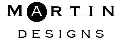
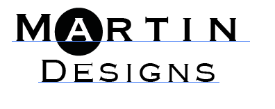
Something is amiss about this logo I've made for myself. I am a design student, and soon-to-be graduate. This logo will go on my business card and possibly other promo things in order to allow me to present myself professionally.
In relation to the actual piece - I designed with the theme of elegance in mind, I want to portray myself as a fresh, young but old-school designer that has an appreciation for crisp, clean design, though isn't afraid to go wild.
Logo 1
###Logo 1

Logo 2
###Logo 2

My questions are:
- Do you think the typography of each logo adequately represents a persona of elegance?
- How comfortable is the positioning of text in each logo?
- Is the positioning of Logo 1 better than Logo 2?
For the moment I have only designed my logos as black and white but I do plan to add color to it later on.
