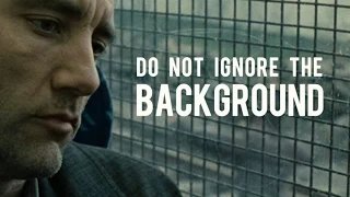
This image is the thumbnail for this nerdwriter video.
I'm about to begin a youtube series of my own, and I want my thumbnails to be that simple and beautiful, and I'm trying to understand how this design comes together. I'd like some help specifically understanding the design of the text.
Two things are eluding me:
- What is that font? (simple but important)
- What methodology could he be using to decide the different text sizes? TheI like way the text is justified and fits so cleanlynaturally in a square is lovelyrectangle. There's obviously some really intelligentIs there any obvious vertical rhythm thinking running underneath this, but I can't discern what's going on.?

