added 216 characters in body; added 34 characters in body
Source Link
user82991
user82991

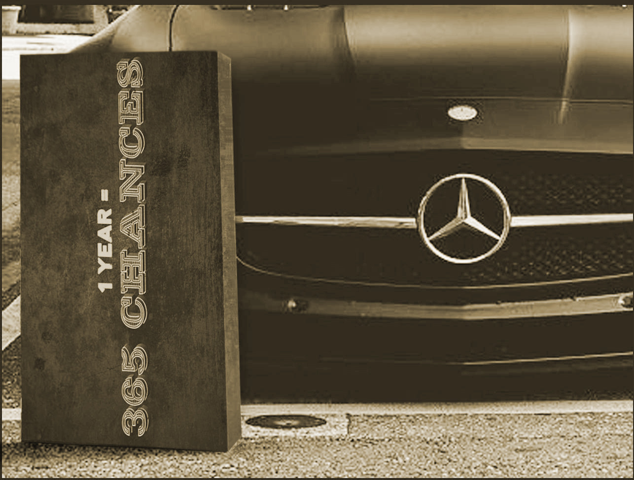
This answer is rewritten. I also edited a little your image to make it more consistent.

All this is only based on my speculations because there's no facts available about the wanted forms, positions and colors.

enter image description here

The edits:

  1. The text plate is straightened. I wanted to drag its bottom end towards the bottom left corner to make it more tilted against the car, but I hadn't the original plain image. The tilting reveals more of it. It probably would be a good idea to mirror the original photo left-right. Then the text could be in the light and still stay at the left side of the image and lean against the car skewed as you originally wanted it.

  2. I reshaped the visible narrow side of the text plate to approximate projected rectangle. The white stroke at the right vertical edge of the plate was removed

  3. The narrow side was made brighter to stay in accordance with the light direction in the original image. A shadow is added respectively at the bottom.

  4. A small reflection is painted to chrome

  5. The plate is blurred approximately to the same unsharpness as the original

  6. The image has got a little contrast because the blurring made 365 CHANCES difficult to read. 1 YEAR= was too bright, so it was kept out of the boosting . It still is a little too bright.

  7. The plate and the original image had different colors. I desaturated all and recolored all to the same hue and saturation. The hue is random. As well it would have been possible to leave it fully desaturated or to copy the hue from your image.

The photo is so unsharp that there's no need to worry about canvas texture and how it is taken into the account in the appearances of the texts. This becomes a problem in higher resolution images which show the canvas details.

This answer is rewritten. I also edited a little your image to make it more consistent.

All this is only based on my speculations because there's no facts available about the wanted forms, positions and colors.

enter image description here

The edits:

  1. The text plate is straightened. I wanted to drag its bottom end towards the bottom left corner to make it more tilted against the car, but I hadn't the original plain image. The tilting reveals more of it.

  2. I reshaped the visible narrow side of the text plate to approximate projected rectangle. The white stroke at the right vertical edge of the plate was removed

  3. The narrow side was made brighter to stay in accordance with the light direction in the original image. A shadow is added respectively at the bottom.

  4. A small reflection is painted to chrome

  5. The plate is blurred approximately to the same unsharpness as the original

  6. The image has got a little contrast because the blurring made 365 CHANCES difficult to read. 1 YEAR= was too bright, so it was kept out of the boosting

  7. The plate and the original image had different colors. I desaturated all and recolored all to the same hue and saturation. The hue is random. As well it would have been possible to leave it fully desaturated or to copy the hue from your image.

The photo is so unsharp that there's no need to worry about canvas texture and how it is taken into the account in the appearances of the texts. This becomes a problem in higher resolution images which show the canvas details.

This answer is rewritten. I also edited a little your image to make it more consistent.

All this is only based on my speculations because there's no facts available about the wanted forms, positions and colors.

enter image description here

The edits:

  1. The text plate is straightened. I wanted to drag its bottom end towards the bottom left corner to make it more tilted against the car, but I hadn't the original plain image. The tilting reveals more of it. It probably would be a good idea to mirror the original photo left-right. Then the text could be in the light and still stay at the left side of the image and lean against the car skewed as you originally wanted it.

  2. I reshaped the visible narrow side of the text plate to approximate projected rectangle. The white stroke at the right vertical edge of the plate was removed

  3. The narrow side was made brighter to stay in accordance with the light direction in the original image. A shadow is added respectively at the bottom.

  4. A small reflection is painted to chrome

  5. The plate is blurred approximately to the same unsharpness as the original

  6. The image has got a little contrast because the blurring made 365 CHANCES difficult to read. 1 YEAR= was too bright, so it was kept out of the boosting . It still is a little too bright.

  7. The plate and the original image had different colors. I desaturated all and recolored all to the same hue and saturation. The hue is random. As well it would have been possible to leave it fully desaturated or to copy the hue from your image.

The photo is so unsharp that there's no need to worry about canvas texture and how it is taken into the account in the appearances of the texts. This becomes a problem in higher resolution images which show the canvas details.

added 22 characters in body
Source Link
user82991
user82991

This answer is rewritten. I also edited a little your image to make it more consistent.

All this is only based on my opinionsspeculations because there's no facts available about the wanted forms, positions and colors.

enter image description here

The edits:

  1. The text plate is straightened. I wanted to drag its bottom end towards the bottom left corner to make it more tilted against the car, but I hadn't the original pkainplain image. The tilting reveals more of it.

  2. I reshaped the visible narrow side of the text plate to approximate projected rectangle. The white stroke at the right vertical edge of the plate was removed

  3. The narrow side was made brighter to stay in accordance with the light direction in the original image. A shadow is added respectively at the bottom.

  4. A small reflection is painted to chrome

  5. The plate is blurred approximately to the same unsharpness as the original

  6. The image has got a little contrast because the blurring made 365 CHANCES difficult to read. 1 YEAR= was too bright, so it was kept out of the boosting

  7. The plate and the original image had different colors. I desaturated all and recolored all to the same hue and saturation. The hue is random. As well it would have been possible to leave it fully desaturated or to copy the hue from your image.

The photo is so unsharp that there's no need to be worriwdworry about canvas texture and how it is taken into the account in the appearances of the texts. This becomes a problem in higher resolution images which show the canvas details.

This answer is rewritten. I also edited a little your image to make it more consistent.

All this is only based on my opinions because there's no facts available about the forms and colors.

enter image description here

The edits:

  1. The text plate is straightened. I wanted to drag its bottom end towards the bottom left corner to make it more tilted against the car, but I hadn't the original pkain image. The tilting reveals more of it.

  2. I reshaped the visible narrow side of the text plate to approximate projected rectangle. The white stroke at the right vertical edge of the plate was removed

  3. The narrow side was made brighter to stay in accordance with the light direction in the original image. A shadow is added respectively at the bottom.

  4. A small reflection is painted to chrome

  5. The plate is blurred approximately to the same unsharpness as the original

  6. The image has got a little contrast because the blurring made 365 CHANCES difficult to read. 1 YEAR= was too bright, so it was kept out of the boosting

  7. The plate and the original image had different colors. I desaturated all and recolored all to the same hue and saturation. The hue is random. As well it would have been possible to leave it fully desaturated or to copy the hue from your image.

The photo is so unsharp that there's no need to be worriwd about canvas texture and how it is taken into the account in the appearances of the texts. This becomes a problem in higher resolution images which show the canvas details.

This answer is rewritten. I also edited a little your image to make it more consistent.

All this is only based on my speculations because there's no facts available about the wanted forms, positions and colors.

enter image description here

The edits:

  1. The text plate is straightened. I wanted to drag its bottom end towards the bottom left corner to make it more tilted against the car, but I hadn't the original plain image. The tilting reveals more of it.

  2. I reshaped the visible narrow side of the text plate to approximate projected rectangle. The white stroke at the right vertical edge of the plate was removed

  3. The narrow side was made brighter to stay in accordance with the light direction in the original image. A shadow is added respectively at the bottom.

  4. A small reflection is painted to chrome

  5. The plate is blurred approximately to the same unsharpness as the original

  6. The image has got a little contrast because the blurring made 365 CHANCES difficult to read. 1 YEAR= was too bright, so it was kept out of the boosting

  7. The plate and the original image had different colors. I desaturated all and recolored all to the same hue and saturation. The hue is random. As well it would have been possible to leave it fully desaturated or to copy the hue from your image.

The photo is so unsharp that there's no need to worry about canvas texture and how it is taken into the account in the appearances of the texts. This becomes a problem in higher resolution images which show the canvas details.

added 478 characters in body
Source Link
user82991
user82991

This answer is rewritten. I also edited a little your image to make it more consistent.

All this is only based on my opinions because there's no facts available about the forms and colors.

enter image description here

The edits:

  1. The text plate is straightened. I wanted to drag its bottom end towards the bottom left corner to make it more tilted against the car, but I hadn't the original pkain image. The tilting reveals more of it.

  2. I reshaped the visible narrow side of the text plate to approximate projected rectangle. The white stroke at the right vertical edge of the plate was removed

  3. The narrow side was made brighter to stay in accordance with the light direction in the original image. A shadow is added respectively at the bottom.

  4. A small reflection is painted to chrome

  5. The plate is blurred approximately to the same unsharpness as the original

  6. The image has got a little contrast because the blurring made 365 CHANCES difficult to read. 1 YEAR= was too bright, so it was kept out of the boosting

  7. The plate and the original image had different colors. I desaturated all and recolored all to the same hue and saturation. The hue is random. As well it would have been possible to leave it fully desaturated or to copy the hue from your image.

The photo is so unsharp that there's no need to be worriwd about canvas texture and how it is taken into the account in the appearances of the texts. This becomes a problem in higher resolution images which show the canvas details.

This answer is rewritten. I also edited a little your image to make it more consistent.

All this is only based on my opinions because there's no facts available about the forms and colors.

enter image description here

The edits:

  1. The text plate is straightened. I wanted to drag its bottom end towards the bottom left corner to make it more tilted against the car, but I hadn't the original pkain image. The tilting reveals more of it.

  2. I reshaped the visible narrow side of the text plate to approximate projected rectangle. The white stroke at the right vertical edge of the plate was removed

  3. The narrow side was made brighter to stay in accordance with the light direction in the original image. A shadow is added respectively at the bottom.

  4. A small reflection is painted to chrome

  5. The plate is blurred approximately to the same unsharpness as the original

  6. The image has got a little contrast because the blurring made 365 CHANCES difficult to read. 1 YEAR= was too bright, so it was kept out of the boosting

  7. The plate and the original image had different colors. I desaturated all and recolored all to the same hue and saturation. The hue is random. As well it would have been possible to leave it fully desaturated or to copy the hue from your image.

The photo is so unsharp that there's no need to be worriwd about canvas texture and how it is taken into the account in the appearances of the texts. This becomes a problem in higher resolution images which show the canvas details.

added 478 characters in body
Source Link
user82991
user82991
Loading
deleted 1 character in body
Source Link
user82991
user82991
Loading
Source Link
user82991
user82991
Loading