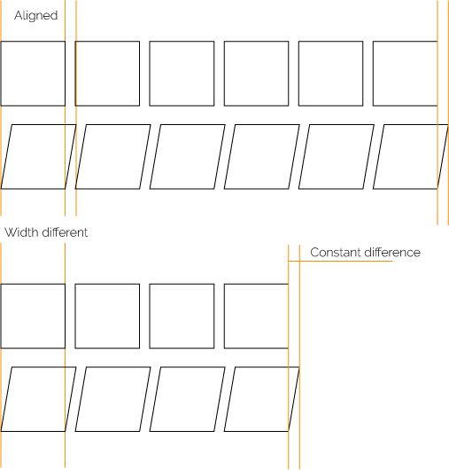
Making a good font is extremely complicated. Its not that any of the individual parts of the font is hard as such. In fact all the steps you do are sort of incredibly simple. There is just lot of them. When you expand this to a font family you get more and more things to consider. When you include the rasterisation of the font even more things to consider.
The quality and usability of the font is highly emergent property. This means that a lot of the features of a font happen, they are not made as such. Sometimes you can anticipate or even control some of the factors but emergence is a bit tricky.
Now as for the italic font. Well the italic font is supposed to interleave with the negbouring character. Otherwise it should probably tecnically just called be called oblique. If you subscrie to this naming then the answer is No, however you may have a bit more flexible view of the world. Then it can be yes.
But please note.
the width difference may also be caused by your rendering engine. So even if the font was same. It may still note come out same. Any, no matter how small detail, in the entire pipline may account for one pixel difference.
Not very many font makers have this as their main priority.
Alignment is not actually affected by width this since the fonts can interleave.

Image: Wdth of string can vary without vialoating the need to be aligned.

