8

After gathering valuable feedback, I worked on a second version for the logo of my online radio station that plays indie music without commercial interruptions.

I wanted to come up with an original one-single-colored shape, one that represented the word "blur". I explored with dots and waves, but most of the results ended up in boring clichés.

So I came up with this version of disaligned lines, aiming to represent the unfocused, the blurriness.

Logotype

I would really appreciate your thoughts and general feedback:

  1. Do you think the symbol represents the word 'blur' in an original way?
  2. Are proportions and kerning correctly applied?
  3. Colors: are they appealing to you?

The same logo using Gotham Rounded Bold:

blur fm logo

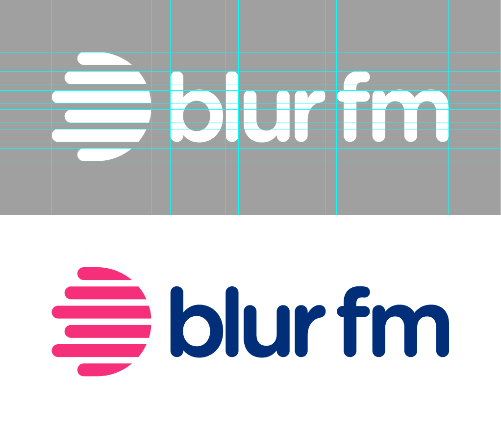
Final version using Gotham Rounded Medium (it blends more harmoniously with the symbol)

enter image description here

6
  • 1
    The lines are quite sharp for something meant to evoke ‘blur’. I instantly saw them as volume waves (or whatever they’re called—what you might see on an oscillograph or similar), which does say radio, but not necessarily ‘blur’. Commented Jul 21, 2018 at 13:51
  • 1
    The station name makes me want to ask if you play Oasis too... ;-)
    – Tetsujin
    Commented Jul 21, 2018 at 13:51
  • 1
    Thanks Janus! I made a version with "Gotham Rounded" and it looks good! [dropbox.com/s/zdq9ltkjd6d9gau/logo_rounded.png?dl=0] Although it gives me the impression of easy and cheap. Maybe it just needs to sink in on me?
    – nicozica
    Commented Jul 21, 2018 at 15:22
  • 2
    Be careful with the spacing between blur and fm. I read this the first time as "blurfm" and "blurf" makes your shape look a lot more like a splat to me.
    – 1006a
    Commented Jul 21, 2018 at 20:49
  • 1
    @nicozica I don’t see easy and cheap; I see more familiar and accessible (similar concepts, but in a positive light). It reminds me a little of the old HMV logo from the ‘90s, which also emanated familiarity and security. It doesn’t say eclectic to me, but I’m not sure it has to—the name ‘blur’ itself says that, and I don’t really think the logo needs to echo it. Commented Jul 22, 2018 at 12:31

2 Answers 2

13

Beyond conceptual issues, some construction adjustments would help your logo a lot.

It is understandable when we use certain fonts with some figures that the estructural axes don't match. What is not permissible is when the designer is the one who creates the figures and makes them do not match anywhere. This logo is very structural and relatively simple to perform within a modulation, which accentuates its imbalance by not having any common measure. As an example, taking the character stroke as module X and the pictogram stroke as module Y, there are few matches.

Here some points, in images it is much easier to understand:

modulation

Spaces II

It's hard to understand the lack of coincidence and the difference between the spaces of the image and the typography, there are four different gaps and no any coincidence with the characters construction lines.
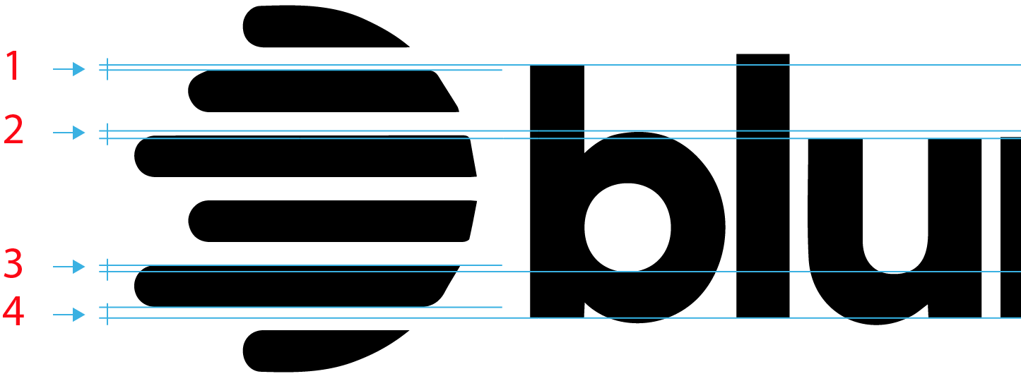
gaps

My personal opinion is that the font doesn't fit with the image. The differences are too subtle to interprete them as a contrast:

  • There are no common points or structural lines
  • There's a rounded end stroke with a cut stroke
  • A simple stroke with a very detailed one

lines

Conceptually the word blur indicates movement, the chosen font is pure tradition, statism, a nail in the ground.

original

As an example, an Egyptian font family is even more static, but accentuates the horizontality movement and modified fits with the pictogram axes. I chose a catalog slab serif, but there are more interesting slab fonts in shape like Nexa from fontbros.com.

Egyptian

The slanted Egyptian is a very rare specimen because it is a contradiction itself, but could give the logo a touch of originality. The mix between Slab Serif and rounded caps is the classic font American Typewriter (myfonts.com).

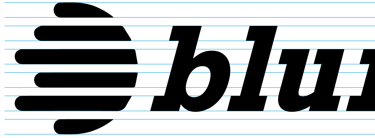
slanted

Matching

The rounded logo you put in a comment it is the opposite of a contrast, it harmonizes with the image. With some structural arrangements it would work well. Definitely the option in the middle it's not the right decision:
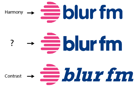
Contrast

By the way, what is the word between harmony and contrast?

Added after the final logo:

The gap between the r and the f is optically too wide, and stick the word blur too much to the image. You should find a way to break this effect separating the image and the b a bit more and joining a bit r and f. You can use 1,5 or 0,5 from the vertical module.
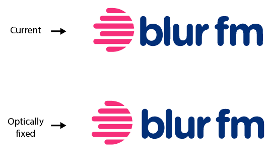
Optically fixed

3
  • 5
    Nice breakdown, but your Egyptian design would work better with a name such as "speed fm" :)
    – Jongware
    Commented Jul 21, 2018 at 20:33
  • 1
    Gracias Danielillo!! Your lesson helped me clarify a lot of concepts and was a tremendous guidance for the last iteration I made.
    – nicozica
    Commented Jul 22, 2018 at 4:17
  • 1
    Good, I added a last thing at the answer.
    – user120647
    Commented Jul 22, 2018 at 7:13
3

I like it. Yes, the colors are a good match and provide enough contrast. The icon no longer looking like a well-known logo. The wording also seems fine with a good balance between the words and icon. Definitely an improvement from your previous attempt. Keep it.

2
  • Thanks Lucian! Unfortunately I'm not allowed to upvote yet. Following Janus comment regarding sharp lines not fully conveying 'blur', I made a version with "Gotham Rounded" (the one I used for the original version is "Gilroy"). It looks good to me as well! Although I have the impression of an easy and affordable brand, and my intention I want to convey somekind of eclecticness. What do you think?
    – nicozica
    Commented Jul 21, 2018 at 15:33
  • 1
    Even better with a rounded font. Looks final to me.
    – lmlmlm
    Commented Jul 21, 2018 at 15:47

Your Answer

By clicking “Post Your Answer”, you agree to our terms of service and acknowledge you have read our privacy policy.

Not the answer you're looking for? Browse other questions tagged or ask your own question.