3

I asked for a critique on my personal logo before and got an amazing response from you guys. thank you! So i abandoned that idea and now have created this new logo.

Basically, I am a graphic designer, already known by the name Miss Graphics and I am trying to rebrand my image.

This was my previous question which shows what my old logo looked like: Critique my logo and help choose colour

Design process involved experimenting with various icons and signature fonts but after the last critique I received I decided to go for some icon.

The concept I have tried to present here is pentool (for to represent graphics) with eyes/glasses (to represent "Miss") sort of a look incorporating the letter M as the basic shape. Please let me know if this is how you perceive it as well.

Also, Please let me know what you think of the logo generally, the colour scheme and geometric/3D effect. Any other comments you might have on whats good and what can be improved, I will greatly appreciate it. Thank you!

enter image description here

5
  • Why glasses to represent Ms? Do you wear glasses?
    – Luciano
    Commented Jun 18, 2019 at 11:07
  • I do.. and besides I was experimenting with things that could represent the "Miss" part so I came up with hats, Masks, glasses etc and then this one made the most sense to me so I went with it but I open to ideas. Commented Jun 18, 2019 at 11:10
  • What you're asking is too broad for the site Q&A format, you need to focus your question in specific aspects of the logo, not a general "what do you think / what can be improved" as a whole. Check the guide graphicdesign.meta.stackexchange.com/questions/681/…
    – Luciano
    Commented Jun 18, 2019 at 11:14
  • I will edit my post. Thank you for the guidance Commented Jun 18, 2019 at 11:16
  • Does your logo work without color and shading in your mind?
    – joojaa
    Commented Jun 19, 2019 at 4:51

3 Answers 3

8

Sorry if this comes across a bit harsh. It's honestly not meant to be anything other than helpful. I have no stake in how good or bad your logo may be. I can only offer some suggestions I would follow in my own effort to create a logo for myself, or another designer in general. You are posting this at a design-oriented site asking designers about a logo for a designer. So, it is expected that you want honest forthright opinions as opposed to merely praise for creating artwork.

Big props to you though. I don't know that I'd open my branding up to scrutiny from other designers. I love my branding, but I'm also aware that pretty much every other designer is going to find something they would want to do differently or change. It's the nature of the field.

Be aware that, for me, creating my own personal identity was among the hardest brands I've ever created. In fact, it wasn't until years later than I could finally land on something I was thrilled to use. Everything prior to that was merely "acceptable" and I didn't feel it embarrassed me. So, I used it. But a strong concept for yourself can be daunting and asking for opinions from designers can make things even worse. It may come down to finding a concept you like and are happy enough with to use for the time being, just so there's something to use. In other words, you may simply need to ignore what anyone else says and use what you are happy with.


To me, this design appears to be an instance of sitting in front of software trying to come up with some concept or idea. As opposed to coming up with an idea, and then using software to refine it.

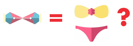
I don't see "eye glasses or a "bikini top" in the imagery. I DO see a bowtie. After reading the question, I can see how you feel the Pen Tool is represented. I would caution against focusing so much on the tools you may use. You can easily pigeonhole yourself that way. Many people hiring designers may not know what the pen tool even looks like. And those that do know what it looks like may feel that's your area of expertise and won't contact you for anything other than projects requiring pen tool-type of work. Which may or may not be a problem for you. In any event, the way it's drawn is very ambiguous and most likely no one is going to pick up on the fact that it's meant to be a Pen Tool.

There's little or no actual thought given to the imagery or type design. It's a clear exercise in "playing" around in the software until you find something which you feel looks good. This is compounded by looking at the previous question which is 180° different in both concept and design. You went from a script, more loose, impression to a hard-edged angular block. Since a logo will go a long way to defining who you are to prospective clients, you need to decide which "mood" you are more comfortable displaying.

I'd strongly suggest you step away from anything with an LCD screen, grab a pen and a piece of paper and start sketching ideas.

Write down a few words that describe your business. Avoid nondescript terms like "professional" They don't actually mean anything.


These are just examples off the top of my head without knowing you or your area of focus.


So you get...

  • Fast
  • Reliable
  • Friendly
  • Print
  • Web
  • Feminine

Now write down a few words for concepts for each of those which might convey that word... a la....

  • Fast
    • Racing
    • Speed Limit
    • Checkered flag
    • Rocket
    • Bullet
  • Reliable
    • Siren
    • Calendar
    • Stars
    • Bricks
  • Friendly
    • Smile
    • Handshake
    • Puppy wagging tail
  • Print
    • Registration
    • CMYK
    • Printer
  • Web
    • Globe
    • Spider
    • Communication
    • Social
  • Feminine
    • (due to the possibility of offending some, I'll leave this list to you)

If possible adding concepts which are not very commonplace can be helpful. For example, I've written "smile", "spider", "globe", "rocket" -- these are really common and you may do better by trying to think of more obscure, but clear, concept references. Again, the list above is merely an example.


Now start combining the secondary words and doodle......

  • Rocket + Puppy
  • Checkered Flag + Smile
  • Rocket + Spider
  • Siren + Phone
  • etc.

From there you should have several doodles representing more solid ideas/concepts and then move to software the refined ideas. With this in mind.. what exactly is the Pen Tool representative of?? How you spend a few hours of your day? Does that really convey what it is you do overall?


I would also encourage you to ignore color and those "highlights" on the type and design strictly in black and white until you feel you have an idea nailed. Once you can walk away for 2 or 3 days, and come back to look at a black and white version of your logo concept, and be pleased with it... then start thinking about color.

2
  • 3
    Can we make this answer a reference to other broad questions about logo critique?
    – Luciano
    Commented Jun 19, 2019 at 8:25
  • Thank you so much for such a detailed response! This is so useful! Not only for this but all future projects I have applied this and created a completely new identity. I realize I have to ditch the idea of "Miss Graphics" to apply this, and I really like this thought process. I have created a new concept and hopefully have been able to apply your technique in the right way. I have posted it here graphicdesign.stackexchange.com/questions/125868/… @scott Commented Jun 22, 2019 at 11:23
1

I can give you some recommendations while creating your logo:

  • While the typographic part seems to be that you already have it resolved, I think you should forget it for now and focus on the image
  • I would also propose to forget the color issue for the time being, color sometimes distracts us from the main idea, at the beginning of the development of a corporate image is noise, unless we have absolute confidence in our color knowledge in all its aspects.

From now on, when there are doubts about a final solution it's always good to question the result, as if we were our own clients. The first question that comes to my mind is:

enter image description here

I ask this only because you have affirmed it in the text of your question, if the comparison doesn't appear anywhere, the question would be another:

enter image description here

It's obvious there's something that doesn't work.


It would be interesting to create a work scheme.

What do you want to create with the image?

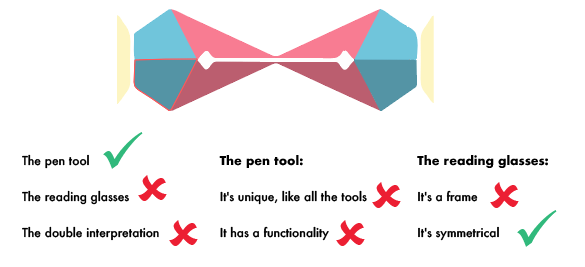
  1. The pen tool
  2. The reading glasses
  3. The double interpretation

The pen tool has a couple of essential features:

  • It's unique, like all the tools
  • It has a functionality

The frontal graphic representation of a reading glasses:

  • It's a frame
  • It's symmetrical

What do you have until now with the image:

balance

A very negative balance so that someone can interpret it at first view.

My approach, without leaving aside any of the premises that you have established, try the top balance of elements be reversed, obtaining more positives than negatives, and if it's possible to fulfill all with positives.

I have many ideas seeing this image:

enter image description here

Google search

4
  • Thank you for responding :) Am I correct in understanding you when I make this change? imgur.com/D4k1Xwd I understand your concept of what it resembles to I think. Like I added the frame to make it look like glasses but a full frame made it look more like a toffee? so I made the half frame sort of thing. Does it make sense? Commented Jun 18, 2019 at 10:57
  • I think the image as it is now doesn't work at all, according to my point of view it should have a complete redesign
    – user120647
    Commented Jun 18, 2019 at 11:08
  • Oh alright. Can I share a few sketches I made? Commented Jun 18, 2019 at 11:13
  • 1
    Think that this is a site of concrete questions and answers, respond to changes on what is asked transform it into a step by step tutorial. I think I've given you enough clues and ideas in the answer, try to think and create your own criteria and logo
    – user120647
    Commented Jun 18, 2019 at 11:21
1

It's now very formal and angular. The pen nibs probably cannot be recognized as tools because they do nothing but exist. If you see a pen as a good thing to show, put it to draw something that you consider you master. You can for ex. develop a signature mark. You had in your previous attempt one. An abstract, but definitely your own shape will do. Nothing already used must resemble it and it has no need to resemble anything. Only be sure it sits happily in the same image with the pen and your name. Because I cannot draw anything really flashy, I would try at first an ultra simple self portrait. It can have the spectacles.

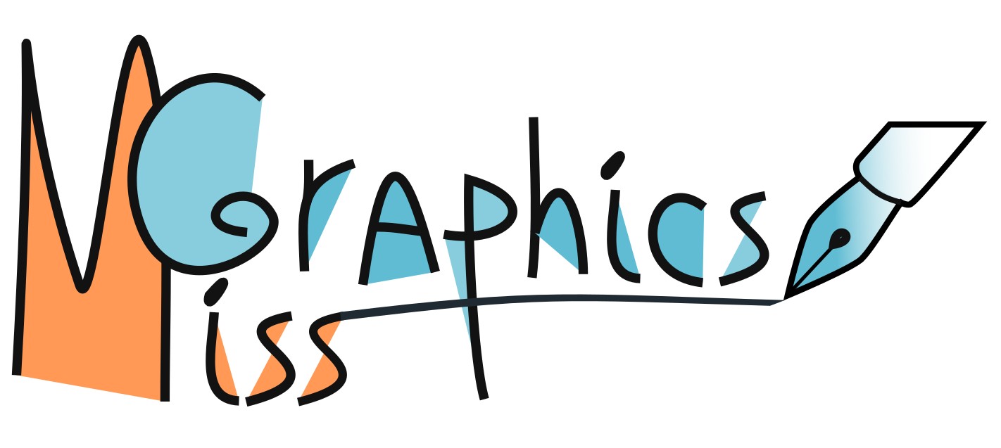
Here's another possiblity: Let the pen draw your business name:

enter image description here

ADD due a comment:

About your linked single nib version: You added a pen as a replacement of your previous 2 pen icon. It's now at least a pen, but you should put it to draw something which is worth of your not especially unambitious name. Here's an example. The general frame is like some boring metal material ad, but your pen brings the life in: https://www.dropbox.com/s/e5psimpkih6pjsj/MissGraphics.jpg?dl=0 (it cannot be shown because pretty items are copied from diverse ads, I do not own them)

If the pen isn't a sharp sword in your hands, consider to drop it. A logo must not rise wrong expectations.

2
  • imgur.com/r9smRvU i can change it like this to make it look like a pen but thats removing the "Miss" concept from the logo.. what do you say? P.S: I am sorry I dont know how to add it as an image here. Commented Jun 18, 2019 at 7:15
  • I mean you could still see the pen tool if it looks like a pen nib. the problem is the icon style is too far from the real thing, and removed of the context
    – Luciano
    Commented Jun 18, 2019 at 11:09

Your Answer

By clicking “Post Your Answer”, you agree to our terms of service and acknowledge you have read our privacy policy.

Not the answer you're looking for? Browse other questions tagged or ask your own question.