2

Let me explain what I mean by better.

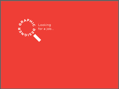
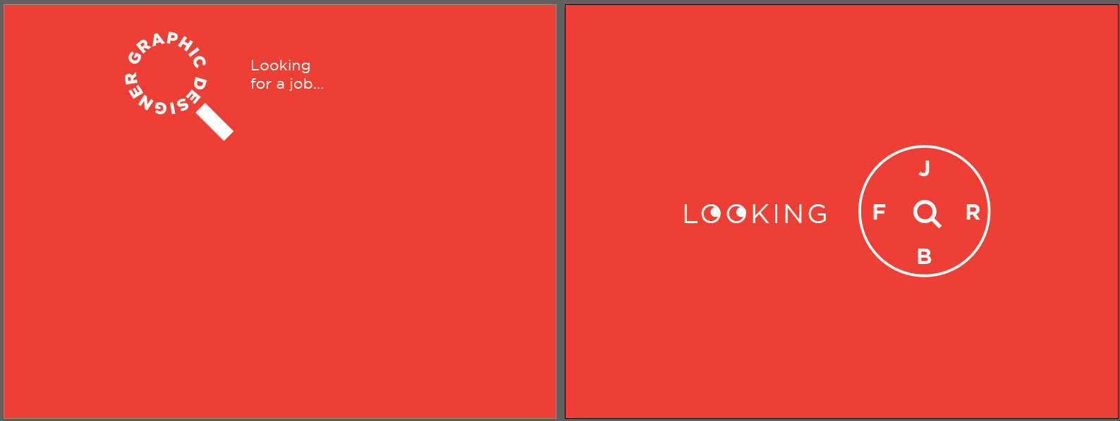
There are 2 designs (rough unfinished work). First one has only search icon made by characters. Second has some creativity and a search icon (and a feel of working hours).

Suppose you're a designer and you will post it on a platform where recruiters and employers (who know about design) see such stuff. You're looking for a Graphic Design job.

Now, you're a designer and you're posting any of them.

So the motive is: You're a designer (and NOT a recruiter) and you're are looking for a Graphic Design job, which is emphasized by a search icon and typography.

Given all that, which design conveys the motive better and is easy to understand for recruiters (and also designers who after seeing it will ask their recruiter about it)? enter image description here

2 Answers 2

2

Left one

Why I prefer the left....

  • It's clear in message
  • placement is interesting at a glance (because it's not all centered)
  • The concept of a magnifying glass and search is instantly perceived

What I'd do to alter the left one...

  • Consider placement a bit more. There doesn't seem to be any direct thought as to why elements are placed where they are.

By merely using the magnifying element and repeating it as a spacer, you can determine a harmonious location for the elements.
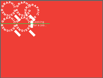
enter image description here

Then remove the duplicates...

enter image description here

Other things to consider in order to improve overall perception....

  • upward right angles are better than upward left angles. Rotating the magnifying image so it points up and the right may be better.

You could merely rotate the magnifying element...
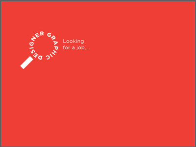
enter image description here

In addition...

  • Scaling various objects differently can lead to more interesting visuals.
  • Since it's a magnifying glass and "search" is the operative message, why not show the "graphic designer" searching for a job.....
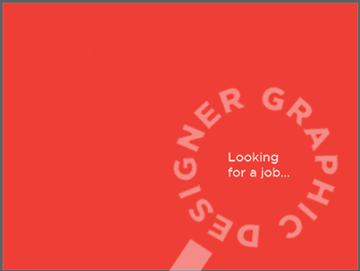
enter image description here

Spacing/position here is also determined by the elements..
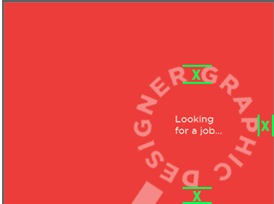
enter image description here

I've lowered opacity on the large element to better balance it with the internal type. This is done so "looking for a job" is as prominent, if not more so, than the large element at a glance.


Here's why I dislike the right one....

  • Centered content is boring and pedestrian
  • The eyeballs in "looking" are overkill. The text alone convey's the message.
  • The crossed type in the circle forces the reader to work... to "figure out" what is being conveyed. It's not difficult to figure out... but merely that step can be a deterrent for some viewers.
  • Intake is not instantaneous, and can be read different ways -- "looking job for" -- "looking for job"
  • The circle honestly reminds me more of a wacom touch ring more than anything. But that's merely my perception

This is all merely my opinion. I am not stating this is "correct" or "right", merely how I'd approach using the same elements. It's all simply my personal aesthetic acumen which I'm sure many may disagree with.


regarding the comment:

Different people have different views. Why is it so? Can a design never be bad or good? Can a design never be better than other for same purpose?

Different people have different aesthetic senses. Or.. "beauty is in the eye of the beholder". What I find visually pleasing others may find horribly ugly. There is almost never a single solution to any design. Design is 80% art and 20% science in many instances. If it were all cut and dry, black or white, then it could all be done by some automated machine and humans would no longer be necessary. Studying human perception and demographics of audiences can lead a designer to some "cues" based upon overall, general, preferences of human beings in a given demographic. But ultimately it is all still "best guess" at most.
3
  • Good suggestions! I would really like if it was possible to move "graphic designer" down, let the magnifying glass be made of "looking for" and just have "a job" in the center. It annoys me a bit that the magnifying glass looks at "Looking for a job..." - should be searching for "a job".
    – Wolff
    Commented Dec 29, 2019 at 19:46
  • Possibly @Wolff :) I focused solely on size and placement and not any direct object alteration really :)
    – Scott
    Commented Dec 29, 2019 at 19:48
  • I read all the things, but followed a few of them. I have uploaded it in Looking Glass if you wanna see.
    – Vikas
    Commented Dec 29, 2019 at 21:41
1

The one on the right definitely, but needs more tweaking I'd say:

  • remove the eyes from the OO, there is too much information already and you may have heard this before, but simple things are generally better
  • make every font bolder and in the same weight and also the circle having the same weight
  • just a random example of how everything looks optically balanced when made in thicker and equal weight

enter image description here

5
  • 2
    :) I'd say the left.. which also needs tweaking.
    – Scott
    Commented Dec 29, 2019 at 9:09
  • Different people have different views. Why is it so? Can a design never be bad or good? Can a design never be better than other for same purpose?
    – Vikas
    Commented Dec 29, 2019 at 10:36
  • 1
    Both designs can work, but i still favour the one on the right. To me it makes more sense because of the way everything flows in a single direction (to the right), sort of like an "arrow", while the one on the left is a bit all over the place: the word "designer" is upside down, so that points to something, then the line in the icon points to something else, then "looking for a job" goes somewhere else entirely. Kind of distracting and not as focused as the logo on the right. But yeah this is a subjective, opinion based question ultimately. You need to decide which works better.
    – lmlmlm
    Commented Dec 29, 2019 at 11:24
  • @Vikas I'd vote for the one on the left. But also agree it would need tweaks to improve it. The one on the right oddly reminds me of the pin entry screen for an Amazon Fire TV Stick. Also the word "a" is missing which makes it look like a grammatical error.
    – Billy Kerr
    Commented Dec 29, 2019 at 13:04
  • @BillyKerr okay. Do you have any trick about where I can insert A?
    – Vikas
    Commented Dec 29, 2019 at 15:25

Your Answer

By clicking “Post Your Answer”, you agree to our terms of service and acknowledge you have read our privacy policy.

Not the answer you're looking for? Browse other questions tagged or ask your own question.