Using black ink for non-gray colors is very common. Nothing wrong in that.
When you convert an image from RGB to CMYK, you normally trust the color profile to find the CMYK numbers needed to reproduce each pixel as accurately as possible. Most standard color profiles will use black ink throughout the image, also in the more colorful parts which could be reproduced without black ink. This is done in a pretty complex compromise between color likeness, stability of tone, total ink, smooth transitions etc.
When it comes to color swatches for vector objects, most designers like to "program" their swatches directly in CMYK. For many everyday jobs we could as well define our colors in RGB or Lab (while making sure to keep them inside CMYK gamut of course) and just convert them to CMYK on export and thereby leave it to the color profile to decide on the specific CMYK numbers. This would make it possible to export to different CMYK profiles for different paper types. Actually, defining swatches in CMYK is often the same as working in RGB. You might nudge the CMYK values up and down, but you rely on the RGB preview on your screen to decide if you like the chosen color.
All this said, there are still reasons to want to control the CMYK values manually. Keeping black text and line art exclusively black (preferably at 100% to avoid halftoning) and making sure neutral colors only use tints of black ink are some of them. Here I'll show some other examples where it can be wise to consider exactly how to define the CMYK values. The examples both speak for including and excluding black ink in colors under different circumstances. That's the complexity of it.
(In the following I'm using the color profile ISO Coated v2.)
Minimize Unwanted Color Tint
As you already know, the same color can often be defined with or without black ink.
Below are two colors: some kind of curry yellow and a warm gray.

The left version of each color is defined without cyan ink and the right is defined without black ink.
Let's imagine they were printed on slightly uncalibrated equipment which resulted in a shift of for example CMYK(+5,-2,-5,+5).

Notice how the colors to the left (without cyan ink) mostly get a change in lightness, while the colors on the right (without black ink) also get a visible shift in hue.
The "tinted grays" are the most sensitive. If I want to make for example a yellowish gray, I would never add anything besides yellow and black ink. Why risk getting a greenish or reddish tint by adding cyan or magenta ink if it's not needed to obtain the wanted color?
Smooth Transitions
When you want a smooth transition between two colors, for example in a gradient, you get the most aesthetically pleasing result if the two colors share one or more inks.
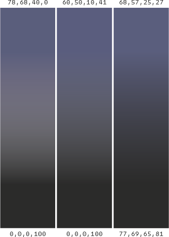
Let's assume we want to make a transition from some dusty blue to a pure 100% black.

To the left the blue is defined without any black ink. The gradient becomes pale in the center because all of the inks of both colors must fade all the way to zero.
In the middle the blue is defined with some black ink. The transition becomes slightly better as the black is present all the way through the gradient.
To the right I've converted the two colors from the leftmost gradient to Lab and back to CMYK again. Now the color profile decides the CMYK numbers and it adds color to all four inks. The transition is much nicer, but the black color is no longer just 100% black.
So if the purity of the black ink is important (for example if it has to blend together with other graphics or it contains negative text), the middle solution is probably best. If the appearance of the gradient is more important, the solution to the right might be best.
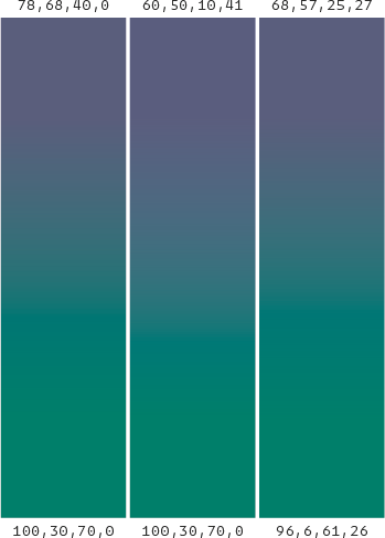
Here is another example with the same principle, only this time it goes from that same dusty blue to a green color.

Here it seems like the left solution without black gives the best result. The middle one looks a little bit faded in the center. The right one looks fine, but in this case there is probably no need to add black to complicate things unnecessarily.
Cleanness
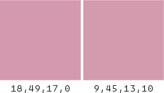
Two CMYK colors that apparently appears exactly the same on screen (has the same Lab values) will in reality look a little different on print texture-wise.
These to colors looks very similar on screen although they are defined differently.

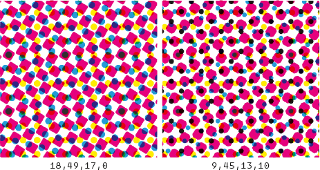
Seen from a distance or when squinting your eyes, they will look the same, but a closer inspection will reveal that one of them has tiny black halftone dots while the other hasn't.

It might be a subtle difference, but in my opinion the black dots do pollute the color a tiny bit and it might look cleaner and less flickering to avoid black here.
Avoid Darkening of Colors
Even though most print houses follow a standard there is still some craft to it. The printer might want to make small adjustments while printing to get the best result.
If you for example make a print with black text, grayscale images and some colored areas, it might be a good idea to define the colors without black ink. This way the printer can turn up the black a tiny bit to get darker text and images without affecting the colors.
Minimize Misalignment
It's recommended to keep small text in 100% black to avoid misalignment issues. But sometimes you just can't avoid having small colored text. In those cases it's best to define the color of the text with as few inks as possible.
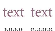
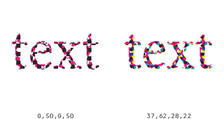
Here are two texts defined in two inks and in all four inks.

On print the inks might get slightly misaligned and the text with only two inks looks a little less blurry.

Eliminate Misalignment
Sometimes you want detailed graphics in one color on top of another color. This can lead to problems with misalignment. Those problems are countered by trapping, but it can still look messy. With a little attention to the CMYK values, you can eliminate the misalignment completely.
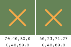
Look at this green square with an orange cross.

In the left version the only difference between the two colors is the cyan ink. In the right version the green color is the standard mix of all four inks and all the four inks differ.
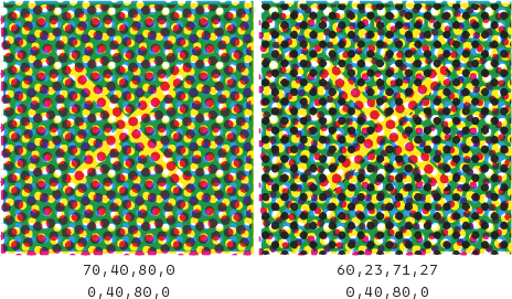
On print these two approaches will look rather different.

The left one can't be misaligned as the shape of the cross is only made with the cyan ink. The right one needs to be trapped and can look a little blurred.


