3

In some typefaces the "a" at the core of the glyph for "@" is similar to the italic glyph for "a". Examples include Bodoni, Bookman, New Century Schoolbook, Palatino, and Times, which are all serifed faces using a double-storey "a" in roman and a single-storey "a" in italics.

This is not so for many typefaces which have a double-storey "a" both in italics and roman, such as the sans serif faces Arial, Verdana, Gill Sans, and Univers. Despite the double-storey look of their italic "a", they still use a single-storey "a" inside the "@" sign.

In fact all the faces I've looked at use a single-storey "a" in the "@" sign. What faces, if any, use a double-storey "a" in that position?

4
  • 1
    Hi. Welcome to GDSE. You can use a site like myfonts.com, and type in the @ symbol as the example text, and check for yourself.
    – Billy Kerr
    Commented Jan 23, 2021 at 14:02
  • Thanks. I made a double-storey "@" and pasted it into their "What my font?" engine and found only a single typeface, called Index, which has an "@" of this type.
    – user159870
    Commented Jan 23, 2021 at 14:10
  • I was bored, so I activated all my fonts… in the ensuing crawl... through all my fonts finds Skia & Trebuchet are all I've found so far...
    – Tetsujin
    Commented Jan 23, 2021 at 14:12
  • @ruffle You don't have to do that. The fonts on myfonts are searchable using just a regular @ symbol as the example text. You can search through their lists to find fonts that have the glyph you want. The first page of serif fonts shows at least two.
    – Billy Kerr
    Commented Jan 23, 2021 at 17:09

2 Answers 2

2

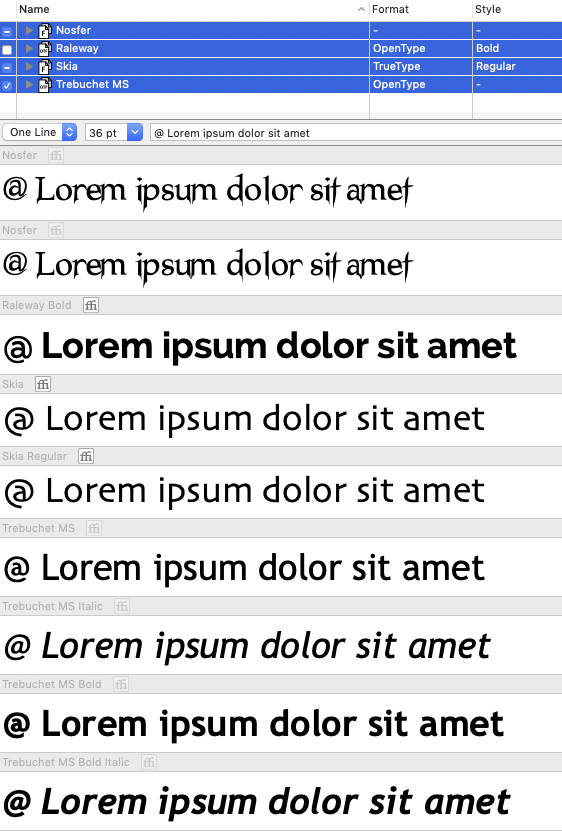
Well, that's not a job I'm going to volunteer for again, but after activating my entire font collection & decided to wade through them all in a kind of bored yet grim determination, I found…

Nosfer, Raleway, Skia & Trebuchet.

enter image description here

I've no clue of the source of any of these - about 35 years ago I asked the company I worked for for "some fonts" for a task. They bought a box-full of CDs, entire foundries. CDs are long gone but I still move all the fonts from Mac to Mac every time I upgrade.

1
  • 1
    Bit off topic for the question, but many of the older, lazier font digitizations just copy the same @ character to every font and make no attempt to match weight and design (I'm looking at you, Bitstream). When I buy an updated digitization of an old font symbols and character range are often the reason.
    – Copilot
    Commented Jan 27, 2021 at 21:44
1

Corbel, Harrington, Kefa, P22 Underground, PF DIN. Quite a few others have a hybrid form where a curl grows out of the top of a double-storey a like Audimat, Courier New, FF DIN, Lucida Console, November. Linotype Copperplate is an all caps typeface: it has a capital A!

Your Answer

By clicking “Post Your Answer”, you agree to our terms of service and acknowledge you have read our privacy policy.