There's a whole lot wrong here... or a whole lot you are seemingly unaware of.
First.. A commercial printer will be looking for 2 colors if you have more than 2 colors for whatever reason.... you don't have a 2/2 document. The actual operation of exporting to a PDF will never create a 2 color file. There's no setting, no job options, nothing to set when exporting to PDF which will magically create a 2 color file. The document must be set up as 2 color before any export.
It is possible using Adobe Acrobat to check the ink usage within a PDF if you are unsure. Similar to below... which you can do within InDesign...
You can also use the Separations Preview panel within InDesign (Window > Output > Separation Preview). The panel will allow you to turn off visibility of colors to see what will print. You should be able to turn off your 2 colors and see nothing. If you can't do that, the file set up is incorrect.
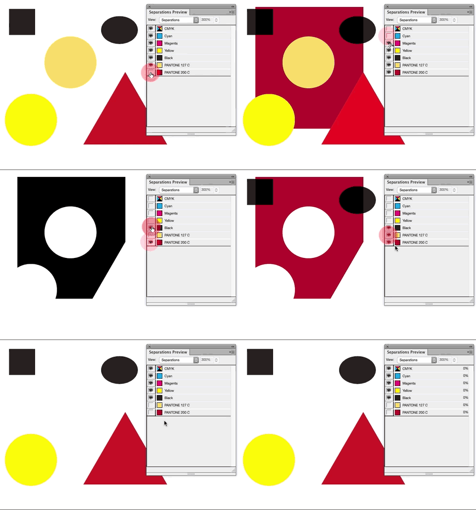
Using the Separations Preview Panel and toggling color visibility, you can see in the animation below the triangle and lower circle are still built using process colors. Therefore this artwork is not configured correctly for, in this case, 3 color reproduction.

If the artwork is correctly configured, you should be able to toggle visibility of colors you are expecting to print and see nothing else. So, below, I can turn off visibility for black and the 2 pantone colors and nothing is visible. That's correct.

Yes you should work with a CMYK color document. However, unless you are using a spot color in InDesign, you will have a 4 color PDF upon export.
The color of a swatch means nothing to the PDF export. It is the color definition created when using a swatch that matters.
You can have a "red" swatch. That swatch can be C0M100Y100K20, or R100G0B0, or Pantone 187. Only using the Pantone swatch will result in a single color upon output because the color definition is one color. See here for an explanation of spot color vs process color reproduction. This is also a decent explanation.
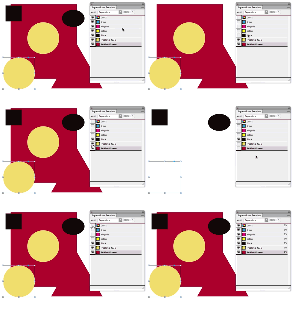
You can change the color definition of a swatch to be a spot color, so it will separate as a single color. Merely double-click the swatch in the Swatch Panel and set the Color Type drop down to Spot. In the animation below, note how the icons on the right of the panel change to indicate a spot color. And, also as shown below, you can verify this with the Separations Preview panel again.

Most professionals would use a spot color from a built in color book such as Pantone colors. This is done to ensure better color matching. If you merely change a swatch to a spot color, there's a margin for error in the actual color since a print provider will be guessing as to what "red" actually means (or whatever you name your swatch). Using color books, such as Pantone's, ensures everyone is referencing the same color.
Is your "1 additional color" a spot color? If not, it should be.
And YES RGB images are a MAJOR problem. They need to be strictly 2 color images. RGB is Red/Green/Blue.... i.e. 3 colors... and can only be converted to 4 color upon export. Just because a raster image may look like it has two colors, it does not have only 2 colors, unless it's been correctly configured.
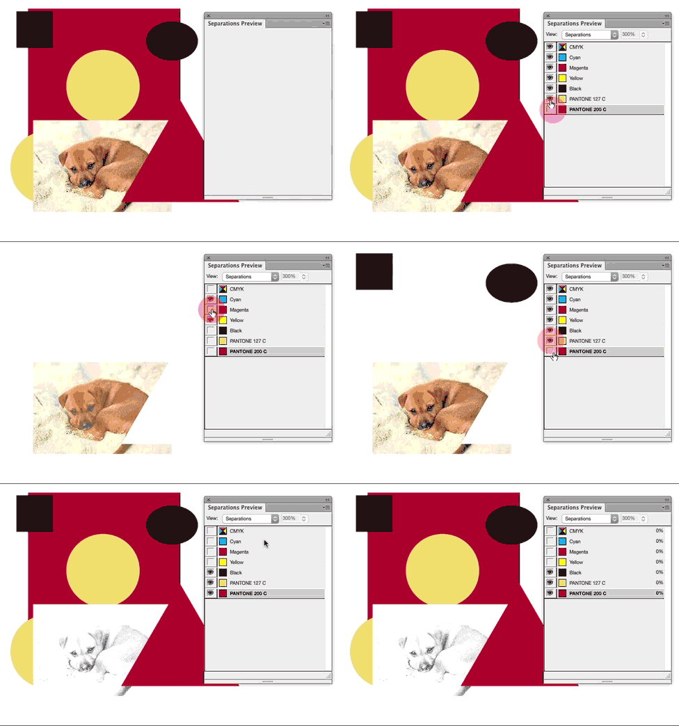
If you place an RGB image within the document, it will be separated to 4 colors. The Separations Preview Panel will also show you this...

Configuring raster images for two color printing can be a lengthy process depending upon the image. There are several question here regarding raster images and two color reproduction...
In short .. simply using 2 colors within a layout does not create a 2 color file. You have to be specific about color definitions... and not use anything other than 2 specific color definitions within the document layout.

