0

I’ve been trying to figure out color management (mostly in InDesign, but this question is more general) in a print production workflow in more detail recently.

What I am trying to achieve is printing a color that is as close as possible to what I define in InDesign, without having “proof colors” turned on.

I want to use a very obvious but not quite realistic example (and assume that the screen of my computer renders colors correctly):

I defined a color that needs to be printed exactly as viewed on screen (it’s inside the screen’s and target profile’s gamut) and this color equals, totally by chance, the color of the media white point of the target color profile of my document. The target profile is PSO Uncoated ISO12647 (ECI), so I get the media white point from the ICC file—values in the XYZ color space: X = 0.846, Y = 0.877 and Z = 0.747.

I can then translate these to the Lab color space: L = 95.03, a = 0.07 and b = -2.03.

And these values again I can add as a color swatch in my InDesign document and convert them to a CMYK swatch: C = 5, M = 3, Y = 1 and K = 2.

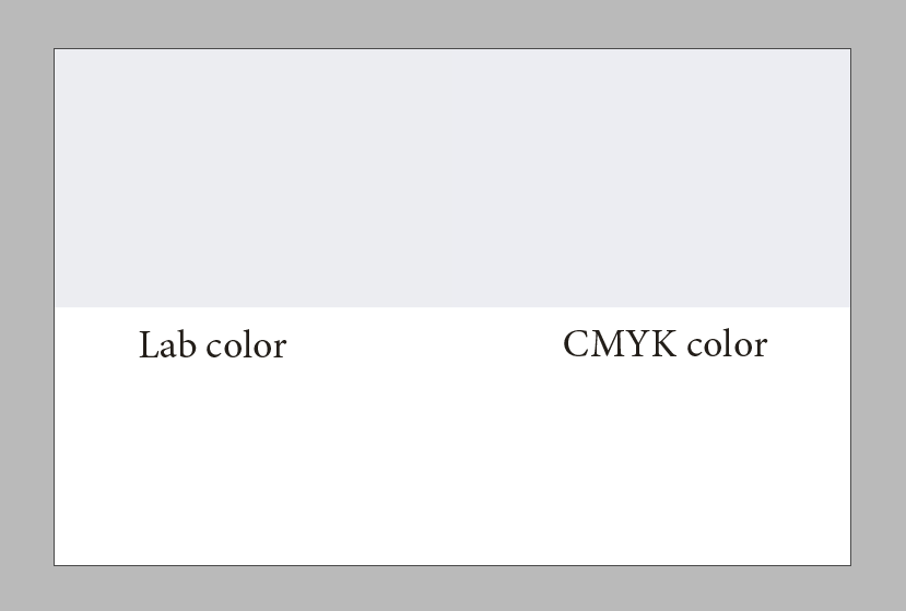
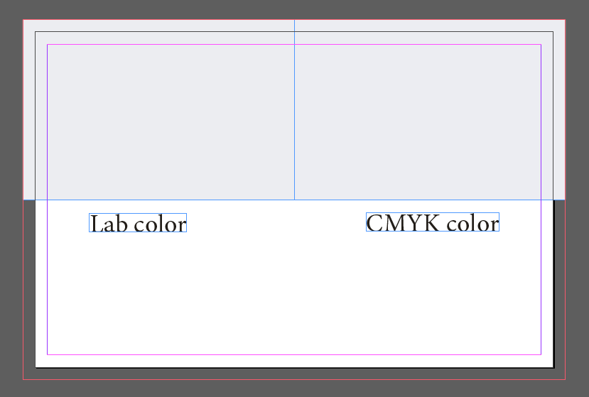
I add two rectangles to the artboard, one in the Lab and one in the CMYK color.

enter image description here

In preview mode it looks like this and we can see that the two colors match:

enter image description here

(We are now back in the real world where I can’t print a proof of this document but need to rely on the soft proofing function of InDesign.)

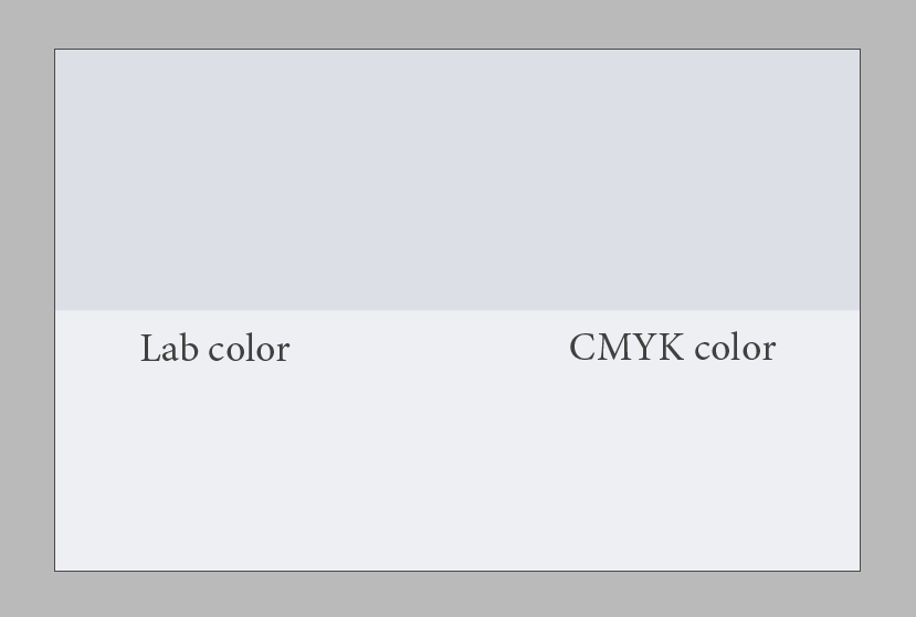
Now I turn on “proof colors” to see how this will look when printed. To get as close as possible to reality, I make a custom proof setup and enable paper color and black ink simulation (of course for the document’s already assigned color profile).

What I see now and what I think is about correct is this:

enter image description here

The colors will be printed on the paper that has a color of its own—and by that get “multiplied”.

But since I actually want to see my originally defined color printed, wouldn’t it be a better solution to print “nothing”, because my desired color is already there (in the paper)?

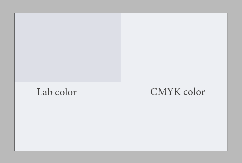
So I subtract the media white point from my CMYK color by hand, because these values are already waiting on the sheet… and get C = 0, M = 0, Y = 0 and K = 0—what a surprise. The output looks the way I imagined it now:

enter image description here

Of course this doesn’t make sense with multi-color graphics like photographs because we need a real white point, but that’s what the “perceptual” rendering intent is there for when converting images to a different color space and / or profile.

But when trying to print a certain, defined color, wouldn’t compensating the media white point be the way to go? Or is this something that can be (or already is?) handled later in the process, in a color profile for the print machine for instance?

The idea is the same for any color but most obvious by using the paper color directly. You could subtract the paper color from C = 100, M = 75, Y = 50, K = 25 as well—that would yield in C = 95, M = 72, Y = 49, K = 23 and should give a color more accurate to the one you have seen on screen than simply printing the original values.

Maybe this is something very obvious that is already dealt with but I’m lacking the knowledge and words for it.

(The paper color used by the color proofing functionality of InDesign doesn’t match my defined paper color exactly, but I will ignore this for the sake of the example.)

8
  • A color profile can do this. But given that your manipulating the values wouldnt this be more produuctive if you used absoilute colorimetric as intent
    – joojaa
    Commented Apr 16, 2021 at 19:08
  • I can’t set a rendering intent for native InDesign objects in CMYK, since only colors in differing color spaces and profiles are converted. But for the rectangle in my example that has the Lab color applied this actually works! So maybe the takeaway is that colors that should compensate the white point should not be defined in CMYK?
    – silllli
    Commented Apr 16, 2021 at 20:48
  • Ah now I get it. Converting my Lab swatch to CMYK after setting the rendering intent in InDesign’s color settings to “absolute colorimetric” also results in my desired C = 0, M = 0, Y = 0, K = 0. If you are working with brand colors this makes so much more sense.
    – silllli
    Commented Apr 16, 2021 at 21:16
  • If that light gray paper color should just become CMYK(0,0,0,0) then what do you expect happens with pure white? The same? And just loose the range of tones between white and light gray?
    – Wolff
    Commented Apr 16, 2021 at 21:16
  • I made a remark about that in my question. It doesn’t make sense when printing e. g. photographs that have lighter areas. But when I print a business card with one or two “signature colors” and black only, this gives a more accurate result.
    – silllli
    Commented Apr 16, 2021 at 21:19

1 Answer 1

1

Thanks to the comments under my question and some additional research I was able to figure this out:

Yes, it is possible and reasonable to compensate the media white point of a target color profile—but it depends on the case.

Since I’m mostly using Adobe InDesign I will describe the solution within that context. The general idea applies to other applications as well.

I was aware of “rendering intents” but didn’t really know how they come into play in my scenario. The rendering intent that can be set in the color settings of InDesign—or in the “Assign Profiles” dialog, for a per-document basis—is used when colors or images that use a color space other than CMYK are converted to CMYK. That’s for example the case with placed RGB images.

But it’s also the case for color swatches that weren’t defined as CMYK colors but HSB, Lab or RGB. These will be converted using a specific rendering intent when either converting the color swatch to CMYK by hand or when the document is exported with color version enabled.

The rendering intent defines how to handle the color conversion regarding out of gamut values, but also the white point. (You can read more about it on Wikipedia or this CreativePro article.)

So in order to keep the appearance of my hypothetical example Lab color (as defined on my screen) on the target medium, I need to use an absolute colorimetric rendering intent. Now when I convert the color to CMYK the algorithm takes the target white point into account and “subtracts” its value from the resulting CMYK values—just as I did before by hand.

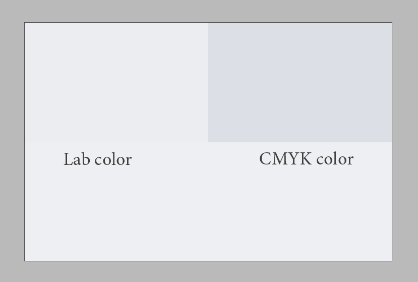
The result, with “proof colors” turned on, looks like this:

enter image description here

On the left the Lab color, converted in realtime using the absolute colorimetric rendering intent, and on the right the CMYK color that was converted by hand, while the rendering intent was still set to relative colorimetric. Mission accomplished.

Another takeaway from my findings is that it may make sense to not define colors in CYMK if they should be replicated exactly as defined on different media. Of course the gamuts of all possible color applications need to be taken into account—but by doing this, you are able to convert colors for different scenarios without problem.

I found an organization that is promoting and researching this new way of thinking regarding media-independent color, freieFarbe e. V..

There is also a paper about this topic by a different author that states how the current use of media-dependent color values only, especially without context, in corporate design or brand manuals is problematic.

Your Answer

By clicking “Post Your Answer”, you agree to our terms of service and acknowledge you have read our privacy policy.

Not the answer you're looking for? Browse other questions tagged or ask your own question.