Like others have said, not every design needs to use a grid as such to be balanced, but rather a set of geometrical rules.
It's common to have some sort of horizontal grid in the form of margins and columns, but vertically you would often let the height of elements be dictated by the content. That's just the nature of text really. You can set the width of a text frame, but the height is dictated by the font, its size and leading and the amount of text.
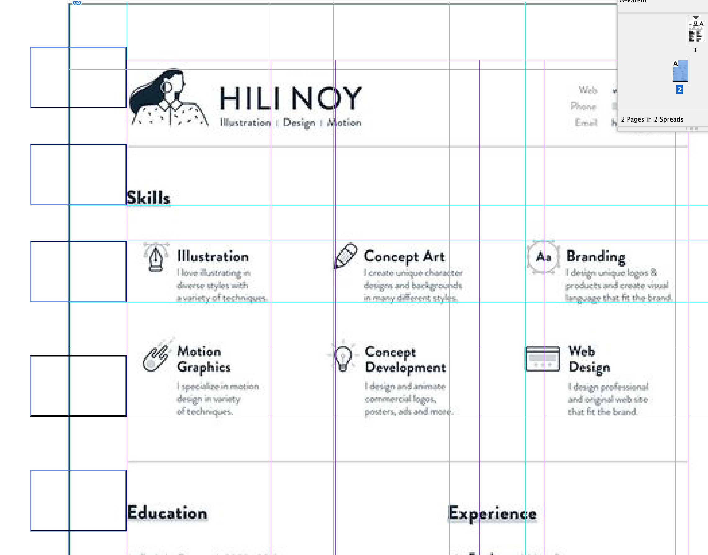
To create order vertically, you would often work with some consistency in white space and often also use a baseline grid if the design involves multiple columns.
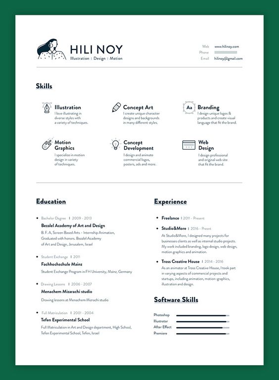
In your specific case, I'm afraid you are searching for a system where there is none. The design you want to copy is, in my opinion, not a particularly good example to follow. The overall idea is hard to have anything against, but the execution is a bit sloppy. There are lots of inconsistencies.
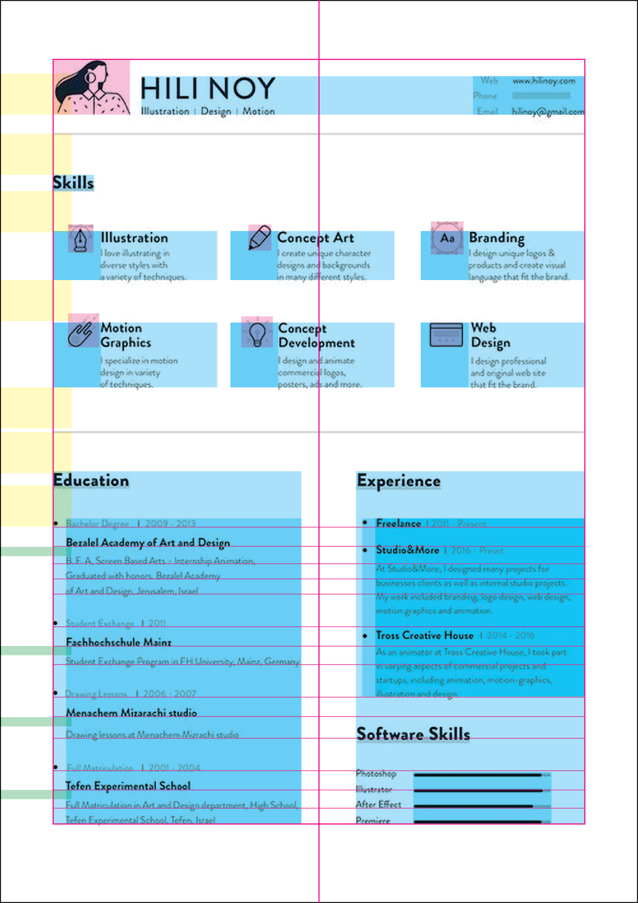
I've drawn some lines and boxes on top of the layout to show you what I mean. I hope it's not too confusing.

The header section in the top does not seem to align or correspond with anything else in the layout. That's not a problem at all, it's just not based on a grid.
The Skills section is divided in three columns, but the columns do not have equal spacing. There is less space between column one and two than there is between column two and three. Perhaps this is done because the two icons in column three are more "solid" than the others, but it certainly doesn't follow a grid.
The icons in the Skills section don't seem to be consistent in size or scale. In the upper row their centers are aligned to the center of the one line in the headings and in the second row their centers are aligned to the center of the two lines in the headings. Perhaps the best solution in this case, but not grid based, merely "aligned by eye".
The two columns in the bottom section are not of equal width. The left column is wider than the right.
In the Education section, the bullets align with the heading and the rest of the text is indented. In the Experience section, the bullets themselves are indented and the text has an additional indent.
The text lines in the bottom section don't follow the same baseline grid. It's not a must that they do, but if possible, it can really help the overall balance of a design. Hard to imagine a strict grid based layout which doesn't take the baselines into account in some way.
The yellow boxes on the left are all of equal height. They show that the vertical distances that appear similar aren't really exactly the same. Not necessarily a problem, but it just shows that no strict grid is involved.
The green boxes on the left are also all of equal height. They show how inconsistent the spaces after the bold lines in the Education section are. This really makes that section look unbalanced in my eyes.
As I see it, this layout isn't particularly systematic and grid based in its approach, but follows the principle of "nudging until it looks good".


