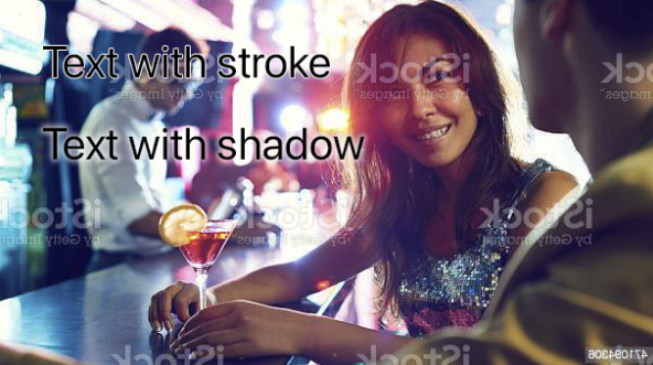
I, personally am never a fan of using strokes or shadows to boost contrast if they can be avoided. They absolutely work and many people like to use them - there's certainly no harm in using them if thats your preference. I try and find other, hopefully more interesting, ways if I can.
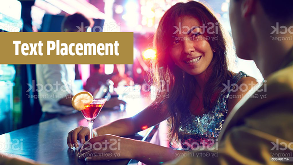
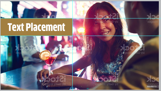
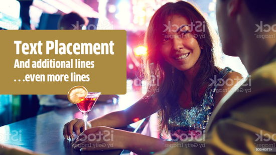
I would instead choose a background shape for the text.
Without knowing what the text involves... something like...

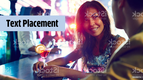
Or for dark text...

Note the box is specifically colored to play off of either the man's coat or the blues in the existing background. It's positioned specifically between her eyes and mouth and ends at her elbow and wrist intentionally. It's always favorable to start shapes like this at someone's eye level if there's a face in the image.

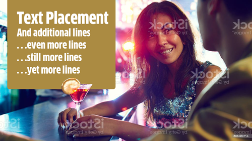
If a larger shape is necessary, I'd consider a cut out for her drink....

Or a vertical box with a cut out...
