8

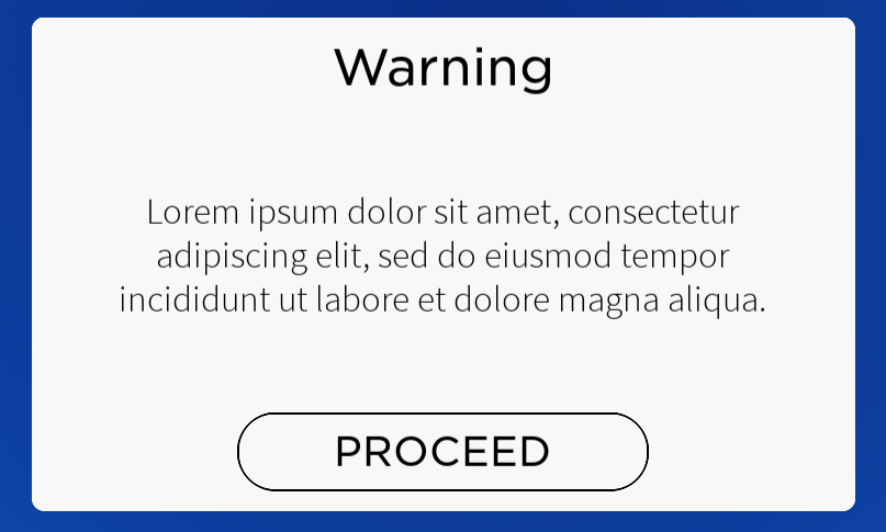
I made this design for practice, a simple popup warning someone of something:

enter image description here

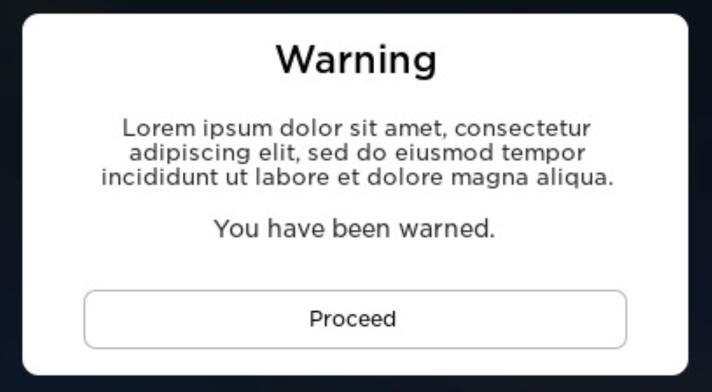
Immediately, I could tell there was something wrong with it, but I couldn't quite place my finger on what. I shared this dilemma on another forum, where someone designed this:

enter image description here

As soon as I saw it, I could tell this was a better design, but being the amateur I am, I have no idea why. Compositionally, what makes their design look so much better, and why?

0

3 Answers 3

12

The primary reason the second image is better received is due to consistency. Not in type sizes or faces, but in the white space.

As with most designs, greatness lies in the parts you don't see.
As much as it does the parts you do see.

I, personally, think the typefaces used are relatively unimportant and practically any face will work. The only comment regarding the type I have is that not using all uppercase can convey a less "SCREAMING" attitude and come across as more "cool" and "professional" in some instances. This, may be one such instance. The button itself creates visual prominence, adding an all uppercase label is essentially overkill and causes a visual imbalance.

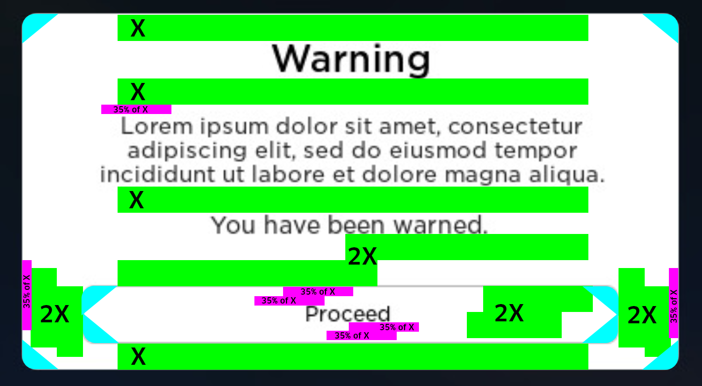
The primary difference is the white space and corner rounding. While not 100% perfect it is very close (the minute variances could merely be due to the fact it's a screenshot). There's much more consistency in the white space and all the corners use the same rounding. This makes the image appear more structured and intentional.

enter image description here

There is a rhythm to the white space, especially vertically. This rhythm is unconsciously percieved when reading. A reader unconsciously instantaneously recognizes that spacing is the same - so the brain knows that after reading something the "bump" to the next piece of content is the same each time. bump-read-bump-read-bump-read-bump-bump-read-bump - if it were drums you could dance to it. :)

Now the new user somewhat cheated by throwing in an extra line of text which helps balance the whitespace. But even without that additional line, taking your screenshot and making all the white space consistent helps considerably.

enter image description here

I did recreate the button to reset the type, adjust corner rounding to match the container, and add a white fill since the background is actually a light grey (f8f8f8). The white fill helps push the button forward visually.

Depending upon your preference, you can adjust the width of the button by using multiples of the spacing....

enter image description here enter image description here enter image description here

As long as you remain consistent with multipliers, it's going to be pleasing visually.

Consistency always conveys more "professionalism" because people inherently perceive symmetry. It may not be something they consciously acknowledge, but it is always perceived.

There have been studies showing that people who are said to be more attractive or beautiful are percieved as such due to facial symmetry - Facial symmetry and the perception of beauty (PDF). And Wikipedia has an article on the subject as well. Symmetry and consistency will typically make designs appear more pleasing regardless of the actual style or content of the design.

5

Information priority

  • font sizes in your version are too equal. You need a clear distinction in font size between a header and a paragraph. The button stands out anyway because it is boxed in a container, so again no reason to make every font size (almost) identical.
  • font weight in the lorem ipsum part too thin. Use a regular, not a light.

White space

  • way too large gaps above & below the lorem ipsum part. You need to group the message (title AND description) into a more compact box (reduce space below warning title). The second group is the button (CTA) and the white space is supposed to separate these groups of information, not every element equally.
  • way too narrow space above warning and below proceed. No need to stick the information to the margins like that.
2
  • 2
    I think the use of almost angular corners on the button also make a difference. It seems more serious.
    – Barmar
    Commented Dec 16, 2022 at 17:00
  • 1
    The matching font makes a difference, too. Commented Dec 16, 2022 at 17:15
1

I will draw your attention to the collective impression, and then to two specific things.

Collective impression:

Overall, the top design, even if its mission is to create a layer of discouragement, or to serve as a metaphorical speed-bump, is relying on a design language that looks as if it was borrowed from a "Call to action", whose role is the opposite, to invite the specific action.

The design language is not consistent with the intention / role of the widget.

Specifics:

1.

The saturated blue color:

Saturated colors will attract attention, and may also attract action. The latter will be influenced by the specific hue, and whether that hue in a given culture has a specific association.

Since the message is written in English, I take that the context is "western" culture, where English language is native. In western culture, a saturated red color would be associated with a warning or a prohibition. Blue does not carry any such semantics. Being saturated, and not explicitly forbidding, it rather encourages engagement as opposed to inhibit it.

The bottom design's black background is free from this effect.

2.

The shape and typography of the button:

The button in the top design is labelled in caps lock, which is a way of shouting for attention. Its font size is also much larger than the warning text's. Thus, the button is competing with the semantics of the warning, and is winning the competition.

This is further reinforced by the fully rounded corners. Rounding corners humanifies design elements, makes them more empathic, more inviting.

Thus, the character of the top button appeals to impulsiveness. Overall, the weight falls on carrying the action out, instead of contemplating the warning.

The bottom design's button label is much more modest in size, compared with both the warning text's size and also with the button itself. There is plenty of padding remaining within the button.

The bottom button is also much wider than either the top one, and either its own label. There is plenty of unused whitespace on the sides within that button. This translates to both authority, and — thanks to the button not being filled with color — also to emphasized indifference. Additionally, it also manages to signify that the action it represents has significant consequences. The wider the button, the more impactful consequences to reckon with.

The indifference, or even discouragement is further reinforced in the muted gray border / outline color of the button. Its contrast is consciously lowered. "Not only I am not inviting you, I even avoid capturing your imagination through an explicit effort of the muted contrast."

All in all, the bottom button is in really good accord with, and reinforces the message that's written above it: "you have been warned". As if it said: "I am here, but you are going to press me out of your own decision. I am clear of the blame of encouraging or manipulating you in any ways."

Your Answer

By clicking “Post Your Answer”, you agree to our terms of service and acknowledge you have read our privacy policy.

Not the answer you're looking for? Browse other questions tagged or ask your own question.