0

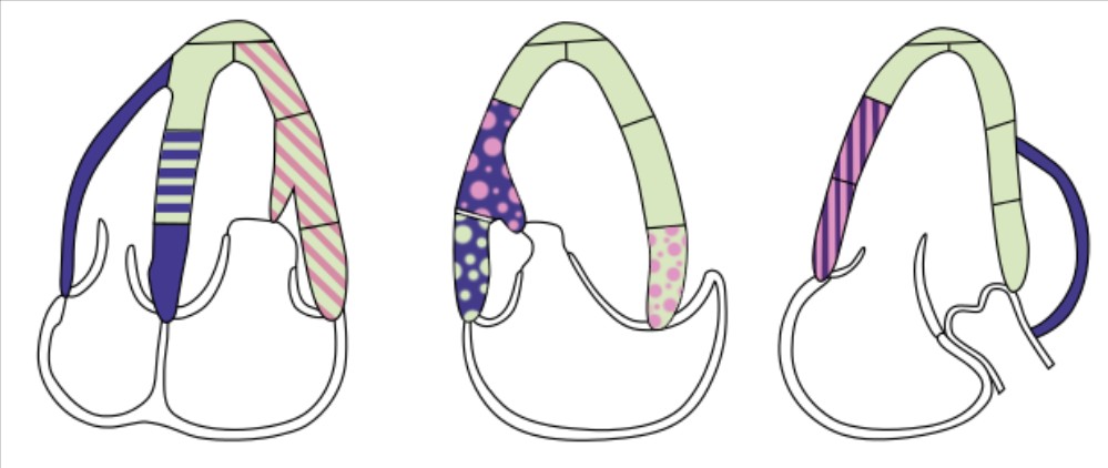
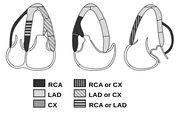
I'm redrawing the following diagram, which I find cluttered. I think I find it's cluttered because of the stripes in different directions, that represent combinations of the three colors (RCA, LAD and Cx). Is there another useful way to visualize these combinations?

I considered using three additional colors instead of the patterns, but I think these would be unintuitive to interpret as combinations of the existing three, regardless of if I used additive or multiplicative color combinations.

My only other idea is to simply replace the different patterns with the same pattern, e.g. all downward-sloping diagonals. Are there any other reasonable alternatives I'm missing?

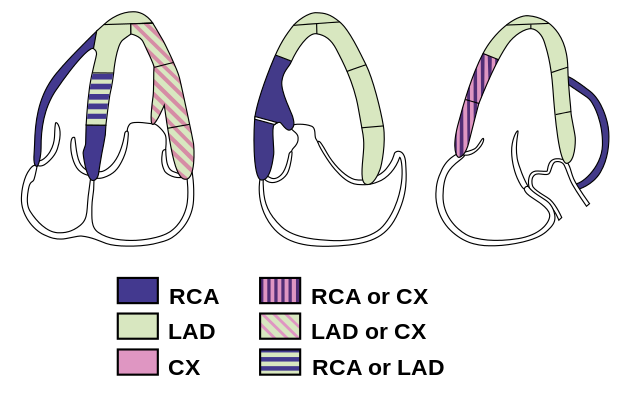
enter image description here

3 Answers 3

0

I don't see why using other solid colours would necessarily be unintuitive.

If you use a different combination of colours, i.e. primary colours such as blue, yellow, red. Then you could use combinations of these colours to produce secondary colours based on the logic of mixing those colours to represent each combination.

I would suggest using RYB as the primary colour scheme here, because I think most people will be at least semi-familiar with this from learning to mix these primary colour paints at school, when they were children.

For example

enter image description here

3
  • My thinking was that, to my untrained eye, such a diagram would look chaotic with the many sharp colors, I think it would be hard to see on a clance that e.g. green represents the intersection of blue and yellow.
    – Anna
    Commented Jan 7 at 15:58
  • @Anna - don't you think that most people will know that blue+yellow=green? Even if there is someone who doesn't know it, the diagram key would make it clear anyway what each of the colours represents. As for these being quite saturated colours, you could reduce the saturation and go for more pastel/muted shades.
    – Billy Kerr
    Commented Jan 7 at 16:06
  • I actually have interacted with adults who did not know how to mix secondary colors.
    – Yorik
    Commented Feb 9 at 22:01
0

No idea what is allowed in the software you use, but try dots like I have done in the middle of your example:

enter image description here

The dots cover about 50% of the area and they are scattered irregularly. I painted them manually (by clicking with different size brushes) to selections, but many programs allow them as prepared fill patterns.

My argument: Dots and irregular scattering form no lines to be followed, so they do not force eye movements. Only the major outlines of the drawing have that ability as it should be.

An opinion: A little stronger red would be more visible.

Facts:

  • using different fill pattern on every zone would make it readable also for people who do not see colors right and as BW photocopies.

  • poor color contrast ratio makes informative diagrams and texts useless if the result must be accessible (WCAG).

  • artistic beauty is secondary in scientific works.

0

I don't find it cluttered or fussy in any way and I think the point that @user6922992 makes about greyscale and/or B&W is pretty important. Your current design survives even 1 color with dither.

First is 1 color, second is greyscale: 1 color dithered

enter image description here

Your Answer

By clicking “Post Your Answer”, you agree to our terms of service and acknowledge you have read our privacy policy.

Not the answer you're looking for? Browse other questions tagged or ask your own question.