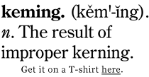
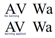
From what I see here, it seems kerning is just rearranging the space between letters. However, the comments here lead me to believe there's more to the story. Is kerning really that simple? Is the only purpose of it to look nicer or is there some practical reasoning for it?
4 Answers
I think the Wikipedia kerning article essentially covers it, but the bulk of the article is about adding kerning information to a font during its design, or applications automatically using this built-in information to improve composition of a font's characters -- rather than the a fine-tuning a designer might do on a particularly problematic pair of characters in a headline.
As an example, say the revolutionary new product, the
iVone
was launched; that combination of italic/oblique and roman characters would probably not have been foreseen by the font designer, and so would require special treatment to avoid the dot of the i from colliding with the V.
Letter-letter, or letter-punctuation combinations that are only used in some languages are other situations that might require custom kerning by a designer.
Also to note, fonts contain widely varying amounts of kerning information - this is one of the key differentiators between amateur and professionally produced fonts, or even between different versions of the same font.
-
2
-
-
-
2
(via Ironic Sans):

-
I really like this, but I don't think it's quite the answer that was being looked for, so... Commented Jan 7, 2011 at 2:14
-
@Pearson: It does give a case for kerning being needed. +1 Commented Jan 7, 2011 at 15:22
Yes, that is essentially it. From Wikipedia:
In typography, kerning (less commonly mortising) is the process of adjusting the spacing between characters in a proportional font, usually to achieve a visually pleasing result. In a well kerned font, the two-dimensional blank spaces between each pair of characters all have similar area. The related term kern denotes a part of a type letter that overhangs the edge of the type block.
the point of making it looking nicer is the only point, but it can be very important for a clean-looking typeface. The Wikipedia page shows how massive the difference can be:

The main reason to pay close attention to kerning is for readability. Visual appeal is also very important. Another reason is that a properly kerned word will typically take up less horizontal space than an unkerned word, therefore allowing larger type sizes (this is useful for book cover design and poster design).
For more information, check out this previous article by me: What the Heck is Kerning? The Fundamentals of Good Typography
-
Welcome to the community. Please be careful about promoting your own site here and in the other Stack Exchange websites. There is a very fine line between thoughtful help using one's own resources and simply generating more hits on a website. Your response definitely falls within the former (despite you being new here), but others may take a less tolerant view. Commented Sep 15, 2011 at 10:19
