5

We are working on a mobile game that will run on iOS and Android devices. The graphic theme has been designed during the first steps of the development by a single person. Now he's no more an active part of our team (he was enrolled exclusively for this purpose, for a shorter amount of time, and now he's focusing on other external projects). Such theme is very colorful, mainly composed by green, light brown and orange elements.

The problem for the mobile dev team is that those shades have been selected by the designer using his Apple iMac and Photoshop, and we discovered that only the iPhone displays are capable of rendering them to look as the designer originally intended.

Instead, all the different Android phones use different color palettes that makes them much too bright, or much too saturated; depending on the display quality.

I'm sure that this is not an isolated issue when developing mobile app graphics.

How can we manage to render the same colours when the app runs on different displays?

All I know is that the original PSDs have been designed using the sRGB color space, should they have been done in a different way?

1
  • You may want to check how well-behaved the gamma-correction is on the various devices, e.g. with test patterns found here somewhere Commented Apr 27, 2014 at 15:54

3 Answers 3

6

Not all displays are equal. This is a problem in the desktop world, too. I got shiny new monitors last year, and looking at some of my old work now emphasizes just how poorly calibrated my monitors were at the time.

My advice is to just accept it as something you can't control and ensure that there is sufficient contrast between your colors so that it does not impact the user's experience. If the user can't tell that there's something wrong (eg. "I know that button is supposed to be green, but it looks yellow to me" or "I can't tell the difference between these 2 colors"), they're going to assume that's the way it's supposed to be and happily go about using your app.

2
  • Thanks, I just want to know if there is something more than "accept it as something you can't control". For example, is there a particular set of RGB combinations that should be avoided? Something like "don't choose #17e717, use #00ff00 instead because it renders more equally on different devices"? Commented Apr 27, 2014 at 14:41
  • 2
    @alessandro.francesconi no, not really. About the only rule-of-thumb is perhaps to not get too subtle with contrast, as that's where details can get lost on lesser displays. For example, setting #666 type on a #bbb background may become unreadable on some devices due to a lack of contrast.
    – DA01
    Commented Apr 27, 2014 at 16:48
0

You could continuously adjust the shade of colour slightly until you find one that looks good both with full saturation and brightness as well as with very little saturation and brightness.

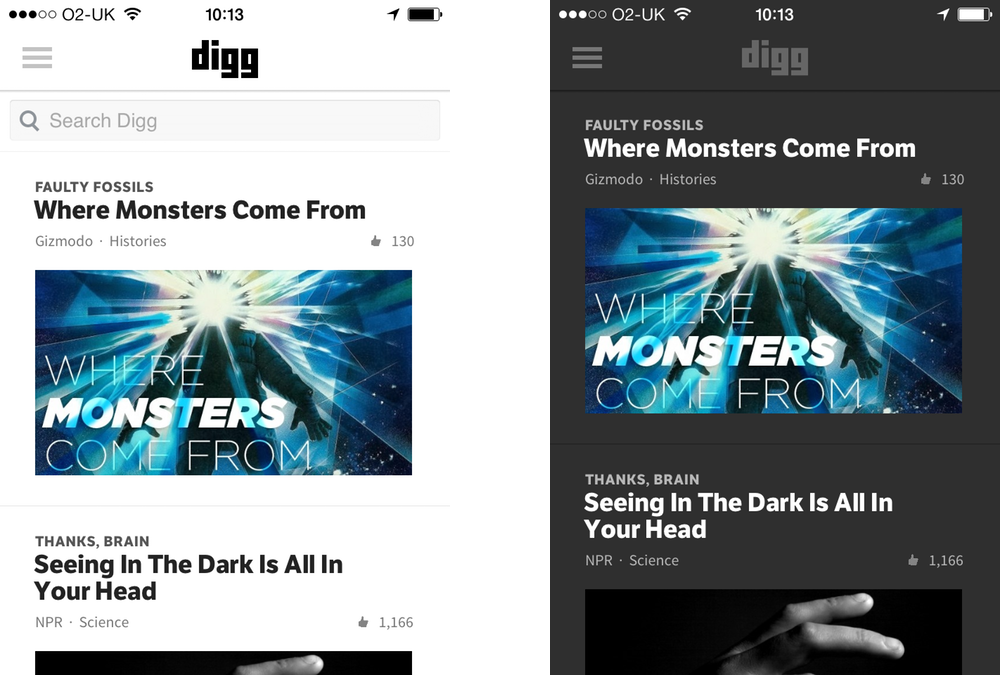
In addition to this, you could use the phones onboard light sensor to adjust the colours based on the level of ambient lighting, as seen with this app (light for daytime, dark for nighttime):

enter image description here

For anyone wondering if this will ever be possible for websites, the answer is 'Yes! Probably, maybe'. The CSS4 spec alludes to a Luminosity media query.

Anyway just a few options that might help. :)

0

This is a problem in all apps on all devices.

Mainly, the colours do not impact the user's experience.

There are millions colours of around us, but there are different manufacturers with different resolutions for all of the different models of android mobile that are available, no mobiles device supports all colours. Mobile device hardware supports some 8 bit colours, some 16 bit colours etc.

Because of this we can't make consistent colours for all devices. They automatically choose the closest and most suitable colours.

Your Answer

By clicking “Post Your Answer”, you agree to our terms of service and acknowledge you have read our privacy policy.

Not the answer you're looking for? Browse other questions tagged or ask your own question.