3

Although I have already asked a résumé question here, this is for another resume and a completely different question so I created a second question so as not to distract from the first one.

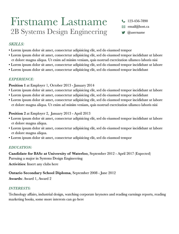
Essentially I am trying to create a résumé for the finance/enterprise field, so I understand the design has to be really simple and conservative here, but elegant and pleasing to look at, at the same time. I used the Baskerville font, but I am open to suggestions for any other serif fonts to use instead. I'm also open to change the secondary color to something else as well. There is more content to be added, so the margins should not be an issue. My actual last name lines up nicely with the 2B Systems Design Engineering subheading.

My main question, and concern, is that I'm wondering how I could maintain the conservative nature of the résumé seeing as though it's for a corporate audience, but at the same time improve readability and aesthetics. I was thinking this could be achieved simply with typography manipulation?
enter image description here

0

2 Answers 2

5

Here is what I would play with:

  • loose the italic and uppercase on the "education", "skills" etc. One will do nicely. And I would imagine that you can skip the ":", as it is pretty obvious what follows.

  • I would make the line space bigger and also increase the paragraph shifts.

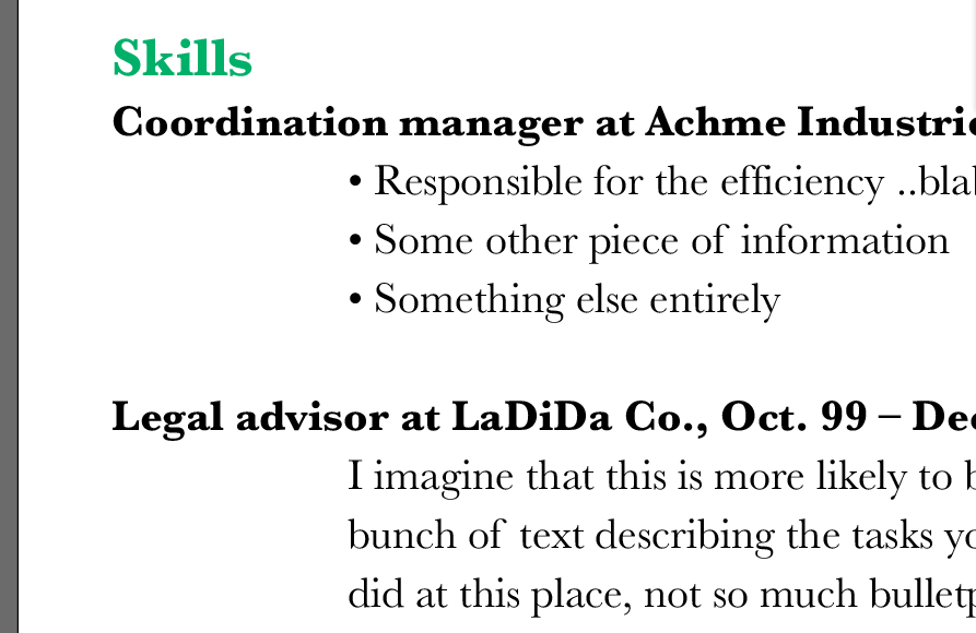
  • I would make the indents a lot bigger on "experience" and down to the actual employer history. See example here:

enter image description here

Baskerville is fine, really. Your image is a little measly in resolution, but when I tested this myself, it seems fine. I really see no reason for making it more complicated than necessary. You will be using bold, maybe italic and various sizes (three-four different ones), so it is sensible to stick to one font. Keep it simple.

The colour; I think green works well too. Generally, the most conservative colours are often dark blue/prussian blue/navy/indigo. So green: good. You are conservative with the font; a fresh green is good. IMHO.

4
  • 2
    I agree with everything except the depth of the indent. What you have here is outrageous. Three wordspaces, no deeper. Commented Jul 8, 2014 at 18:19
  • 1
    I love how designers can come up with adjectives like "outrageous" for indents :-D
    – curious
    Commented Jul 8, 2014 at 18:58
  • @LaurenIpsum hehe - i overdid it, to highlight the area, as it would not apply to other parts of the CV. Maybe I should have been clear on that...
    – benteh
    Commented Jul 8, 2014 at 20:49
  • @Emilie A nine-wordspace indent for 10-point text? "Outrageous" is the only possible description. :) Commented Jul 8, 2014 at 20:56
0

If you're using small caps for your first name, use them as well for your last name. Try playing with, font size of the headers and sub-headers, & Indenting the content to divide the sections a bit more

Your Answer

By clicking “Post Your Answer”, you agree to our terms of service and acknowledge you have read our privacy policy.

Not the answer you're looking for? Browse other questions tagged or ask your own question.