As the title says, I would like to know what's best to approach when inserting/using an icon when designing website/app UI. Should I insert it as a “smart object”, font-based icon, or vector mask?
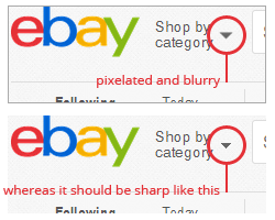
I've looked at tons of websites in terms of UI design and how sharp/pixel perfect their designs are, mainly regarding the use of icons, and sadly believe most of them are rasterized! Even though most are using SVGs, they are still not as sharp as you would expect them to be and always tend to have pixelated and blurry edges.
For example, take a look at this;

I've realised this is true with many sites and not just eBay! This is true regardless whether they use font-based icons or SVG icons.
I often face this problem when starting a new design in Photoshop and then coding it. For example sometimes I find smart objects are sharper than font-based icons and sometimes even vector masks. I don't know what exactly causes this problem or why. Even if you resize them in Illustrator, it still happens and it always ends up NOT snapping into the right pixel. The same goes for font-based icons.
They never end up being sharp enough unless you create it with the pen tool, just as I did for the example above. But that's not always possible as not all the shapes/icons are easy to be redrawn or to be corrected that easily using the pen tool.
So what's the solution to this and how do you personally approach this when designing an UI when it comes to icons?
Thanks in advance.
