-1

I have some custom groups. Each group is actually a text layer with some effects. I want to align them. But with move tool or transform tool it is very harder. Can anyone show me an easy way to do this?

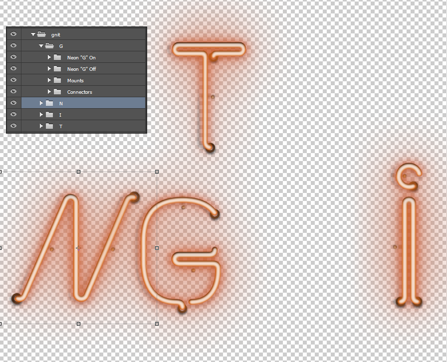
What I have now

enter image description here

I want that all the groups (G,N,I,T) are aligned such that it looks like a text.

8
  • Is using smart guides and placing guides not effective? Are you having trouble deciding what the kerning should be?
    – AndrewH
    Commented Mar 5, 2015 at 16:43
  • @AndrewH Smart guides are not helping pretty much, cause the transform size are not same for all groups. Also yes I'm confused about the kerning. Commented Mar 5, 2015 at 16:45
  • For the height of each text (If you want the same height) place 2 horizontal guides and use the transform tool to re-size each letter (group). For Kerning, maybe finding a similar text and re-sizing to overlay the text and just base the kerning off of the other text. Once you do this, upload the new graphic and ask about the kerning you have done. I am not sure about the rules for critiques or where to go for that.
    – AndrewH
    Commented Mar 5, 2015 at 16:49
  • For more information on Kerning, see this thread: graphicdesign.stackexchange.com/questions/26476/…
    – AndrewH
    Commented Mar 5, 2015 at 17:53
  • This may be helpful: graphicdesign.stackexchange.com/questions/26526/…
    – user9447
    Commented Mar 5, 2015 at 17:57

2 Answers 2

2

An issue you are going to run into when laying bent neon for a layout is the mounts and turns for the ends of the neon. I've not done layouts for examples in Photoshop but we did 2D cad style callouts in Flexi. I wouldn't imagine using Photoshop would be an issue but there are some areas you need to take into consideration.

1st area determine the thickness of of the neon at the bottom without the curve (example with the smart-guide for the bottom of the G):
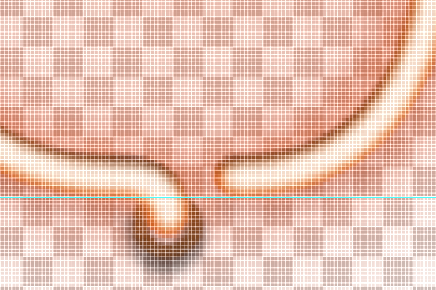
enter image description here

Also note, when building for neon after you figure your placement, its typically known for the exposed curved areas that maybe going into a wall or panel to be covered with black electrical tape to help with the design and to not throw off the piece.

I would move the bottom right turn of the N and place into onto the guide:

enter image description here

Since the G may be the widest letter and the I the shortest I would separate the G in equal quarter lengths with guides:

enter image description here

If I move the i into the area of the guide it will show me this:
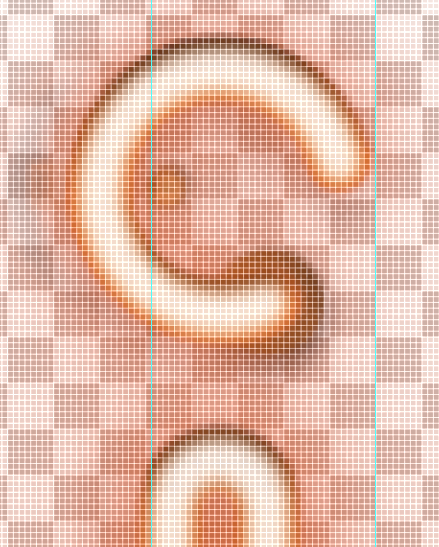
enter image description here

Since the top of it the i is a major part of the font I will take into consideration the difference of the width from one quarter of the G and place a guide:
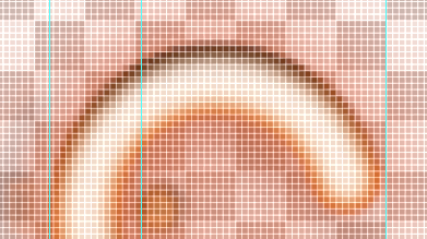
enter image description here

Taking the half difference and a full quarter of the one quarter of the G I will be given this:
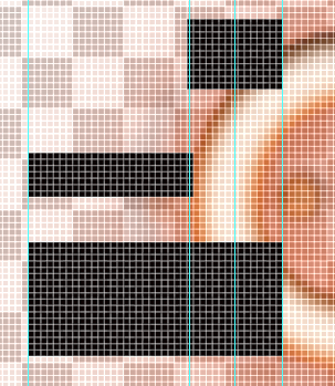
enter image description here

The bottom shape we are going to use as the spacer:
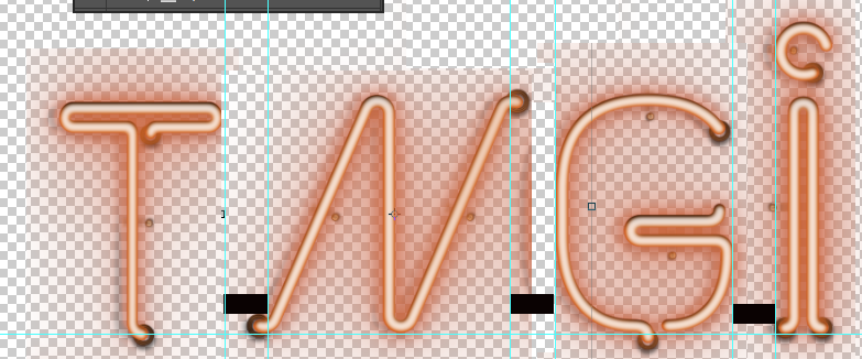
enter image description here

Notice on the dot of the i I took consideration of the curve and went off the space from that. All other areas that are over the guide I would cover up with electrical tape. So the overflow of the G, N, and T should be addressed. This is just a rough idea but I hope it helps. I would go back and adjust the height of some of the letters unless that is intended per the project. Personally I would adjust the top of the i to go along with the T, N, G but thats not what you asked.
-1

First of all use smarguides
Now if that's not helping just find a font that looks the most like what you are doing, lock it on the background and one by one place your letters on top of the letters until everything falls into place

Your Answer

By clicking “Post Your Answer”, you agree to our terms of service and acknowledge you have read our privacy policy.

Not the answer you're looking for? Browse other questions tagged or ask your own question.