0

I have designed a Photoshop flyer (CMYK, 16 bit) and have a grey background, some black & white pictures and some blue graphs and text.

Now the guy who prints it told me that it looks good on digital, but when printed the grey will appear a bit blue-ish.

He didn't explain how I could fix this, and now I am a bit lost.

Can you help? Do I need to set something somewhere?

1
  • Hi Patrick, welcome to GDSE and thanks for your question. If you want to know more about the site, please see the help center or ping one of us in Graphic Design Chat once your reputation is sufficient (20). Keep contributing and enjoy the site!
    – Vincent
    Commented May 19, 2015 at 10:39

3 Answers 3

4

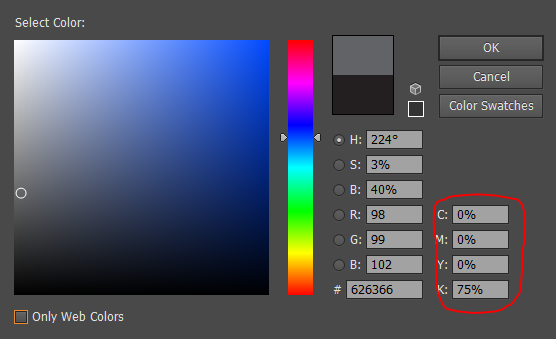
Make sure when you select the gray color not to include any colors in it. Let it be black only. It must not appear in other colors channels. This will ensure the gray will be pure gray.

The gray you use must be something like this:

  • Cyan: 0%
  • Magenta: 0%
  • Yellow: 0%
  • Black: 50%

Screenshot of colour selection with highlighting showing C: 0%; M: 0%; Y: 0%; K: 75%

6
  • 1
    Many thanks hsawires! This makes all a lot more sense now! I can do this for a simple flat shape or for background but what if it comes to "pictures"? I have black & white pics in the flyer. What is the easiest way to do something like you described for all the grey tones in the pic? I doubt you want me to go with the color finder and adjust it one by one :-)
    – Patrick
    Commented May 19, 2015 at 12:06
  • If all you photos are gray them you must make sure to convert it to gray mode with 256 shades of gray. if it comes with colored photograph that have grey, it will be completely different process. We call it "Color Calibration" where you can calibrate your monitor and color profile with the print shop machine . it is a complicated process where you have to do some little test.
    – hsawires
    Commented May 19, 2015 at 12:18
  • Following: Photoshop project is a flyer based on different layers. Bottom is a grey square representing background. Dont ask me why i did this like this back in the days :-), than different text in white and blue. Additional to this I have some pictures. When I inserted the pics I opened them in Photoshop, changed them to black & White following this path (Image - adjustment - Black&White). Then i also used HDR toning to adjust it. After this I imported or drag&drop it into my flyer project. Is this wrong? Do I have to change something? No writing I am thinking about "greyscale" before import!
    – Patrick
    Commented May 19, 2015 at 13:17
  • You have two big problems .. First white or colored typing over a dark plain area whiteout considering "Color Trapping" -- second drag and drop a gray scale photo in a CMYK document will remain the gray distributed over the other channels while you should copy paste it into the Black Channel only.
    – hsawires
    Commented May 19, 2015 at 14:38
  • And how would you do this then? All in Illustrator instead of Photoshop? Or would it come out the same? So I rather copy paste as drag and drop. Fine with that...but how do I see if the pic would come out with the colour sheen when printed? I understand that I can check the colour with the colour finder and then see the numbers in the channels but with a picture?
    – Patrick
    Commented May 20, 2015 at 19:54
1

In my experience, there are two major causes of this, and both boil down to a difference between RGB and CMYK output since even a CMYK image MUST be displayed on a monitor using RGB.
First, if the grey tone isn't neutral to begin with (by having too much cyan in the CMYK mix, for example) it will show in the print.
The second cause may be ICC profiles. ICC profiles are data sets employed by most printers (whether they realize it or not) which are designed to massage the output values of an print image based on the theoretical output profile of a given device. Properly used, they can be a wonderful means to consistent color. Otherwise they can be an infuriating obstacle. Ask your printer what output profile is being used. If it isn't a device-specific profile, it will probably be something generic like "US SWOP Coated V2". Once you know what his output profile is, you should assign an appropriate monitor ICC profile for your monitor. A very common pairing for Swop V2 is Adobe RGB 1998. That would be a good start if you can't determine a better match on your own. Note that ICC profiles are employed a little differently between Photoshop, Illustrator and InDesign, and they can be overridden by the output process. Communicate with your printer and do your research on how to use them properly.

2
  • Thanks 13ruce! I have been told from the print guy to use "Convert to destination" and "Euroscale coated v2". What and where should I do something now if I may ask?
    – Patrick
    Commented May 19, 2015 at 12:05
  • In Photoshop, when you select Edit>Convert to Profile... then select Euroscale Coated v2 as your destination space, you should see the change the printer is talking about. If you want to see exactly what the change is, you can sample (ink dropper) the gray color before you apply the conversion, then fill an area with the original gray afterward. Side-by-side, you should be able to see what needs to change in order to compensate for the hue shift.
    – 13ruce
    Commented May 19, 2015 at 13:12
0

Note down the CMYK color code of the grey color you have used in the flyer. Give it to the printing guy and ask him to specify the CMYK color code before printing it. As CMYK is readable well in print, it should work here as well.

1
  • I just want to say thank you for the fast and valuable replies! Already a big help. Looking forward reading your next answers!
    – Patrick
    Commented May 19, 2015 at 13:10

Your Answer

By clicking “Post Your Answer”, you agree to our terms of service and acknowledge you have read our privacy policy.

Not the answer you're looking for? Browse other questions tagged or ask your own question.