2

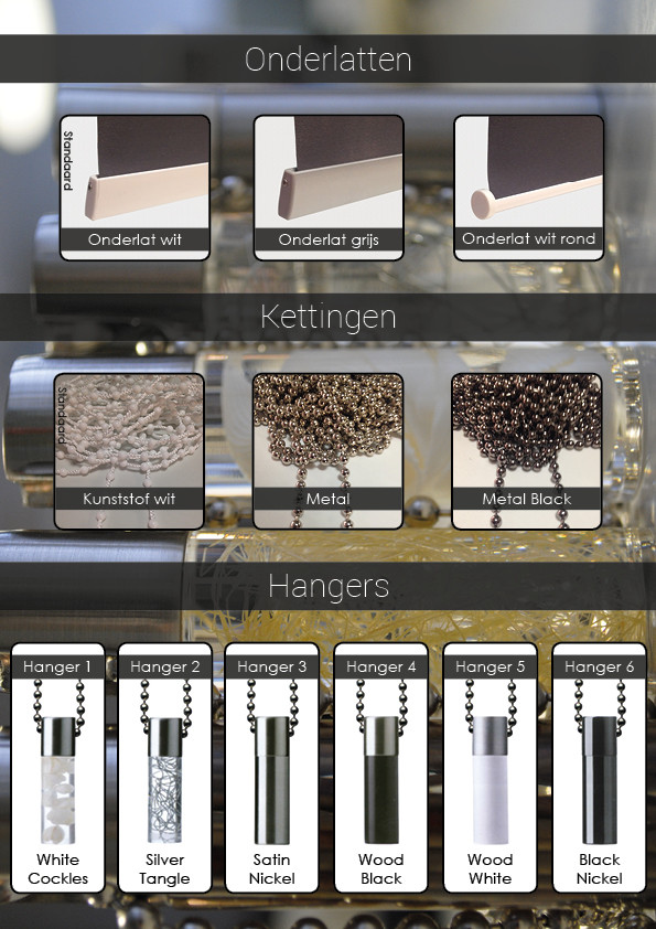
As a Desktop Publisher I feel like I lack the skills of designing something to make it look appealing overall. I have an A4 page where there are some products shown. It has a kinda dark background image and to fill in some of the whitespaces I'd like to add some titles.

My attempt isn't professional enough in my opinion. For some reason the transparent black feels too overused. How could I work this out better?

layout example

EDIT:

Thanks to the feedback, I changed the layout to this very simplistic design.

5
  • 4
    I think the background image is an overkill. I'd suggest you try it without the unmeaningly background. Also: You don't have to put everything in a box and center it.
    – theyve
    Commented Oct 7, 2015 at 8:17
  • 1
    It looks like you have a symmetry obsession..it's all very stiff my friend...loosen up a little and, like @theyve said, lose the background or at least blur the sh*t out of it.
    – Alin
    Commented Oct 7, 2015 at 8:26
  • Yes I kind of have a symmetry obsession, I learned this throughout my entire study as a Desktop Publisher. It was more my job to have things aligned and stuff (not the design at all). I'm looking to improve my designing skills as I'm about to start up my own business for Webdesign (currently working as a Webdeveloper). Anyways, I really appreciate the feedback and will try to work it out a bit better.
    – Daan
    Commented Oct 7, 2015 at 9:13
  • @Alin Whenever I don't make this particular thing symmetrical it looks even worse (at least in my opinion). I don't see ways of doing it while containing the same structure of the 3 groups of images. Any tips here are welcome, as I struggle with it a lot.
    – Daan
    Commented Oct 7, 2015 at 10:08
  • 2
    I think symmetry is fine, but to further what @theyve said: its not "overkill" so much as "too many things." Start by looking for ways to simplify. The background is obvious: either solid, or blur the heck out of it to make a pseudo gradient. Remove the black rule around each white box (double emphasis). Basically: eliminate decoration. Its the equivalent of 5-blade, 4 moisture strips on a men's razor.
    – Yorik
    Commented Oct 7, 2015 at 14:34

2 Answers 2

3

I don't think the issue is really with the titles; I think the main issue is that your layout has a mix of elements that are not matching well together.

I think it's too busy with the image in the background and it's unclear what it is. If something doesn't add anything to the layout, don't add it. A good layout is "perfect" when nothing else can be removed! The goal is not to fill all corners but make sure what's being sold is clear, put in a way to show its value and that the elements around them won't take the emphasis away from the main subject.

A suggestion: Why not use one of the product and put it on the side in very big size, over a white background... and put your boxes more on the other side to balance all this. It's a great way to show some nice details that are hard to notice on the smaller pictures. Play with the layer mask to add a gradient and make that image "melt" with the background and give an effect of dept.

If this trick can help, imagine your images as having a weight according to their size and contrast, and balance them visually this way. I'm not sure if this makes sense but it usually gives great results and still create a nice symmetry without using a grid concept.

Another thing that could be changed is that you mix rectangles with round corners and use very symmetrical straight black backgrounds for your texts; it often looks better if you stick to curvy or rectangular, and not mix too much unless there's a purpose.

It could be nice too if you could make the background of all the products in pure white as the hangers are. It would look more clean.

One last suggestion: be very careful when using very thin fonts over a black background, especially if you need to use a rich black. You can also play a bit with the size of the text for the hanger subtitles and their color; the color text could be smaller a bit (eg. "black nickel" could be a bit smaller than "Hanger 6".)

Finally, make sure your boxes from the first and second row are well aligned vertically. Right now they're not.

ORIGINAL:

ORIGINAL CONCEPT

Example sketch 1:

(You can find a better image for the background. I used one of the hanger as example.)
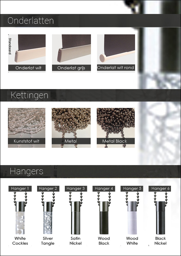
example 1 layout

Example sketch 2 with images bigger (client might request this):
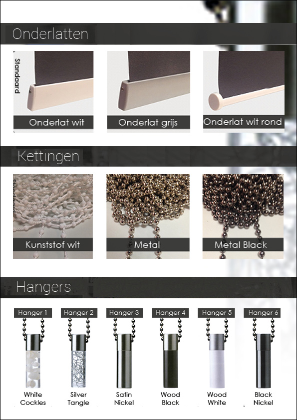
example 2 layout

1
  • I changed the layout to an even more simplistic design, used all the feedback I had been gievn. Thanks for the great input.
    – Daan
    Commented Oct 13, 2015 at 11:23
3

Why are you afraid of whitespace? It's a good thing. Your background distracts from the product and I'm sure that's not your intention. If this is already a flattened page you may want to consider extracting the products and rebuild.

You have 3 products that have variants. IMO you don't need to picture every variant when they only differ in color or medium but appear and function the same. You can picture the optional colors and textures in small squares or shapes that resemble the product.

Add some typography to your page and

Finally, as Alin stated, loOsen uP a bit and have some fun. :D

2
  • The products are very different, not only in colors :/ There isn't always freedom with the content but only with the layout and design!
    – go-junta
    Commented Oct 8, 2015 at 7:37
  • I never read that there were restrictions to editing this document so my opinion was only a suggestion. My point was simply there are three products. That is unless you want to design a DB with all the specs to each variant. Shade cap, bead cord and hangers. Each product has variants. I don't believe the variants are "very" different at all. There are various beers out there but they all belong to a beer category under booze till you get into types. Commented Oct 8, 2015 at 21:52

Your Answer

By clicking “Post Your Answer”, you agree to our terms of service and acknowledge you have read our privacy policy.

Not the answer you're looking for? Browse other questions tagged or ask your own question.