12

I have been reading a lot about font pairing lately, but I’m still missing to identify when fonts don’t complement and contrast with each other, instead they clash.

An example that I've read was about comparing a so-called blackletter with a roman serif. They had different proportions, one condensed with large x-height, the other more extended and taller. As they shared the same weight, size and decoration, they were considered too alike. Why was that so, if they had about the same contrast and similarities?

Could the overall thickness have something to do about it?

enter image description here

5
  • 6
    Alas, there are no hard and fast rules for this. Context is important. And opinion is important as well. At the end of the day, it comes down to a trained eye making the call more than it being a checklist. That said, the article you link to seems to cover things well at a high level--which is probably all you'll find.
    – DA01
    Commented Nov 5, 2015 at 17:21
  • 1
    Note that Almendra (the upper font in the example) is not a blackletter font. It has a small number of stylistic elements that are more typical for blackletter than for roman fonts, but that’s really it.
    – Wrzlprmft
    Commented Nov 5, 2015 at 22:29
  • 1
    Just took a minute to scan the article you linked to. It's not the worst advice, but there are so many grievous errors (like IDing that font as blackletter) that I'd look for a better authority. That one will mislead you in too many finer points. Commented Nov 6, 2015 at 2:17
  • 2
    I figured there had to be something here: graphicdesign.stackexchange.com/q/11/4216 Commented Nov 6, 2015 at 2:20
  • If one of the excellent answers helped you, accept an answer by clicking the little diamond icon next to the answer you prefer! That's a nice way to also thank the people who spent time helping you.
    – go-junta
    Commented Nov 17, 2015 at 10:31

3 Answers 3

15

Subtle differences look like careless mistakes and sloppiness, not just in fonts but in all designs.

When things are just slightly off, its enough people notice, but not enough people think its a deliberate thought out decision.

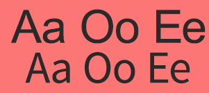
Here is Arial Black with Source Sans Pro Semibold. They clash because they're both trying to be clean sans-serif fonts and in that sense have a lot in common. But then there's jarring differences when used together. Just look at those lowercase e's at the end and the angles don't match at all. the o's likewise are fairly different and that's really because they are very different.

enter image description here

Here they are in Regular weight and same size / kerning:

enter image description here

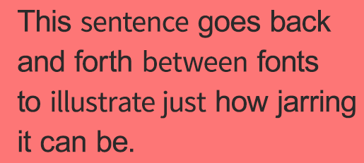
Take either one on its own and its fine. But when used together those little differences make it jarring to look at. Here we can demonstrate this by using both in a sentence. They are similar enough that its hard to tell which words are in which font, but different enough to see that something is off:

enter image description here

If we had instead used a more Contrasting font however it could work even within a sentence:

enter image description here

In some respects it is a matter of opinion, there are many fonts that can pair. But the reasons not to pair is a bit easier to pick out.

  • Can you easily tell the two fonts are different?

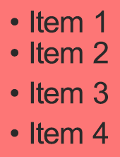
That's really all there is to it. And its important to note this is true of all areas of design. Its why in fashion when someone wears two close but not identical shades of a color its said to clash, why suits are made from the same fabric so the exact same shade is used on the jacket and pants. Or in spacing why it would be very strange if you had 3" then 2.8" then 3" then 3" then 3.1" or something like that.

enter image description here


As far as the exact fonts in your article are concerned. It does a pretty good job explaining it.

enter image description here

While not the worst pairing ever it does clash because they're similar enough that its not immediately apparent that they're different fonts. Especially (and this was probably deliberate in their example) when there is no lowercase a which is the greatest difference between them.

9
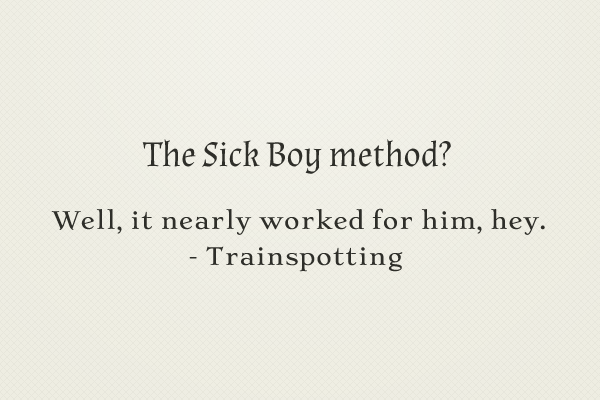
  • I wish to note that the in “sick boy” example, the quality of the pairing is very difficult to assess as the first font is horribly rendered. It looks as if there are fringes or smeared ink all over the type. (I know that that’s not your fault.)
    – Wrzlprmft
    Commented Nov 5, 2015 at 22:34
  • The problem with this advice is that it reduces type pairing to simple in-line variation, which is rarely a requirement of a typographic exercise. In most cases, you can keep all the small type in one family. The question of pairing often centers on headings or some other device where size and weight contrast is part of the equation by definition. Commented Nov 6, 2015 at 1:24
  • You gave a good example when comparing pairing with fashion. Leopard print with a zebra print are terrible pairing and the logic is the same as with fonts! It's always a question of balancing one with the other, toning down one with the following, etc. There is some kind of movement in design and when you see it, it becomes easier to know what's matching well or not. And the best starting point is probably to not use 2 positive together.. 2 fonts that are too similar ;)
    – go-junta
    Commented Nov 6, 2015 at 2:39
  • Immensefuly helpful clarification!The Arial Black with Source Sans Pro Semibold example, with both in regular weight really gives the impression that they are almost the same font(if it wasn't for the minor differences referred), most probably because there is almost no variation in the stems thickness and on the bowl shapes. Commented Nov 6, 2015 at 11:27
  • I've been browsing a bit here and found a link that spiked my curiosity: graphicdesign.stackexchange.com/questions/35218/… Commented Nov 6, 2015 at 15:09
9

DA01 and Dom are pointing at the central problem:

They conflict when they don't look good together.

So how do you know what looks good? That's such an obnoxiously subjective thing. But, like so many areas of design, typography is subjective. You have to train your eye for this soft skill the hard way.

Go be a typographer

  1. Set a lot of type
  2. Let pros criticize your work
  3. Fail miserably
  4. Repeat

Eventually (hopefully) you'll just know. And at some point, you'll be able to see the harmonies before you set a single line just by analyzing the structure of the faces.

Study the masters

You'll do yourself a great service to study the masters and the history of type design and typography.

Two books I consider required for any designer working with type:

  1. The Elements of Typographic Style, by Bringhurst. This one is a virtual encyclopedia for typographers. Bringhurst has a lot to say about proper pairings.
  2. The Form of the Book, by Tschichold. Unfortunately, this one has climbed dramatically in value. But this quick read will teach you some of the most minute intricacies of setting fine type. It's not so much about pairing but, understanding typographic detail and appreciation.

Getting started

So this all begs the question, what qualities of type do you need to understand to build that typographic instinct? In short, everything. But it's a progressive subject.

Start with fundamentals

  1. Stylistic categories. This happens to be anything but a settled subject, but there are generally accepted groups like Venetian, Garalde, Transitional, Modern, Scotch Roman, Grotesk, Geometric, Humanist, and so on.
  2. Anatomy. Obviously, the structure of a face is the driver behind all classification. But beyond the hard lines of historical groupings, there are endless ways to combine of these features. The sum of the parts of two faces will dictate the personality and the potential harmony.
    enter image description here

As you begin to understand how typefaces are built, you'll start to see why one pairing works and another doesn't. You'll be able to look at a face and say, "it's generally round proportions and angled terminals combined with a slightly tilted axis would make it a perfect partner for ...". That's when things get fun.

Context is everything

If you're setting two fonts at totally different scales with plenty of space between them, you'll be primarily concerned with "personality". The interaction of the details is less critical.

If you're looking for a section header face to pair within text or one face that will be used for in-line emphasis with another, the details become critical. At that point, you probably want to normalize their x-height (size them so their lower case characters line up), make sure their extenders are relatively close, and think about things like crossbar alignment and terminal positions. That's much harder to do well.

To illustrate the point, consider the different requirements between these two scenarios. In both cases, the pairing is Bell and Akzidenz.
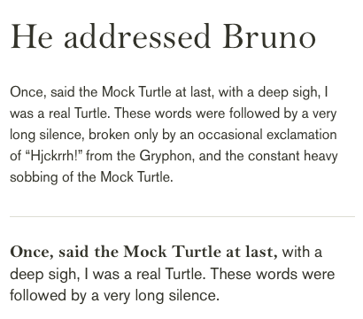
Distinctly separate versus closely tied type pairings

Bottom line

Like any craft, typography and typographic pairing are skills built over time and experience. The good news is, just pursuing this in the first place means you're ahead of 80% of your peers.

5
  • 1
    Would the down-voter care to elaborate? Would you like a formula? Commented Nov 6, 2015 at 1:21
  • 1
    I didn't downvote you but if you feel you can add more to your answer such as adding a formula, that's a secret weapon you should really share because that's what the OP is after. "They conflict when they don't look good together" is like saying water is wet, but I'm not sure if it's worth a downvote and I do agree with some parts of your answer.
    – go-junta
    Commented Nov 6, 2015 at 7:00
  • I was planning to read "The Elements of Typographic Style" as i've heard lots of good recommendations about it.I guess i have now something to read on the weekend. :) Commented Nov 6, 2015 at 11:28
  • Bringhurst's book The Elements of Typographic Style is an excellent recommendation. I also would recommend it as a resource.
    – bemdesign
    Commented Nov 6, 2015 at 11:52
  • 2
    I fleshed out the answer a bit. I may have been a bit terse on the first round ( ◔_◔ ) Commented Nov 6, 2015 at 18:12
5
  • Make sure they aren't too similar.

  • Make sure they aren't too different.

  • Break both rules when necessary (at your discretion).

0

Your Answer

By clicking “Post Your Answer”, you agree to our terms of service and acknowledge you have read our privacy policy.

Not the answer you're looking for? Browse other questions tagged or ask your own question.