1

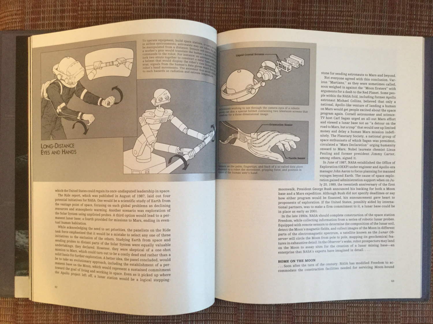
I am trying to identify a font from a series of books by Time-Life that has gone out of print. A sample of the particular is given in the image below:

enter image description here

OCR, image processing and correlation with font databases failed to return anything meaningful. Human expertise appreciated.

Note: We can narrow the search space to all typefaces that were designed before July 1990 since that was the year of publication.

Edit: There are no PDF versions, or higher resolutions of this font from search results returned by Google, Bing or DuckDuckGo.

Update: Have ordered print versions of the book series. Once they arrive (hopefully soon) high resolution images will be uploaded.

Additional details:

Author: Time-Life Books Editors

Series: Voyage Through the Universe Series

Publication: 1990-07-01

Publisher: Time-Life, Incorporated

8
  • 4
    you might want to scan sections of that and then use myfonts.com/WhatTheFont to identify the specimen
    – pixelfairy
    Commented Dec 17, 2015 at 19:02
  • Tried thrice. Manually edited, thresholded and anti-aliased specimens but the results were disappointing. Good suggestion though.
    – GoofyBall
    Commented Dec 17, 2015 at 19:06
  • 1
    Could you add the larger-scale images you've tried, please? Anything could be useful. Commented Dec 18, 2015 at 11:33
  • Which font are you referring to in the image? The caption font (sans-serif), or the body copy font (serif)?
    – DLev
    Commented Dec 18, 2015 at 15:52
  • 2
    It's very small and difficult to see the details of the body font... I suggest you scan the section you want to identify and upload a bigger version. I don't think it will be possible to help you if you can't provide a better image!
    – go-junta
    Commented Dec 23, 2015 at 7:31

2 Answers 2

2

I don’t believe I’ve ever seen this particular variant before, but it is very similar to Linotype’s Egyptienne F™ and Bitstream’s Humanist Slabserif 712, which are almost identical (both based on a design by Adrian Frutiger from 1956). Here is a comparison of a line from the book and Egyptienne F™:

Text from book Text in Egyptienne

It’s impossible to tell, due to the small size and the pixelation of the text from the book, whether this is exactly the font used, but I don’t think it is. If you look very closely, you can see that the top-left terminal of the lowercase a in Egyptienne has no finial or serif and is more or less flush with the left of the bowl, making its upper counter fairly wide; in the book text, on the other hand, it seems to have a cusp or serif, and the upper counter is definitely narrower than the lower. The book text also seems to have a slightly higher x-height.

They are very close, though, and I can’t find anything closer than Egyptienne on the regular font sites.

1
  • Looks like we were in sync ;-) Commented Dec 29, 2015 at 18:22
1

When you're trying to identify a font, it's the details and unique characters that matter. Your image provides next to nothing on either point. Nonetheless ...

Looking closer, those fuzzy characters might be ...

Linotype Egyptienne F

Linotype Egyptienne F

From this low-Earth-orbit view, it appears to be a version of Century, probably the ITC version. If you can find a capital 'Q' you can be pretty sure.

6
  • Definitely not Century. It’s a slab, a (variant of a) relatively common one, too, whose name just refuses to come to me right now. Commented Dec 29, 2015 at 17:37
  • Not Clarendon, I assume. You're going to have to post a better image. Commented Dec 29, 2015 at 17:47
  • @JanusBahsJacquet Wait a second... you're not the OP. How can you possibly say definitely from that image? Commented Dec 29, 2015 at 17:49
  • It’s quite clear if you zoom in a bit that it’s definitely not Century. Many of the letters are quite a different shape, and especially the lowercase y and the uppercase J make it clear that it’s a slab (or at least a slab-like serif). Commented Dec 29, 2015 at 17:51
  • @JanusBahsJacquet you got me there. I missed that odd y. And when I zoom in to the other fuzzy details it's definitely something slabish. This is going to bug me all day. Commented Dec 29, 2015 at 17:58

Your Answer

By clicking “Post Your Answer”, you agree to our terms of service and acknowledge you have read our privacy policy.

Not the answer you're looking for? Browse other questions tagged or ask your own question.