0

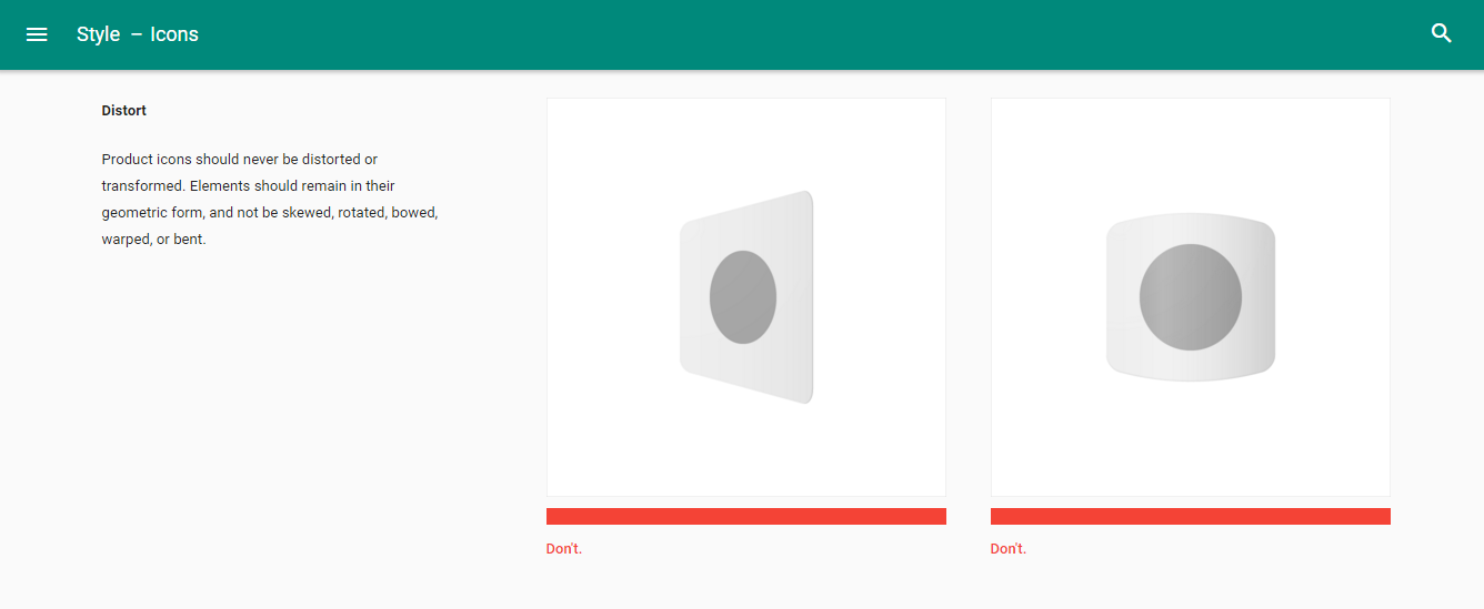
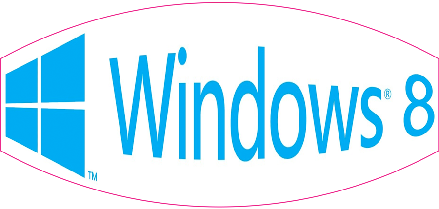
I might, for some reasons, distort an icon like Microsoft Windows 8 icon.

WOTF GOOGLE! MY DISTORTED ICON IS FINE!

However, according to the Google Material design Rulebook icons-product-icons "Google Holy Bible of Designs", I should not distort the icon.

EH WINDOWS, YOU SHOULD NOT DISTORT ICON

When is the right time to distort an icon?

Why Windows think it is a good idea to distort the icon?

Why Google think we should not distort an icon?

What should I consider before distorting my icon?

2
  • Welcome to GD.SE and thanks for your question. You can always edit your own questions, regardless of reputation. Please have a look at the help center if you want to know more about the site, or come and join the Graphic Design Chat once your reputation reaches 20. Keep contributing and enjoy the site!
    – Vincent
    Commented Apr 6, 2016 at 8:02
  • 1
    I disagree with "Never" - as there may be some occasion, such as a logo on an object that is at an angle, ie perspective, that it is necessary. But generally for display purposes, a logo should be left as intended. Commented Apr 6, 2016 at 11:12

2 Answers 2

5

I think you are misunderstanding. Google's Material Design (which is no bible—but correct in this case) says not to distort an existing icon. The Windows logo incorporates a perceived perspective but it is never distorted.

To illustrate my point—The Windows logo without any distortion:

logo without distortion

The Windows logo distorted:

logo with distortion logo with distortion

Using distorted shapes to create a logo or icon is no problem—distorting an existing icon or logo is.

1

There is a difference between distorting an existing icon and designing your own icon from scratch and deciding that the distortion is part of the design. Google is warning you against the former, but no-one can or should stop you from doing the latter.

Lots, if not all, style guides of brands and logos prohibit the distortion of an icon or logo. Rightfully so, because the designer has been thinking about and tinkering with the icon or logo's proportions and other attributes. It might be a good rule of thumb to never distort a logo or icon you did not design yourself.

If you are designing your own logo or icon from scratch, nothing prevent you from taking the decision the logo should be in perspective, bloated, fisheyed, skewed, or distorted in any way. That is up to you, the designer. When this is a good idea is, in my opinion, an opinion-based question.

Your Answer

By clicking “Post Your Answer”, you agree to our terms of service and acknowledge you have read our privacy policy.

Not the answer you're looking for? Browse other questions tagged or ask your own question.