3

I have a pie chart that looks like this:

enter image description here

I want to make it look like this (ignore the purple lines), so that it has both the colored legend AND the percentages. (The color and shape doesn't matter).

enter image description here

Is there a way to do that without manually adding text boxes? I looked at this question and it talks about how to make the percentages appear, but it does not also include the legend with the corresponding colors, which is what I want.

I have fifteen pie charts to update. I have a way to auto-graph my data but there's no point in automating it if I have to type seventy-five little text boxes with percentages afterwards.

1 Answer 1

1

The solution (workaround) is to duplicate the chart on top of itself.

Set up the bottom one with Standard Legend and the top one with Legends in Wedges.

Here is my bottom chart:

Chart One with mask

I've just hidden the visibility of the 'pie' with a simple opacity mask, leaving only the legend showing...

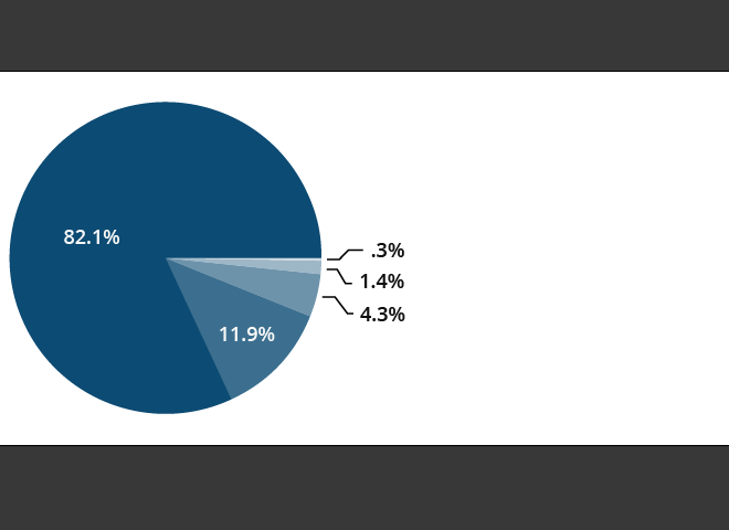
Here is the top chart:

Chart two with percentage values on/near wedges

This one has been ordered and rotated to match the example above, while Chart 1 has a different coloring/ordering for the legend to match.

And here are the two together appearing as one:

Final product

Both of course remain live and editable:

Illustrator live graphs

Not ideal I suppose... but it gets the job done.

Your Answer

By clicking “Post Your Answer”, you agree to our terms of service and acknowledge you have read our privacy policy.

Not the answer you're looking for? Browse other questions tagged or ask your own question.