4

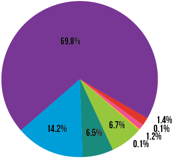
I made a pie chart that contains several slices. Two of the slices are .1%.

enter image description here

One .1% slice (the yellow one) can easily be seen, while the other one is incredibly small - you have to drag the other slices out of the way to see it.

enter image description here

Both have fill colors selected and both have the stroke set to "Transparent". What would cause one slice to appear much smaller than the other? The only thing I can think of is that I did rotate the pie charts at one point, but I can't see how that would cause one tiny slice to change, since I rotated the whole pie, not just one slice.

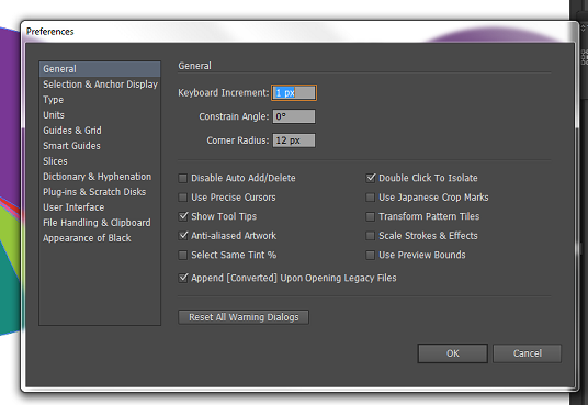
Someone suggested that I should turn off the Enhance Thin Lines setting, but I don't have that option (or any kind of "Performance"/"GPU Performance" tab) in the Preferences window:

enter image description here

5
  • Something else might be wrong - are you sure both slices are the same size?. Do you have Align to Pixels or Align to Grid activated? Are you sure you didn't mess something else while rotating?
    – Luciano
    Commented Aug 1, 2016 at 13:33
  • I do not have Align to Pixels or Align to Grid activated. I'm pretty sure the data should be correct, here's what it looks like: imgur.com/a/A5fQg (The quotes in the top row are there to force the percentages to appear in the slices. I hid the text so it would be less confusing.)
    – ale19
    Commented Aug 1, 2016 at 13:37
  • I also just made a new pie, with different data but the same colors. Then I changed the data to match what I have in the problematic pie. The same thing happened-- one of the slices vanished. So I don't think the rotation was the problem.
    – ale19
    Commented Aug 1, 2016 at 13:41
  • that's very odd! it might be some sort of bug, because the result is different if you change the order of the data in the data chart...
    – Luciano
    Commented Aug 1, 2016 at 15:41
  • The order of the nearly alike adjacent colours in the chart make it difficult to differentiate between them to diagnose. Please try making the 0.1 slice black. Then, look at the layer order and visibility of the slices.
    – Stan
    Commented Sep 11, 2016 at 19:04

1 Answer 1

1

Illustrator seems to have internal 1 degree resolution when it draws pie charts. Smaller than 1 degree slices are left out if there's not enough cumulated residue after calculating other slices before it.

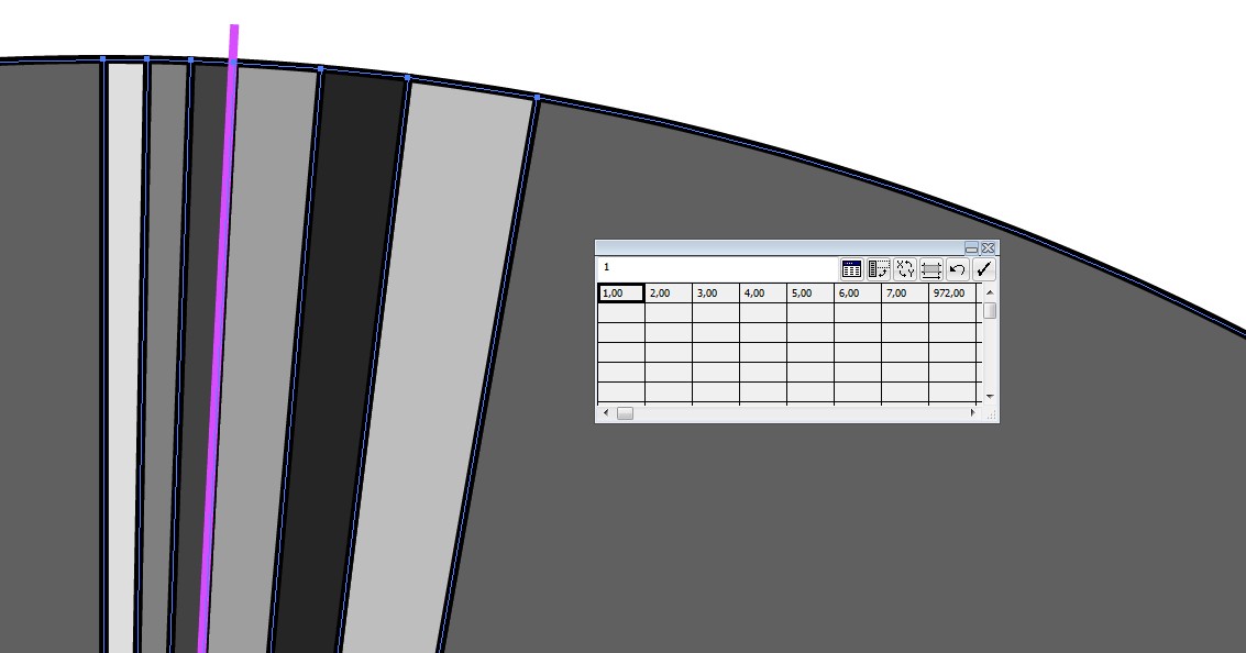
Here's an example the first 1 unit slice should be 0,36 degrees. It's left out. the second 2 unit slice should be 0,72 degrees. With the residue 0,36 degrees allows it to be drawn as 1 degree. the next is drawn as 1 degree because it should be a little more than 1 degree. The residue is saved for next slices.

enter image description here

The magenta stroke is my measuring tool. It's height and width show that those 3 first slices are together 3 degrees. (=arctan(W/H))

0,36 degree slices can be drawn manually, because that 1 degree limit isn't general, its only in pie chart creation. You can well rotate a line 0,36 degrees perfectly.

How to: Add too small numbers to adjacent bigger numbers and draw the missing slices on the bigger ones. That can well be done with the pen, nobody cannot see is it 0,3 or 0,4 degrees.A triangle probably is accurate enough at least onscreen. Drawing a line and filling the new slice with the Shape builder do not work until the chart is fixed uneditable. Not recommended!

Your Answer

By clicking “Post Your Answer”, you agree to our terms of service and acknowledge you have read our privacy policy.

Not the answer you're looking for? Browse other questions tagged or ask your own question.