1

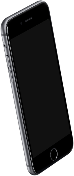
I have 2 images I need to combine (actually in HTML but I need help with getting the rotation), one is a mockup of an iPhone with an angle, and the other is a screenshot with no angle. I need to guess the rotation of the screenshot to make it fit in the phone's screen area. I can't use skew because that's not available in HTML / CSS (the skew that is available is different that what I need to achieve).

See below images:

Mockup of iPhone Screenshot image

So I need to somehow rotate the screenshot in 3D space to make it have an identical perspective with the phone's screen. Anyone knows of a simple and straightforward way?

9
  • Its sometimes called a corner pin and you can find a implementation here, note that this is more of a stackoverfliw question than a GD kind of question.
    – joojaa
    Commented Dec 17, 2016 at 15:01
  • I was thinking to get the coordinates in Photoshop or Sketch as there is no way to do that in CSS. Thanks for the comment, I'll look it up
    – borislemke
    Commented Dec 18, 2016 at 1:18
  • My coint is its perfectly possible to do this in a browser with javascript setting up the css. But sure you can do this in photoshop if you want to do more work.
    – joojaa
    Commented Dec 18, 2016 at 6:47
  • here is a guesstimate done quickly with method outlined in link in my first comment. Its slightly off but quite good.
    – joojaa
    Commented Dec 18, 2016 at 17:46
  • Hey thanks for the link. I did ended up using the code provided in your first comment. Very handy for this kind of stuff. Thanks a lot!
    – borislemke
    Commented Dec 19, 2016 at 3:19

1 Answer 1

1

Take a look here, with skew(XXdeg,XXdeg) you can achieve exactly this in Photoshop.

EDIT:

Here is some css code that does that:

.transform {


 transform: scale(0.8) scaleZ(1.0) rotateX(9deg) rotateY(9deg);
    transform-origin: 0% 0%;
    perspective: 200;-webkit-transform: scale(0.8) scaleZ(1.0) rotateX(9deg) rotateY(9deg);
    -webkit-transform-origin: 0% 0%;
    -webkit-perspective: 200;
    -webkit-perspective-origin: 50% 50%;
    -moz-transform: scale(0.8) scaleZ(1.0) rotateX(9deg) rotateY(9deg);
    -moz-transform-origin: 0% 0%;
    -moz-perspective: 200;
    -moz-perspective-origin: 50% 50%;
    -o-transform: scale(0.8) scaleZ(1.0) rotateX(9deg) rotateY(9deg);
    -o-transform-origin: 0% 0%;
    -o-perspective: 200;
    -o-perspective-origin: 50% 50%;
    -ms-transform: scale(0.8) scaleZ(1.0) rotateX(9deg) rotateY(9deg);
    -ms-transform-origin: 0% 0%;
    -ms-perspective: 200;
    -ms-perspective-origin: 50% 50%;
    transform: scale(0.8) scaleZ(1.0) rotateX(9deg) rotateY(9deg);
    transform-origin: 0% 0%;
    perspective: 200;
    perspective-origin: 50% 50%;
}

You might want to play with attributes to make it fit, this link might just help you get there via GUI.

Here is a fiddle you just need to tweak it.

6
  • Yes, skew does distort the image but it does so by maintaining an "isomorphic"-ish proportion of the sides. So each parallel sides will have the same line length. On the other hand, with distort, or matrix3d as @joojaa stated in his comment, the position of the vertexes, and the length of any sides are independent of each other... Skew is not the solution. Thanks for the link to the tool, but the tool that joojaa included in his comment is more useful in my case. Please have a look at it so you understand what I'm trying to achieve goo.gl/saniVd
    – borislemke
    Commented Dec 20, 2016 at 3:28
  • At first place is not great way to do it with css, is better to create it with ImageMagick and just display it there, why you are leaving all transformations to client side. fmwconcepts.com/imagemagick/skew/index.php
    – Flak
    Commented Dec 21, 2016 at 15:40
  • as I said, skew is NOT the solution. Please have a look at this image and understand the difference between skew and distort(which can be done with matrix3d) tutorial9.s3.amazonaws.com/uploads/2008/04/…
    – borislemke
    Commented Dec 21, 2016 at 17:33
  • with skew, each PARALLEL lines will always have the SAME LENGTH. With distort, the length of any sides are INDEPENDENT from each another...
    – borislemke
    Commented Dec 21, 2016 at 17:34
  • and secondly, I will have some HTML elements in the screenshot for animation purposes. So I can't just render a skewed image and put it there.. It cannot be animated that way...
    – borislemke
    Commented Dec 21, 2016 at 17:35

Your Answer

By clicking “Post Your Answer”, you agree to our terms of service and acknowledge you have read our privacy policy.

Not the answer you're looking for? Browse other questions tagged or ask your own question.