23

In Hebrew, there are some diacritics which occasionally need to be combined. However, a frequent result is that they will all be centered, leading to a stack of characters which need to be re-kerned. For example, the meteg (אֽ) a vertical line used to indicate syllabic stresses (when not final) often migrates so that it crashes with the vowel diacritics (אַ, אָ, אֶ, and אֵ). (This also occurs with some cantillation marks)

Is there a way to individually kern the meteg to avoid crashing type? For some reason, my attempts to use the kern tool in the character palette invariably do not succeed.


An example of text where this may occur:

אֱלֹהִ֑ים (where the esnachto crashes with the chirik)

or possibly

מֶֽלֶךְ (where the meteg crashes with the segol)

9
  • 2
    Not familiar with Hebrew at all, but I know that special features are available in the ME version (which I believe you are using). Check Character panel > Adjust Horizontal Diacritic Position. See: helpx.adobe.com/indesign/using/arabic-hebrew.html#id_48870
    – Vinny
    Commented Mar 30, 2017 at 7:47
  • 1
    @Vinny, thanks for the suggestion, but it doesn't appear to work for Hebrew, even though I do have the ME version
    – NoahM
    Commented Mar 30, 2017 at 13:25
  • 3
    Since nobody seems to be able to help you on this very specific issue, I suggest you give Adobe forum a try: forums.adobe.com/community/indesign/content
    – Vinny
    Commented Mar 31, 2017 at 17:47
  • 1
    I am fairly sure you could find proper help at the TypeDrawers forum. (typedrawers.com)
    – curious
    Commented Jun 6, 2017 at 3:47
  • 1
    Can you select the marks and choose alignment to push them right or left? Are there key combinations that will force alignment of the marks right or left (such as alt/option + …) ?
    – Stan
    Commented Aug 21, 2017 at 20:27

1 Answer 1

1

Although no Hebrew expert, I don't see any reason why individual diacritics can't be kerned individually by adjusting the font itself. However there's a couple of caveats here, so be warned!

Firstly, it's important to note that diacritics are individual glyphs, and by default have 0 spacing. From what I have see, the diacritic glyphs are all zero width characters in a font set, which does mean that any application that renders fonts will have a built in handling method to add spacing to diacritics. Straight away, this means that the way a diacritic is spaced and rendered can differ depending on the parent application.

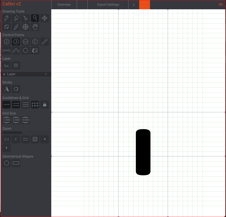
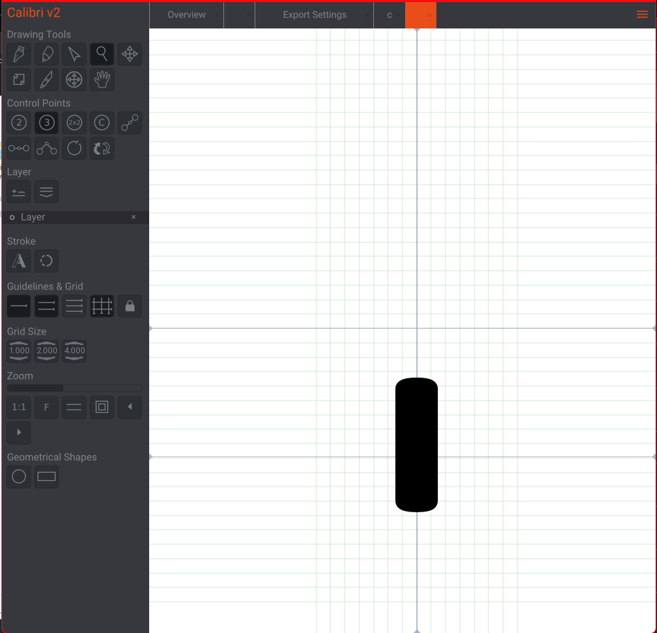
I use a tool called Birdfont when editing and creating new fonts. As a test, I opened the Calibri font in Birdfont, and increased the kerning of the meteg from zero to 14 units wide. Saved, exported and installed on my PC.

Default diacritic width is zero
enter image description here

Increased glyph kerning to 14 units

enter image description here

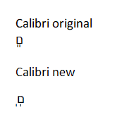
And here is a test showing the original calibri font and the new one i've created. As you can see, the kerning has worked, and the two metegs in the new font are spaced further apart.
enter image description here

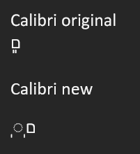
However, please note that if you kern too much, multiple diacritics can prove problematic in Office applications such as Outlook, Word etc. If diacritics extend beyond the boundary of it's parent letter, Office interprets it as not being combined with the letter and adds a dotted circle to show this.
enter image description here

So a bit of caution required, different apps will handle the font differently. Sorry I can't share the font I've created as its copyright, but this process should be fairly simple to follow for personal use.

Your Answer

By clicking “Post Your Answer”, you agree to our terms of service and acknowledge you have read our privacy policy.

Not the answer you're looking for? Browse other questions tagged or ask your own question.