15

The ambigrams have great visual appearance, some are very interesting, others not so much and of course not all would be good as corporate image.

oysho

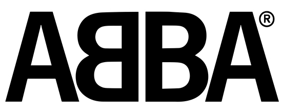
There are with the same reading when rotating 180º and horizontal or vertical reflection:

abba

Sometime ago some brands of companies transformed into ambigrams like Samsung or Oreo were published on internet. Logically, not all names give the same result to be represented like that.

Very few companies admit it as a corporate image: DMC, New Man ... Not even young and recently created companies.

newman

Why?

1 - Ambiguity: the double reading leads to interpret a conceptually wrong ambiguity as a company image.

2 - Ignorance: the designer is unaware of its existence or did not think of it as a design possibility.

3 - Informality: can be interpreted with a playful sense and indicate lack of seriousness.

4 - Gimmicky: once played the visual game loses effect giving a sense of ephemerality.

5 - Comfort or practicality: it is much easier to choose a designed font.

6 - Discard: should be definitely excluded as a branding option.

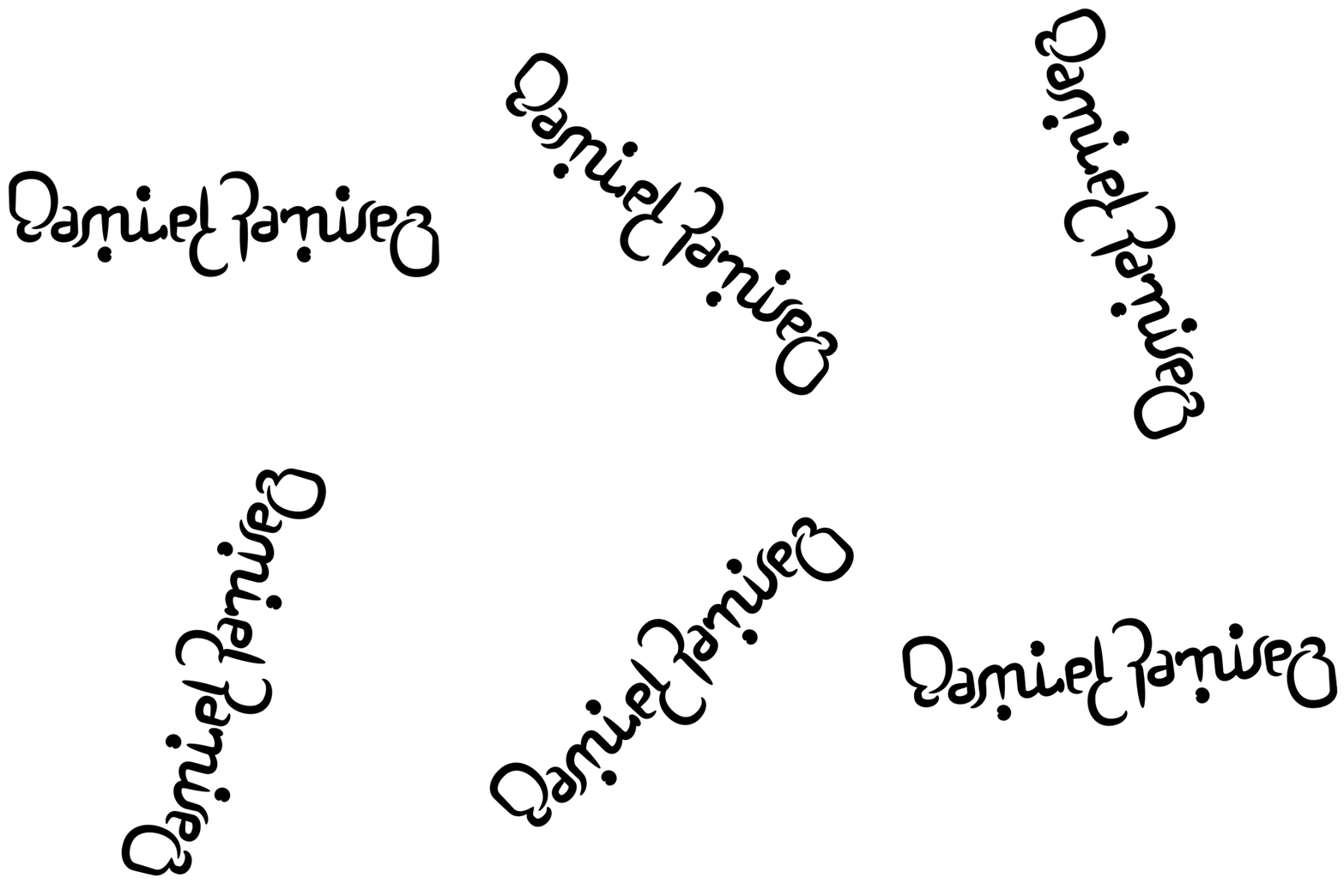
As a practice, it is an excellent typographic exercise. Here my full name.

ambi

14
  • 15
    I think your own example (while nice) exhibits the problem: Unless you are lucky and have naturally matching characters such as M-W, a-e, h-y, o-o, N-N in the right places, the ambigram looks more like a bunch of scribbles than like a text Commented May 21, 2018 at 8:19
  • 4
    7. They are challenging to create :-)
    – curious
    Commented May 21, 2018 at 11:36
  • 3
    To be honest, these are a bit gimmicky. Logo design usually depends on what the client wants. If the client doesn't ask for one of these, then that's your answer.
    – Billy Kerr
    Commented May 21, 2018 at 12:54
  • 6
    Sun Microsystems had a square that read "SUN" in four directions. Commented May 21, 2018 at 13:07
  • 1
    @Scott let me rephrase that... Beautiful ambigrams can be challenging to create. Don't get me started about the apps!! :-)
    – curious
    Commented May 21, 2018 at 16:31

2 Answers 2

21

Real world use is not that applicable.

Sure they are nice for the designer's eye... but in most use cases an ambigram is less clear and less defining than easy to read text/symbols.

Form vs Function.

If you can't immediately read what is being represented, then using an ambigram is often contrary to its overall purpose. In many instances ambigrams present more of a visual puzzle to the viewer, taking a moment to work out what is being represented (as in your spinning sample).

Therefore ambigrams, as a branding device, only really make sense if they are clear, well defined, and easily grasped.... which is rare.

18

When talking about textmarks the reason is probably: Designers do not usually get to pick the name. Therefore the palindromic/mirror and or rotationally symmetric quality of the logo is up to chance. While you can manipulate the situation a bit, conditions leading to this kind of feature are quite rare. At least if you intend to avoid hard to read combinations.

Also being able to spot the possibility is also somewhat up to chance. Some people are naturally much better at spotting this spatial possibility.

And last but not least not all designers and/or clients see value in this. Sacrificing legibility to a gimmick is not necessarily worth it.

Your Answer

By clicking “Post Your Answer”, you agree to our terms of service and acknowledge you have read our privacy policy.