Understanding typography is vital to being successful in graphic design. The first step of great typography comes in choosing the right typeface. You can only choose the right typeface if you keep the nature of the content and target audience in mind.
Here are five guidelines for picking and using fonts
1. What is the mood you want to convey?
Are you designing a presentation, a website, or a book report? What is the mood you want to convey?
Picking a typeface is not unlike choosing an outfit to wear for the day. Just as with clothing, there is a distinction between typefaces that are expressive and stylish versus those that are useful and appropriate to many situations. Is it fun? Casual? Serious? Fresh? Old-fashioned? Choose a typeface that captures that feeling.

Example: if you are creating a logo for a bank, you will want to select a typeface that creates a sense of security and protection. So a formal and a traditional type face like Adobe pro Garamond will be a better choice.
2. Grouping fonts: The font Family
A quick way of organizing possible typeface choices is to use the most widely used typography categorization: serif or sans serif.
They say that serif fonts provide continuity and engagement, and therefore improve readability but sans serif supporters call that a typography myth. Generally serif fonts are more traditional and ‘old style’ while sans serif typefaces are seen as modern and futuristic.

Whether you choose Serif or Sans, there are a plethora of great choices within both categories. To learn more about type classifications, start by looking up commonly used categories like geometric, humanist, old style, modern, transitional and slab serif.
Geometric Sans-Serifs are those type faces that are based on strict geometric forms. The individual letter forms of a Geometric Sans often have strokes that are all the same width and frequently evidence a kind of “less is more” minimalism in their design.
Examples of Geometric/Realist/Grotesk Sans: Helvetica, Univers, Futura, Avant Garde, Akzidenz Grotesk, Franklin Gothic, Gotham.

Humanist
These are sans faces that are derived from handwriting — as clean and modern as some of them may look, they still retain something inescapably human at their root. The letter forms of a Humanist font generally have more detail, less consistency, and frequently involve thinner and thicker stoke weights
Examples of Humanist sans: Gill Sans, Frutiger, Myriad, Optima, Verdana.

Old Style
These typefaces are marked by little contrast between thick and thin, and the curved letter forms tend to tilt to the left (just as calligraphy tilts). Old Style faces at their best are classic, traditional and readable.
Examples of Old Style: Jenson, Bembo, Palatino, and Garamond.

Transitional and modern
The letterforms of transitional and modern are more geometric, sharp and virtuosic than the unassuming faces of the Old Style period. At their best, transitional and modern faces seem strong, stylish and dynamic.
Examples of transitional typefaces: Times New Roman, Baskerville.

Examples of Modern serifs: Bodoni, Didot.

Slab serif
Slab Serif is also called mechanistic, square serif or Egyptian typeface is a type of serif typeface characterized by thick, block-like serifs. Serif terminals may be either blunt and angular (Rockwell), or rounded (Courier).
Examples of Slab Serifs: Clarendon, Rockwell, Courier, Lubalin Graph, Archer.

3. Choosing Serif and Sans serif
The main title of your project could be written in a bold sans-serif font. It might be a good idea to use a serif font with your body copy. You want there to be some contrast to show the difference between the two sections of your project. Combining two or more typefaces can be tricky. The general rule of thumb is to use a neutral serif and san serif combination. It's safe, easy and it works. Set the headline in "Helvetica" and the body copy in "Times New Roman" and you're good to go!

If that's too boring for you, try combining an old typeface with a modern typeface. How about a script with a san serif? If you do this, it's important to pay attention to the contrast between the typefaces you choose. Be sure the contrast between them is great enough to separate them. If the typefaces are too similar, they will look awkward and out of place. Combining "Helvetica" and "Arial", for example, will look more like a careless mistake than a conscious design choice.
4. A Dash of flavor to the design
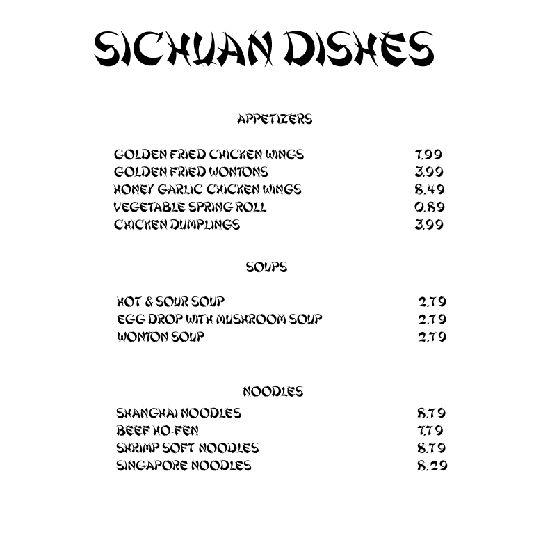
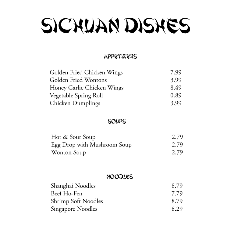
Display and decorative typefaces should be used sparingly. A little "Shanghai" font goes a long way. It works on this menu in the logo and category headings. Now, imagine an entire menu set in "Shanghai" font makes it difficult to read. Unless you are not concerned about readability, these typefaces aren't a suitable choice for large blocks of text. These fonts applied sparingly to headlines, a display font can add a well-needed dash of flavor to a design, but it can quickly wear out its welcome if used too widely.

These fonts applied sparingly to headlines, a display font can add a well-needed dash of flavor to a design, but it can quickly wear out its welcome if used too widely.

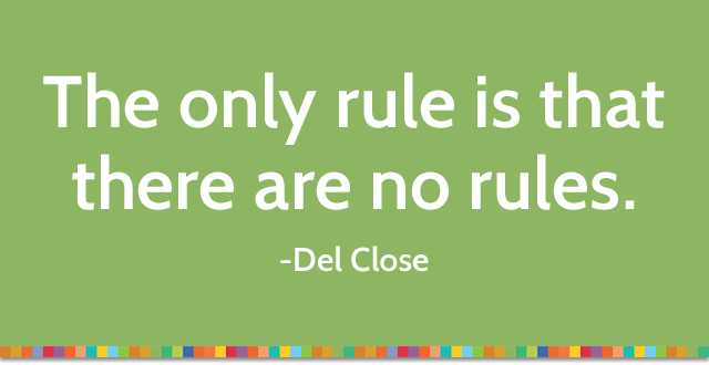
5. Rule Number Five Is ‘There Are No Rules’
There are only conventions; no ironclad rules about how to use type, just as there are no rules about how we should dress in the morning. It’s worth trying everything just to see what happens. Typography is something you learn over time and requires endless trial and error. Eventually, it becomes an easy, natural process. In the meantime, have fun!

In Conclusion
I Hope these five principles have given you some guidelines for selecting, applying, mixing typefaces and whether to mix it at all. In the end, picking typefaces requires a combination of understanding, intuition, and skill demands practice.
Source


