I'm trying to match this font to recreate a business card, but I can't find it anywhere. I've tried font matching it on a range of websites but it comes out suggesting nothing or the wrong font. Does anyone know which it is?
2 Answers
-
Is it just me or does the space between the A & L look wider in this font than it does in the example by OP?– MastCommented Jun 18, 2018 at 17:45
-
1@Mast most likely the kerning was tweaked manually. See also the uneven spacing in "AIN". Commented Jun 18, 2018 at 18:36
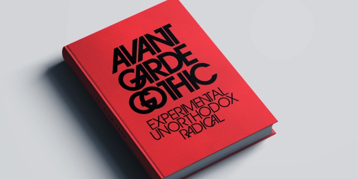
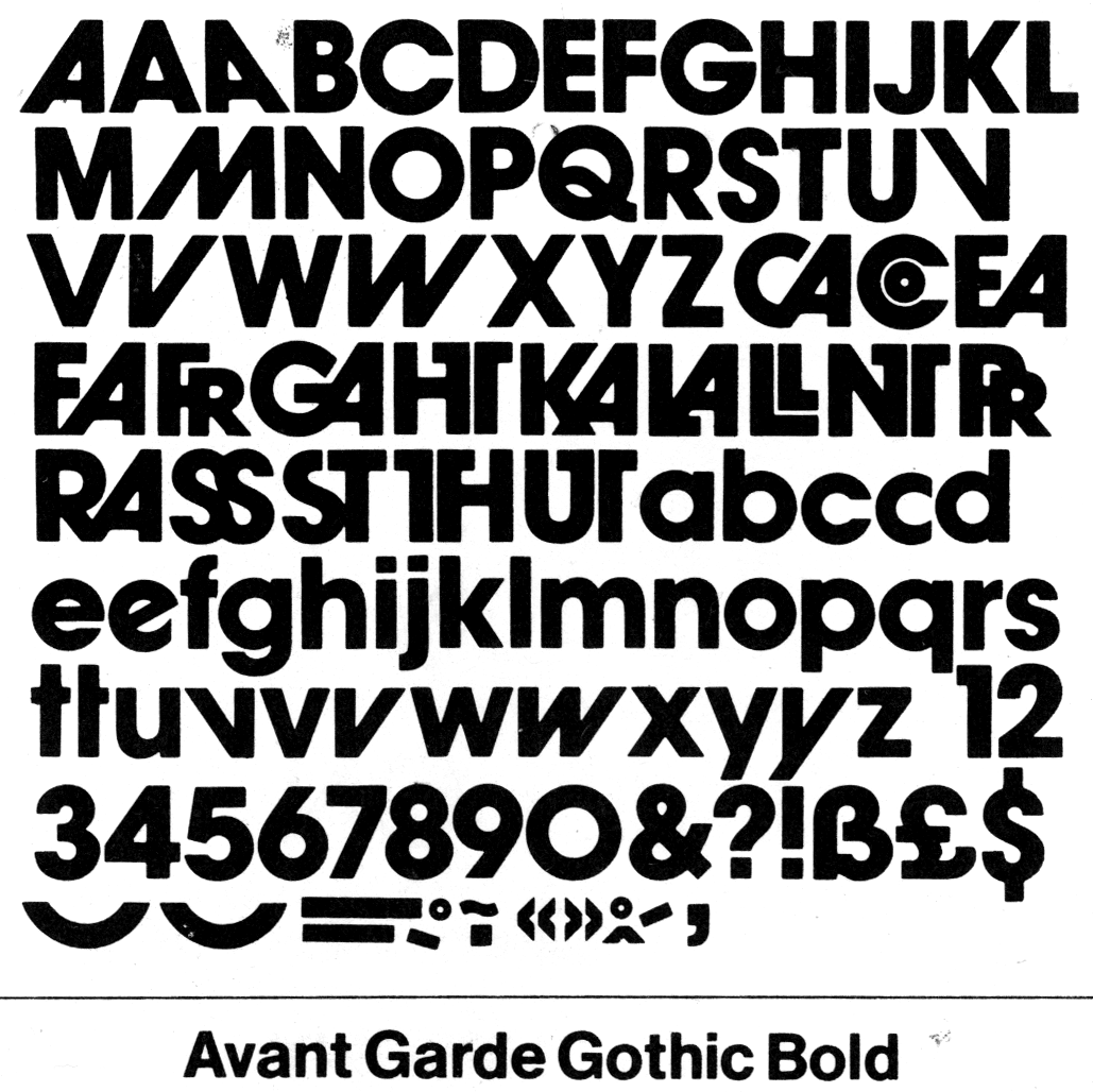
If you are just looking for the slanted A, the classical font with this design is Avant Garde Gothic from myfonts.com, designed by Herbert Lubalin on the seventies. The original design brings optional glyphs like the slanted A or glyphs combinations.
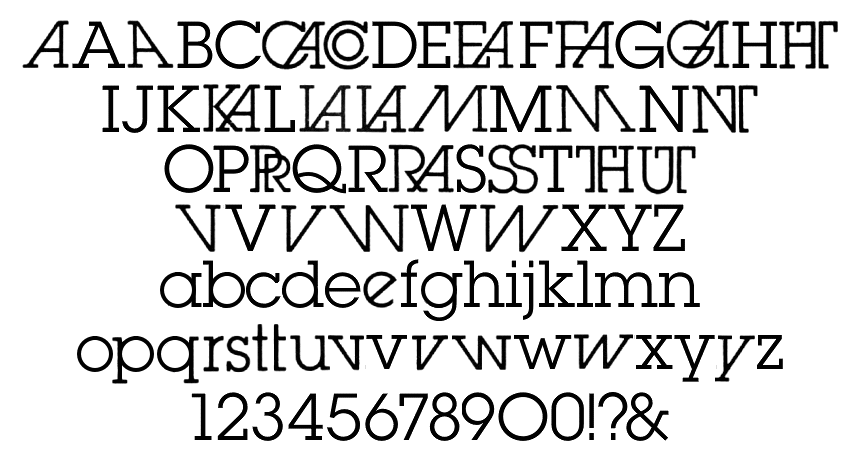
He designed after the same font but with serif, named Lubalin Graph at myfonts.com
-
1Of course, the whole font is different, the subject was the slanted A– user120647Commented Jun 18, 2018 at 15:14
-
2That's the subject not the question. Read the question "I'm trying to match a font to recreate..." - you can't exactly recreate the exact business card if the rest of the letters don't match Commented Jun 18, 2018 at 15:30
-
1No. Because essentially this answer does not answer the question: how to replicate the font used in a business card Commented Jun 18, 2018 at 16:09
-
2In the future, please read the question, not just the title, before writing an answer. While the information you present may be interesting, it does not address the issue at hand. Thank you. Commented Jun 18, 2018 at 17:10
-
3Coming from "Hot Network Questions", I really enjoy reading these slightly off-topic answers. My $0.02. Commented Jun 18, 2018 at 19:56


