1

I'm working to make a layout of a portfolio website. The website will have a side navebar, which will collapse in the mobile view. What I'm trying to achieve is to keep the user's attention in the contents (which will be mostly images and minimal texts) of the main body without causing any distraction while still keeping the brand colours (regardless of what colour). So should I make the navbar coloured (regardless of what colour) or leave it white? But also remember, as the colours that will be used are the part of brand. So I didn't think it's wise to remove it completely. In my finding, I observed portfolio sites have white navbars and colourful navbars are used when there is a complex web directory. Example: 1) https://dribbble.com/shots/3237774-Material-Design-Sidebar 2) https://dribbble.com//shots/2510857-Dribbble-Chat-Client 3) https://bit.ly/2KVXN4Q 4) https://bit.ly/2IYc3bG

Please also tell what methods can I use to test whether the current layout is distracting or not and how can it be improved. Thanks.

enter image description here

6
  • Link to chat conversation about question in Ink Spot
    – Ryan
    Commented Jul 9, 2018 at 17:21
  • 1
    What's so great about the sidebar? Shouldn't the question be, "Where would my brand colour be better/best used?" As you've presented the issue, mobile users (a growing segment) will not have the same brand colour reinforcement as console users. As a UX error, research the Von-Restorff effect. You appear to have applied the emphasis to pull attention from the content.
    – Stan
    Commented Jul 9, 2018 at 17:46
  • @Stan so should I open a new question or edit this one? And the neutral white will actually be home for colourful illustrative images. But it's a wireframe, so I didn't put generic content and can't use original content yet.
    – Bluebug
    Commented Jul 9, 2018 at 17:58
  • 1
    @Stan the question is how to show the portfolio to best advantage while reinforcing the brand personality at the same time?
    – Bluebug
    Commented Jul 9, 2018 at 18:27
  • 1
    Yes, very good. Now, ask that and show your bare wireframes and applicable mood board. Then, stand back and enjoy the show.
    – Stan
    Commented Jul 9, 2018 at 19:03

2 Answers 2

1

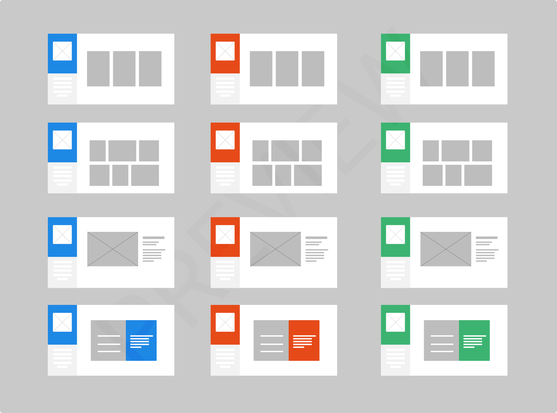
What you show in the wireframe is not distracting. In fact, it could be a great way to convey a change of context, if the color change represents a different aspect of the brand you're building. For example, each color could be associated with a specific vertical market, or product line. It could even be used to designate sections of the site. White papers, "About US," and other self-descriptive content could all be green, the main site could all be orange, etc. There are any number of ways you could use the color of the side bar as an intuitive method to convey the nature of the content they're viewing without the need to spell it out.

1
  • That's an excellent idea. Thanks. Beside that, I'm trying to eliminate all flaws from the layout so engage the users more to the main body.
    – Bluebug
    Commented Jul 9, 2018 at 14:56
1

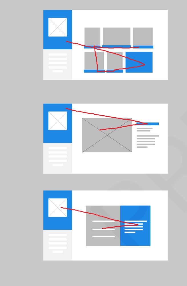
Any bright color introduced in a neutral scheme like you have here will be distracting for sure. However, people learn to ignore certain things after a while. Using a bright color can benefit other aspects of your site:

  • attracting attention in the first place
  • conveying brand, personality, etc.

Moreover, the way the work is presentend (currently depicted as a gray square) will have an impact on this.

In chat, you mentioned: "I was thinking to resort to some design principles to keep the users in the main body with a certainty."

I think good way to achieve this without sacrificing the color of the navbar is to re-use the same color as an accent throughout the site. This would allow the viewer's eye to bounce from color to color and have the opportunity to go over your work vs. simply being stuck on the colored navbar.

enter image description here

5
  • Ah! Yes, That's a good idea! The contents will be mainly colourful illustrations and traditional paintings (those can be dim at some points).
    – Bluebug
    Commented Jul 9, 2018 at 16:02
  • Even though you've tried to minimize it in your answer, I find strong visual conflict with the comparatively neutral portfolio content.
    – Stan
    Commented Jul 9, 2018 at 17:54
  • @Stan Can you elaborate on the visual conflict aspect? I'm not sure I'm getting what you're saying but I'm curious. One thing I've tried to keep in mind is that there will be artwork inserted with its own colors so it might not be all that neutral in the end.
    – curious
    Commented Jul 9, 2018 at 19:42
  • My attention is pulled from one element to another due to the use of colour for emphasis. In your answer you have tried to minimize the colour by incorporating it elsewhere in the layout as accents. The content (portfolio) should be the focal point of the site rather than as a vehicle for all the embellishments. Visual conflict = alternate point(s) of interest competing for my [limited] time and attention.
    – Stan
    Commented Jul 9, 2018 at 20:00
  • @Stan Yes I agree with you, I wanted to make sure I understood which elements were in conflict to you. The way I see it is this is slightly more effective because the eye is more likely to go over the content instead of just staying in one static place. That's why I also mention that the way the work is depicted will be important. If it's just greyscale work, that might not be so effective.
    – curious
    Commented Jul 10, 2018 at 0:01

Your Answer

By clicking “Post Your Answer”, you agree to our terms of service and acknowledge you have read our privacy policy.

Not the answer you're looking for? Browse other questions tagged or ask your own question.