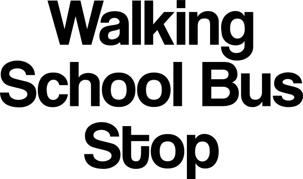
I'm making a sign for my kids' school, and am having trouble with one detail. The primary text is "Walking School Bus Stop". This, the school name, and a whimsical graphic all go into a 3:4 aspect ratio design. (This will be an actual metal sign placed on the street.)
The complication really all comes from the fact that "school bus" is properly two words. Because of this, it really reads better if the lines are broken like so:
Walking
School Bus
Stop
Because "Bus Stop" is also a familiar phrase, with a different break, it looks like we're talking about a "Walking School", when, really, it's the normal sort of elementary school that happens to have a program where we encourage kids and parents to walk instead of driving.
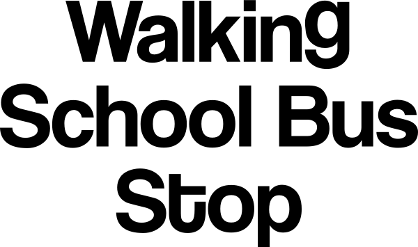
And, that, in turn, means that in the font I've chosen, the letter g drops down to get in the way of the B. Like this:

Which really irritates me visually. If I increase the line spacing, it seems too spaced (and I have to reduce the text size), which is not desirable.
What are good solutions here? It looks just fine if the text is all right-aligned — the g tucks down nicely over the u and s — but given the aspect ratio constraint it's hard to balance that and the other elements.
Font is Coolvetica. (Be glad it's not Comic Sans.) And it looks awful in all-caps, so that solution would really be "find another font", which isn't ideal.
What else could I do?


tis just... yuck...