2

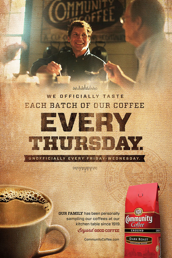
I am having the hardest time trying to create the effect between the image subject and the background texture in the reference below.

community coffee reference

Obviously the image is masked to blend into the texture, but what I am looking for is the blending so that the texture shows through the image, with that vintage effect while still keeping colors in the image. The textures and blending modes I have tried always seem to look more dark or light or washed out. Do I set the images over the top of the texture, or visa versa?

Please, any help would be greatly appreciated to stop from banging my head against the wall.

1
  • 1
    It depends on the images used and the exact style you're after, but sometimes it makes sense to use multiple layers with multiple blend modes. For example first layer with normal blend mode + lowered opacity and a duplicate of that with another blend mode, like perhaps color burn in this case. You basically take the properties of one blend mode, adjust the intensity with layer opacity, duplicate and add another blend mode with different properties and adjust its intensity with layer opacity of needed. You can also use layer masks to make some areas clearer... or edges darker...
    – Joonas
    Commented Feb 19, 2019 at 7:50

3 Answers 3

4

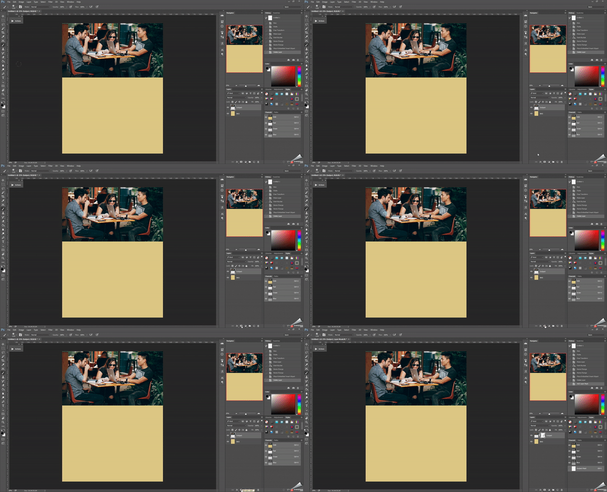
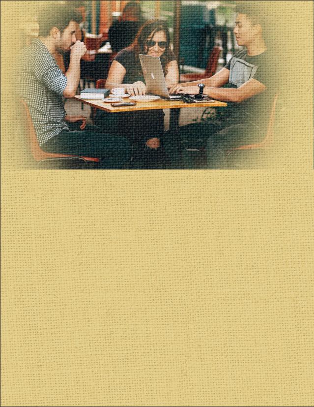
You can simply overlay a texture and then reduce the fill of the texture to get the image to show through. First I create a mask around my image, then I place the texture and reduce its fill.

enter image description here

I encourage you to play around with the blending modes to get different results. Here's an example with the texture desaturated and the mode set to Hard Light.

enter image description here

2

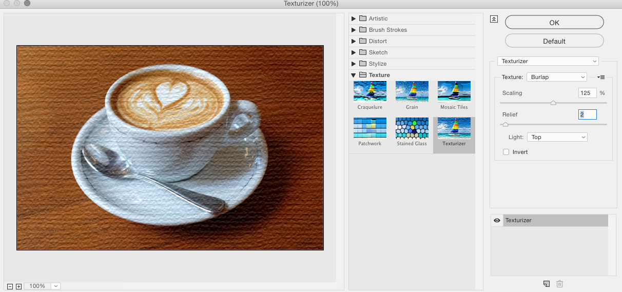
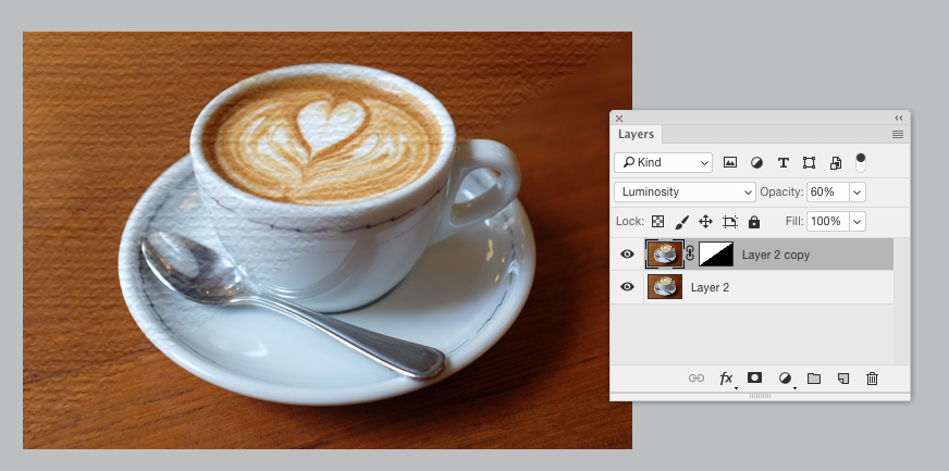
One, simple, option is to copy an image layer and then use Filter > Filter Gallery > Texturizer and set it to Burlap (which matches the texture in your sample):

enter image description here

You can then mask away portions, alter the blending mode and opacity, to further control the appearance of the filter.

enter image description here

Then, you alter tones and coloring via other adjustments or adjustment layers afterwards.

2

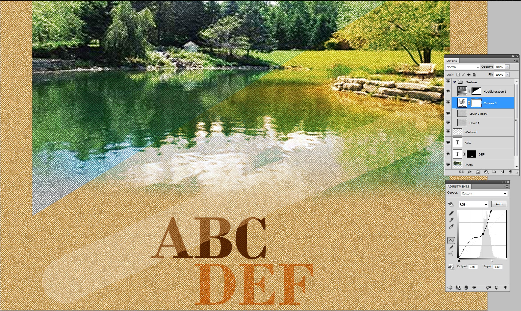
Hard times? No wonder because exact replica is complex. But one can tug together something resembling quite easily. Here's my test field:
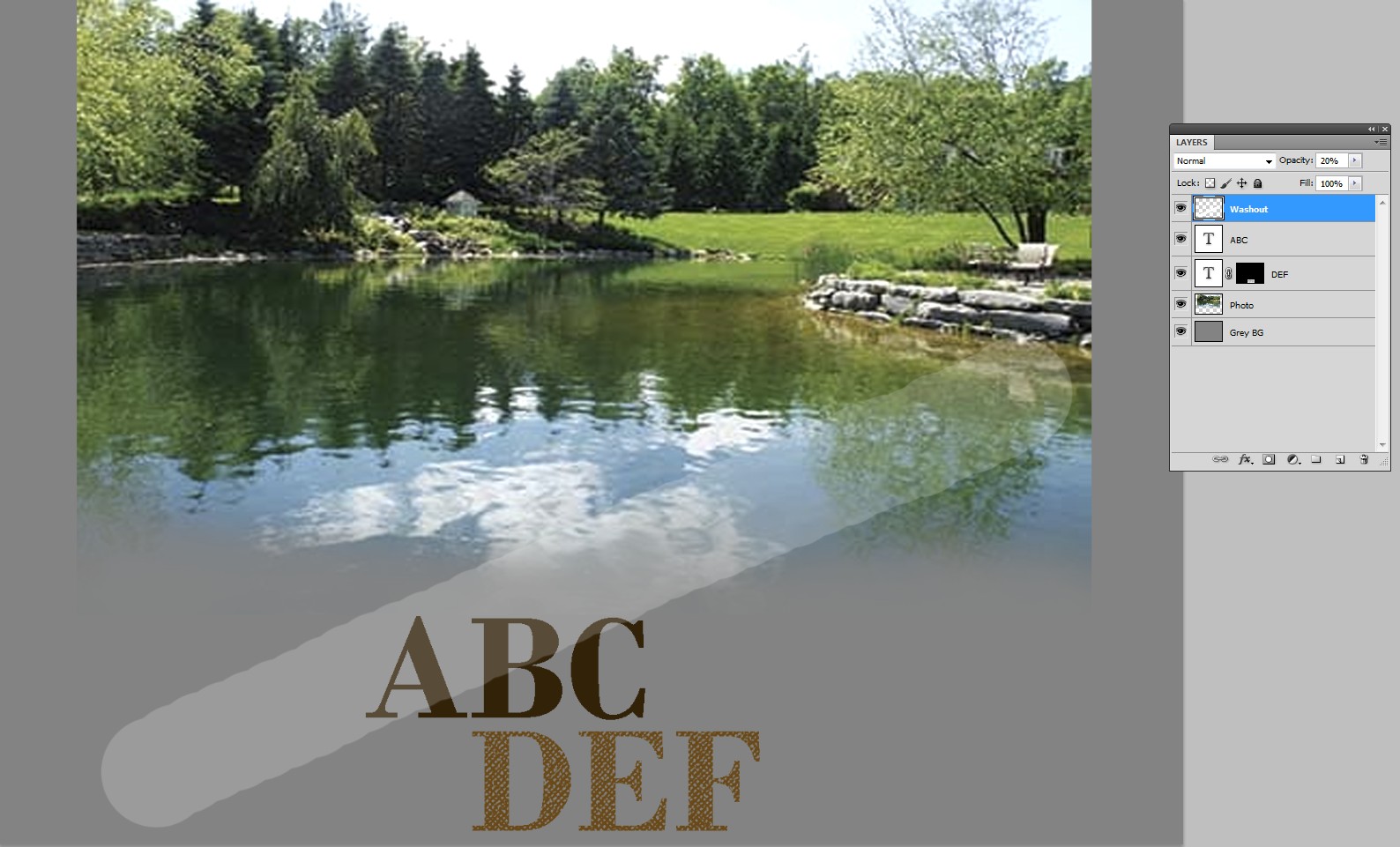
enter image description here

In the bottom there's 50% grey background. It's not white, because 50% grey is the shade which is considered neutral (no lightening, no darkening) in many blending modes.

Above the background there's a photo, partially wiped off in the bottom.

Then there's a couple of texts, nearly black, but actually brown ABC and lighter DEF. The latter has a layer mask, which punches it like it was a low quality print. The mask has a piece of high contrast canvas texture.

On the top there's a low opacity white stroke to create some washiness. In your image there's smoke, clouds or tastefully painted strokes for this purpose.

The fabric texture in your image is colored, but it affects less in bright and dark areas of the image above. I guess the texture layer has blending mode =Overlay and the texture is colored to brown.

In your image there's a red package and texts clearly above the texture. I skip them.

There's a secondary difficulty: I haven't good fabric texture photos, but something resembling can be built with Photoshop's Texturizer > Canvas.

Tiling 2 layers of light grey canvas texture, rotating them plus and minus 45 degrees, blending with "multiply" and colorizing with a Hue & Saturation adjustment top layer make my fabric replacement:
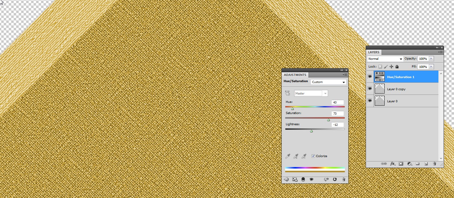
enter image description here

Opacities and adjustments in the texture should stay live for finding the right combination. I made a layer group for the texture. The group has blending mode = Overlay. A good texture photo would make this complexity unnecessary.

Texture needs contrast adjustment to make it match with the rest. For it I added a curves layer. It lifts the dark end and make white areas bigger. Finally I masked half of the colored area off to see the photo also as uncolored. I think it should get some color to fit in the mix.

Here's the result
enter image description here

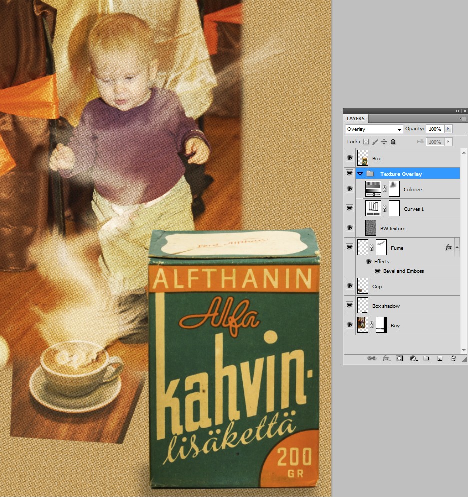
Here's another example:

enter image description here

Texture colorizing principle is the same, but the texture is not fake canvas, it's half-toning pattern + some noise. Some fumes and a box above the texture are added. Colorizing is thinned on the person with a layer mask.

Sorry for the inferior texture, but hopefully you get some ideas.

Your Answer

By clicking “Post Your Answer”, you agree to our terms of service and acknowledge you have read our privacy policy.

Not the answer you're looking for? Browse other questions tagged or ask your own question.