0

I am working with a lot of different tints of the same hue and I would like to have all of those tints as swatches in my colour palette in ILLUSTRATOR. I can not find a way to do that.

Update:

I need to add an image of the problem. Thanks guys for the tips but I forgot an important bit. I am setting the opacity at the top, in the options bar, so technically they are not even tints, it is just the same swatch at different opacities. And I would like those opacities to be converted in swatches :) Is that even possible? I tried what you suggested and it did not work.

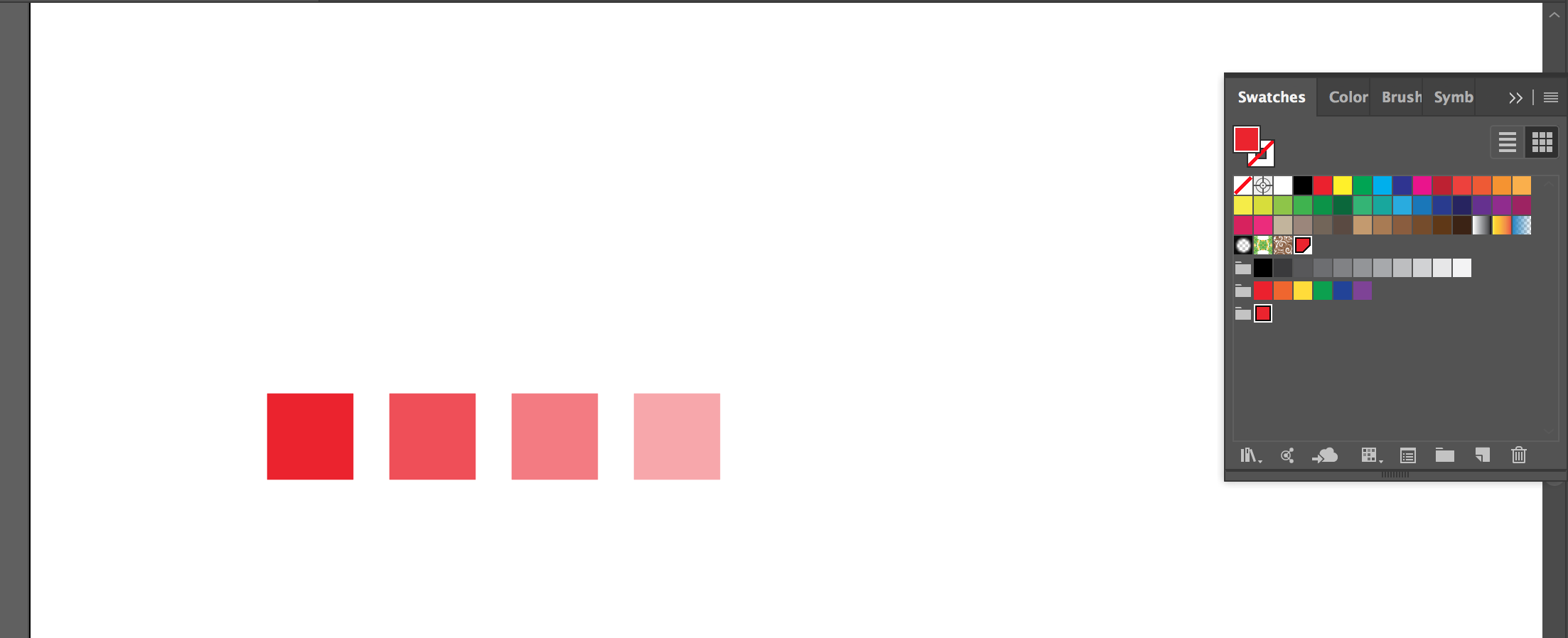
enter image description here

4 Answers 4

1

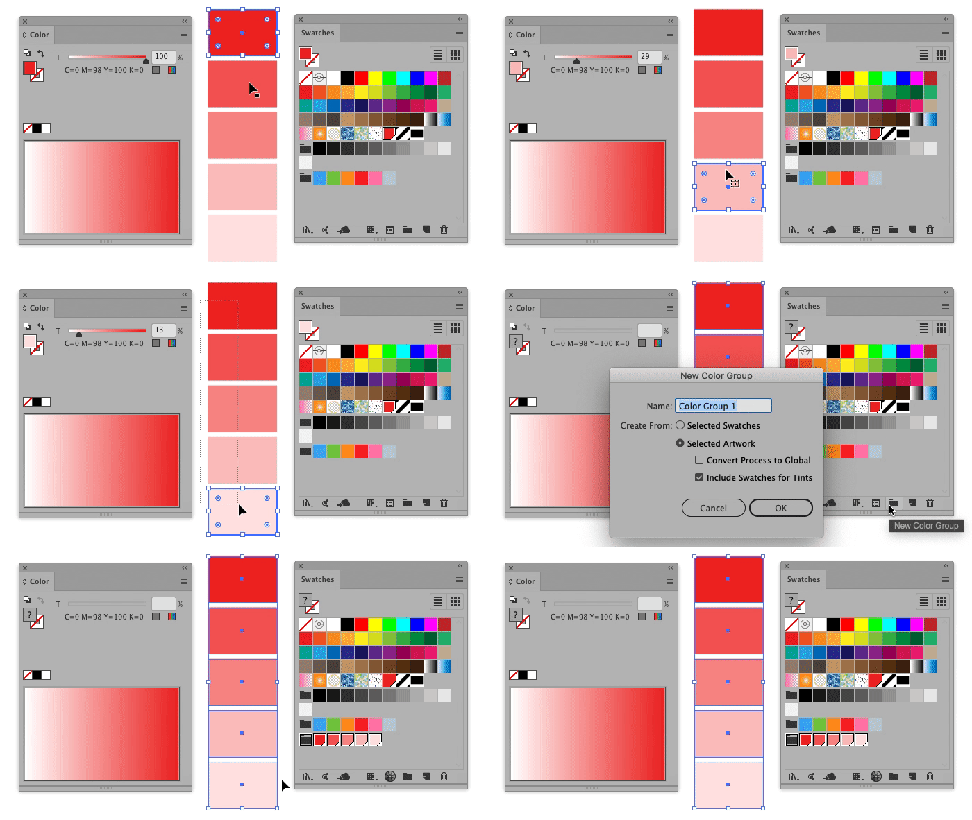
Select all the shapes with the same hue and different tints and click the New Color Group icon at the Swatches Palette

  • At the window's options check Include Swatches for Tints

enter image description here


Note after the comments

Important: the opacity percentage must be set from the Color Panel as shown in the animation. The Opacity field at the top bar is the Transparency, not the ink percentage.

There's no way to add different transparencies from the same color as a new swatch. Just different ink opacities from the same swatch.

0
1

enter image description here

In the left there's a white rectangle as the bottom object. Black stroke is only to show it. There's four red rectangles on it with different opacities.

The next image is the same, but rasterized. The resulted colors are picked one by one from the raster version and moved to swatches. They are 100% opaque.

4
  • Thanks, when you say rasterized, you mean that I can just take a screenshot of all the colours, import the screenshot and eyedrop the colours, right?
    – Nora
    Commented Jun 5, 2019 at 20:42
  • @Nora No screenshots! Copy your shapes, select the copies and apply Object > Rasterize. Pick the colors with the eyedropper from the rasterized copy, it's a single bitmap image where all transparency and blending mode effects are flattened to final resulted colors. Have a white bottom shape to get everything like on the white artboard.
    – user82991
    Commented Jun 5, 2019 at 21:33
  • @Nora In the perfect world screenshots would be ok, but for ex. I have a monitor which a little exaggerates colors. It is calibrated for Adobe RGB color range, but that's done in the system by having a color lookup table which converts all shown colors a little duller to compensate the exessive colorfulness. ==> Screenshots are not accurate, they have those compensated rgb numbers and they look out dull when I paste them back to a progam.
    – user82991
    Commented Jun 5, 2019 at 21:42
  • Thanks a mill :) So much wisdom on this website :D
    – Nora
    Commented Jun 6, 2019 at 18:11
1

Another way to do it is:

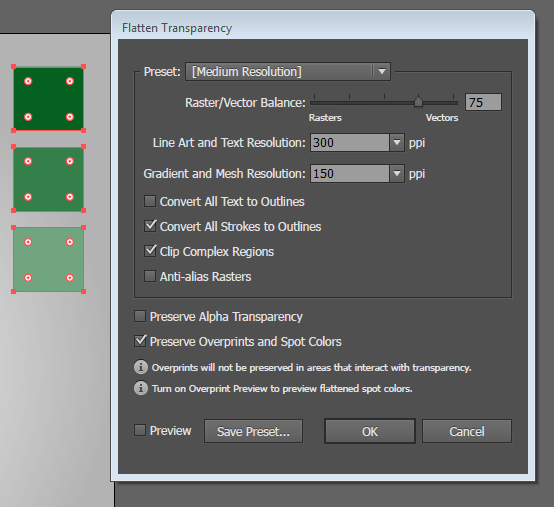
Use the Flatten Transparency to flatten the colors.

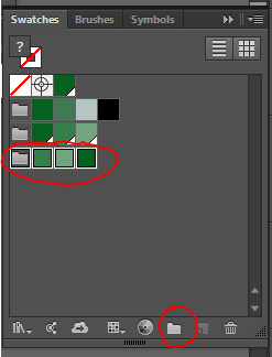
Now you can create a New Color Group using the selected artwork.

enter image description here

enter image description here

0

If you've already created the colours in a file, it's pretty simple.

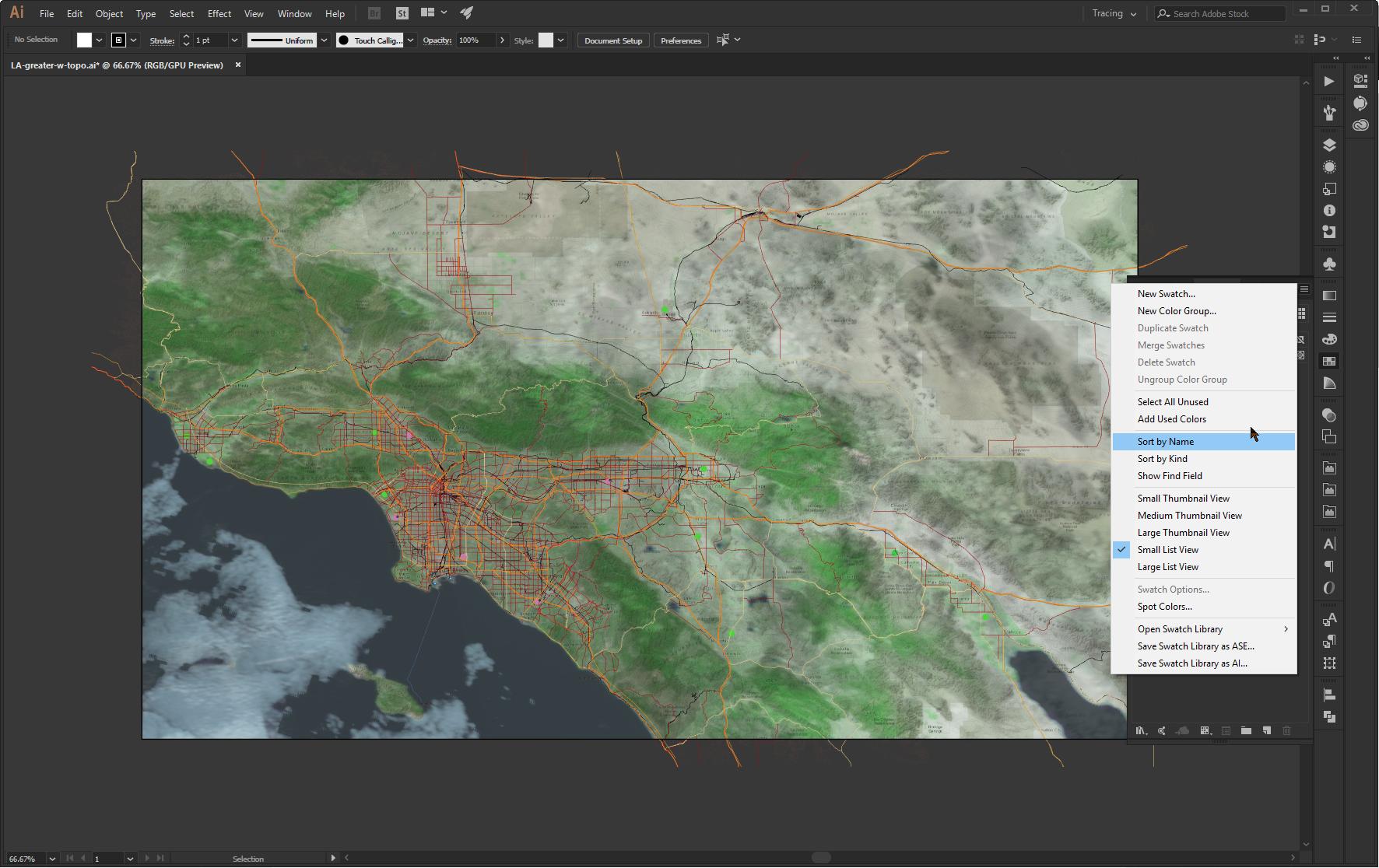
In the Swatches Palette, right-click at the top and get the context menu, and there's an item there labeled "Add Used Colors" which will automagically add all colours used in the current document.

You can, after populating your swatches for this document like this, edit that swatches group as normal, and then export / name / use in all other related documents pretty simply.

Document with no swatches; right-clicking and context menu: enter image description here

Populated swatches as a result: enter image description here

Hope that helps.

Your Answer

By clicking “Post Your Answer”, you agree to our terms of service and acknowledge you have read our privacy policy.

Not the answer you're looking for? Browse other questions tagged or ask your own question.