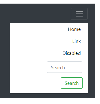
If I have an hamburguer icon on mobile devices, how do I let the user know a menu will appear on touch slide instead of clicking the icon?
Is there any visual trick both for the touch slide left and for the touch slide right?
I leave very basic images for the example:


-
Which is the touch side? Do you mean sliding instead of clicking?– RafaelCommented Jul 30, 2019 at 14:31
-
Yeah, sliding instead of clicking,– SilverSurferCommented Jul 30, 2019 at 15:41
-
I would like let the user guess the menu will appear sliding instead of clicking– SilverSurferCommented Jul 30, 2019 at 15:42
2 Answers
Touching the hamburger menu is standard... regardless of how the menu appears. It doesn't matter if the menu appears as a pop up, sudden dropdown, or slides in from a side/top/bottom.. a simple touch of the hamburger should perform the "show" action.
Requiring the user to slide left is unintuitive and you will cause usability hurdles.
However, if you wanted to be more implicit with the graphic you could use something with an arrow as an indicator.
This question is probably better suited for https://ux.stackexchange.com/
But in my opinion, you need to differentiate two things.
The area and mode of interaction.
The way the element behaves.
You could have your icon, and when clicked the menu simply slides from the right instead of unfolding from the top.
But for the sliding thing, it can be tricky. You could put a tab on the right side, with an arrow pointing to the left. Probably a moving arrow denoting movement.
If the interaction is sliding all the screen, not just the tab... make a bigger tab.
Another option can be a big fat text: "Slide to open".

