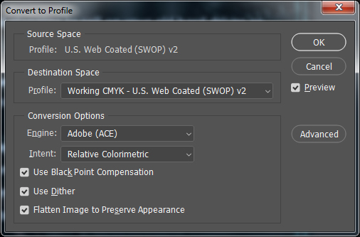
I'm currently in the middle of designing a poster, and obviously want to avoid major surprises with colour when it comes to going to the printers. However, I definitely can't afford any of the colour calibration products, and this answer suggests it's not as necessary as widely believed, so I'm trying to make other adjustments that will help match my monitor closer to the previews I will be printing out with my home printer (and of course the end product with the printers themselves).
I started designing my poster in the default Photoshop colour profile of Working CMYK - U.S. Web Coated (SWOP) V2. I'm in the UK, and have read that FOGRA39 is the standard colour profile used by printers here, and have seen at least one printer explicitly recommend it during my research.
Is it worth converting my document's profile to FOGRA39 to ensure that what I'm seeing while I'm designing will be closer to what is likely to be printed? If so, then which options should I select at the slightly-overwhelming Convert to Profile dialogue?

