1

I would need some guidance on how to proceed. I use a technical program that produces line graphs with text in it, similar to this figure:

https://i.sstatic.net/0D63t.jpg

However, it cannot print them out.

So I need to use screenshots to use these graphs further.

Now I need to create a publishing quality of such a graph. I am lost how to do it practically. Theoretically, I would say I need to clean up the blur and smoothen the lines and finally convert it to a vector graphic or a 300 DPI image.

I have Adobe Illustrator at disposal or Inkscape. What are the steps that I should execute?

Thank you so much! Markus

3
  • Hi. Welcome to GDSE. Vector graphics don't have a dpi. Illustrator and Inkscape have an auto trace feature, but results are often quite poor with low resolution images such as screen shots.
    – Billy Kerr
    Commented Apr 13, 2020 at 20:15
  • Thanks, you are right. I edited it accordingly
    – Markus
    Commented Apr 13, 2020 at 20:16
  • Now you should be able to vote
    – joojaa
    Commented Apr 14, 2020 at 20:39

2 Answers 2

2

The amount of effort put in is directly related to the final quality you desire. For me, there would be no "easy" automated solution to a quality image. But, with just a little effort, manually you can create a high-quality vector image of the graph.

At first glance, this is going to appear to be a lengthy process. The reality is, it took me longer to post this answer than to actually do the work. All-in-all the time from the raster image to final vector image was about 5-7 minutes for this graph. Speed, however, may depends entirely on your familiarity with the tools/software.


Here's what I would do...

  • Open the raster image in Adobe Photoshop
  • Simply use the Eraser Tool to erase everything but the graph data

    enter image description here
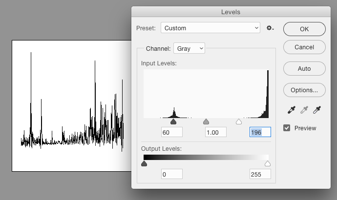
  • Convert to Greyscale and then adjust levels to get a solid black.

    enter image description here
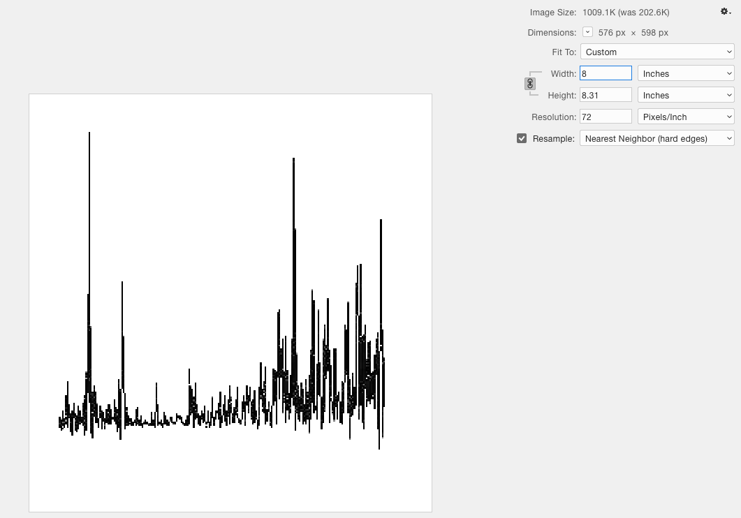
  • Because this particular image is rather small, I increased its size as well. Being certain to use Nearest Neighbor for the resampling method (removing any anti-aliasing or interpolation when scaling). I increased to roughly 250% but really I just wanted it larger so the graph is easier to distinguish. Any larger size is fine. And if images are larger, you may be able to skip this step.

    enter image description here
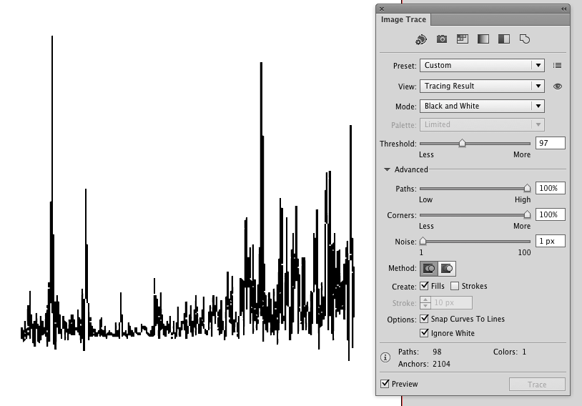
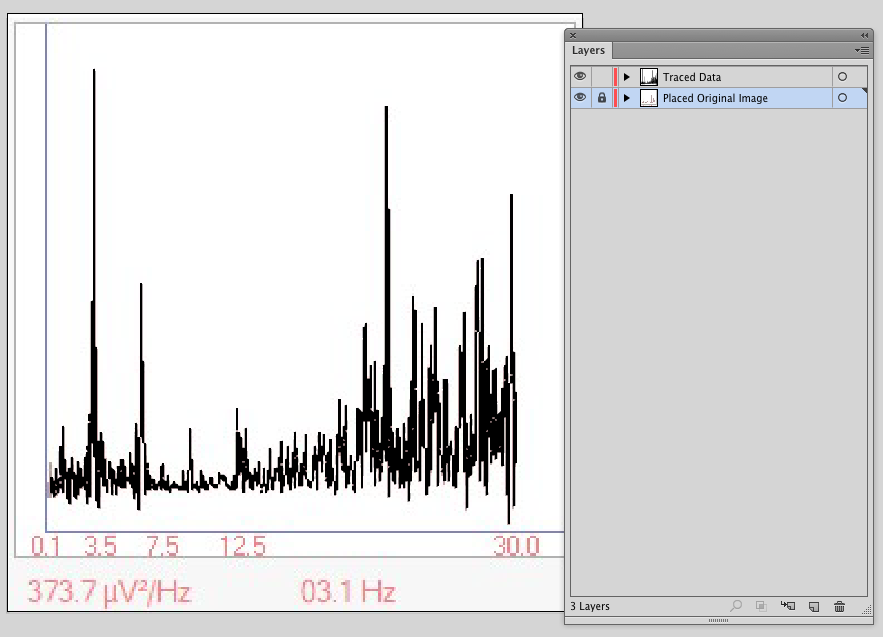
  • Save that raster image of the data. Open it in Adobe Illustrator and use Image Trace To trace the data.

    enter image description here

    Note that I adjusted several options in the Image Trace panel to get a more accurate trace. And be certain to tick Ignore white in the Advanced options.
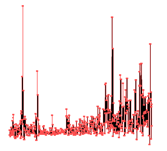
  • Expand the trace
  • Using the Direct Selection Tool (white arrow) click-drag on the outer box of the trace to select only it - Looking at the Color Panel you should see that it has no fill and no stroke and is a "hollow" object.
  • Choose Select > Same > Fill & Stroke from the menu.
  • Hit the Delete key -- This removes all hollow objects from the trace. Leaving you with a clean vector representation of the graph data.

    enter image description here
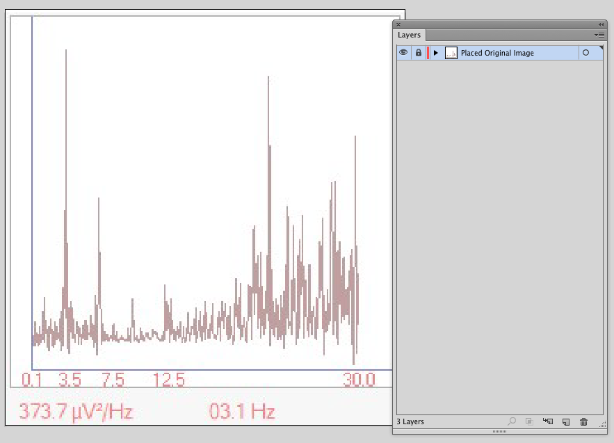
  • Open or Place the Original raster image with/into Adobe Illustrator - To make things easier moving forward, reduce its opacity by about 50%

    enter image description here
  • Lock the layer the raster image is on and create a new layer above it
  • Copy/Paste the chart data from the tracing into this file, and scale/resize it to align with the raster image on the layer below

    enter image description here
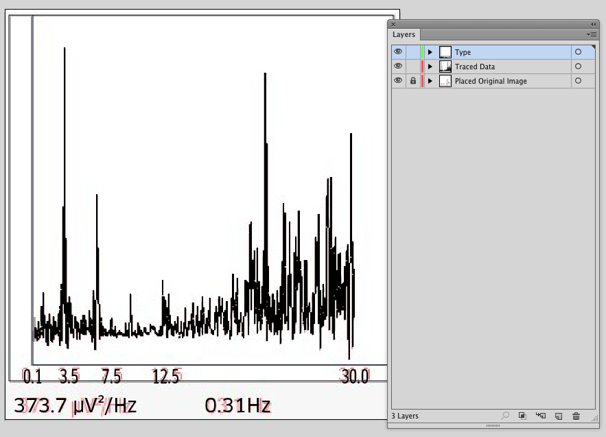
  • Lastly, reconstruct the rest of the elements - type, axis lines etc.

    enter image description here
  • Delete the layer containing the Raster image
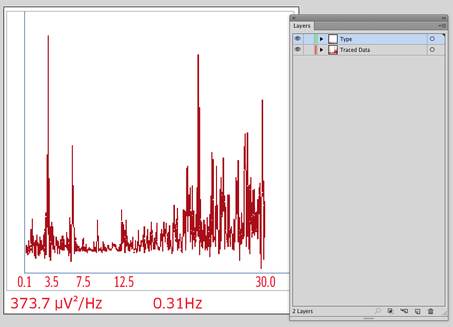
  • Select and recolor objects as necessary

enter image description here


I recreate a number of varying charts/graphs for clients and typically this process works given there's no direct access to the actual data to regenerate a graph as a graph.

Depending upon the actual graph/chart data, at times it is necessary (or easier) to merely manually redraw the data as well, using the placed raster image as a guide for manual tracing.

0

If you do scientific work and the image is your data you cannot redraw the curve, it must stay as the used instruments made it. For succesful printing it can be scaled to bigger pixel dimensions, but beware touching the data content. The texts can be retyped and the frame elements can be redrawn (as already presented in another answer).

Tresholding was needed to clean your very noisy JPG. I guess you can get cleaner image, but the linked image version needed this:
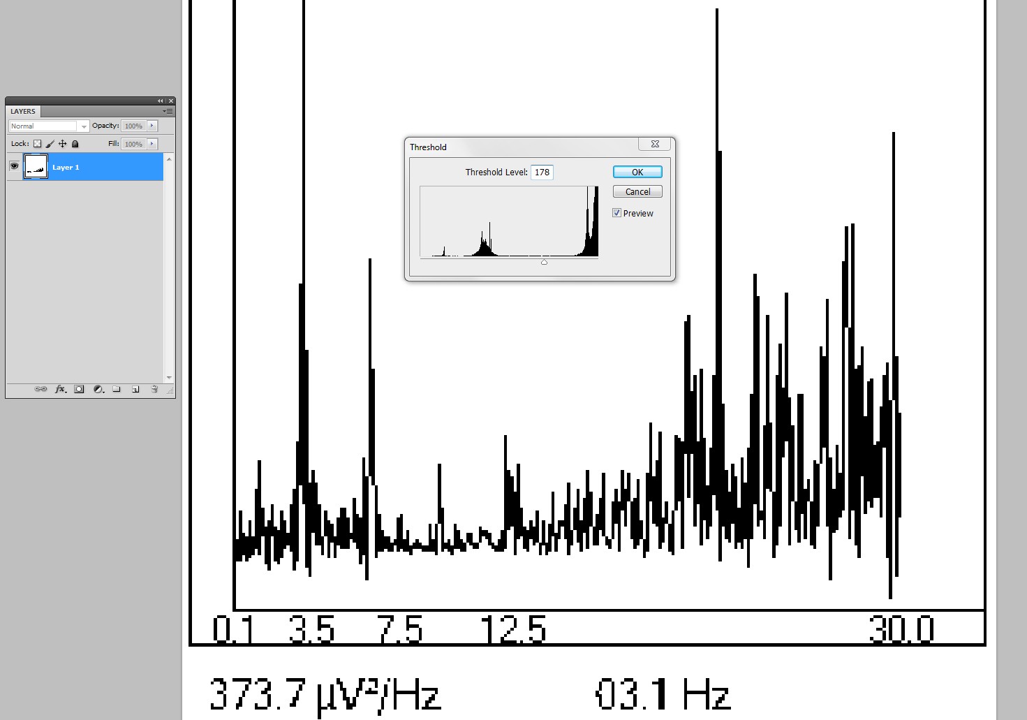
enter image description here

It fixed the spectrum, but you must retype the texts or try to edit them with 1 pixel pencil tool. Editing pixels with the pencil saves original image feel, so I recommend it.

The pixel dimensions can be increased for ex. to 500% with no blur nor data change in Photoshop by resizing with resampling method "nearest neighbour". To keep the original data content scale to multiple 100%, not for ex. to 432%.
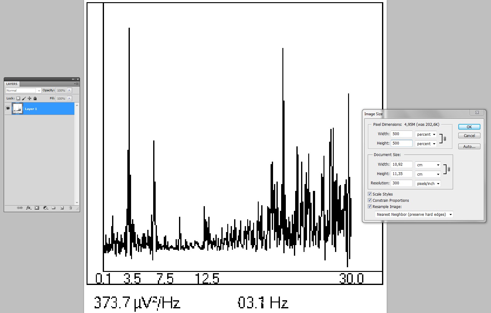
enter image description here

By selecting 300 DPI resolution you can see how big it can be as printed.

If it must bee freely scalable vector you can trace it in Illustrator or Inkscape. The latter seems to do it perfectly with less nodes, but I guess you are not going to jump out of Adobe's stuff if you have already paid for it. Trace the 500% version because it will be free of wrong guesses of "should this pixel be included or not"

Make a careful selection in Photoshop and paste the curve alone without text nor frame elements to Illustrator. With tracing options "view outline" and "view original" you can check that the tracing really is set to make exact non-smoothed result.
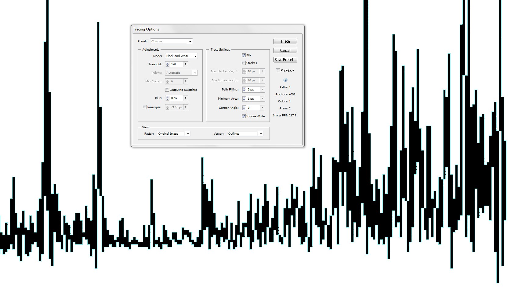
enter image description here

Apply Object > Live Trace > Expand to make the final vector.

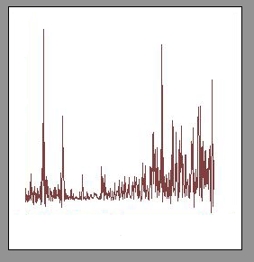
Copy in Photoshop the whole scaled image paste it to Illustrator and lock it to prevent it moving accidentally. With it you can place the traced curve, retype and place the texts and redraw the frame elements.

8
  • How is this any different than my answer?
    – Scott
    Commented Apr 14, 2020 at 0:39
  • Your answer can lead to the same result as mine. My answer do not lead to the same result as your example. My goal = no change in the curve, only scaled.
    – user82991
    Commented Apr 14, 2020 at 2:00
  • Sorry, we did the same thing - created a black and white image of the graph and traced it. You merely used Threshhold rather than levels.
    – Scott
    Commented Apr 14, 2020 at 3:05
  • Thank you both! Amazing help!! I can't upvote yet, so here is my thank you!
    – Markus
    Commented Apr 14, 2020 at 7:29
  • 1
    Accepting is not voting. Accepting needs no reputation. Click the grey V-shaped checkmark at the answer which earns it if there's one.
    – user82991
    Commented Apr 14, 2020 at 10:26

Your Answer

By clicking “Post Your Answer”, you agree to our terms of service and acknowledge you have read our privacy policy.

Not the answer you're looking for? Browse other questions tagged or ask your own question.