0

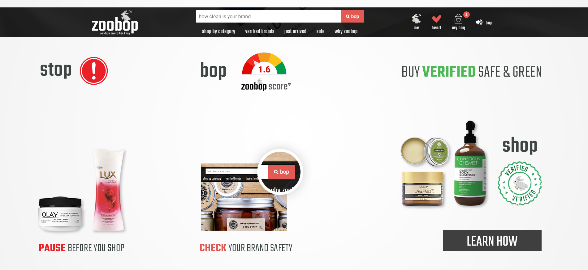
I've tried many options but it's not working. Actually there are 3 groups of bottles in this banner and lots of text. So it is looking crowded. I tried small big size, placing copies here and there and many other options.

Also I feel the CTA button is also creating problem in terms of empty space. There is stuff nearby. I can't figure out a way to make this banner less crowded.

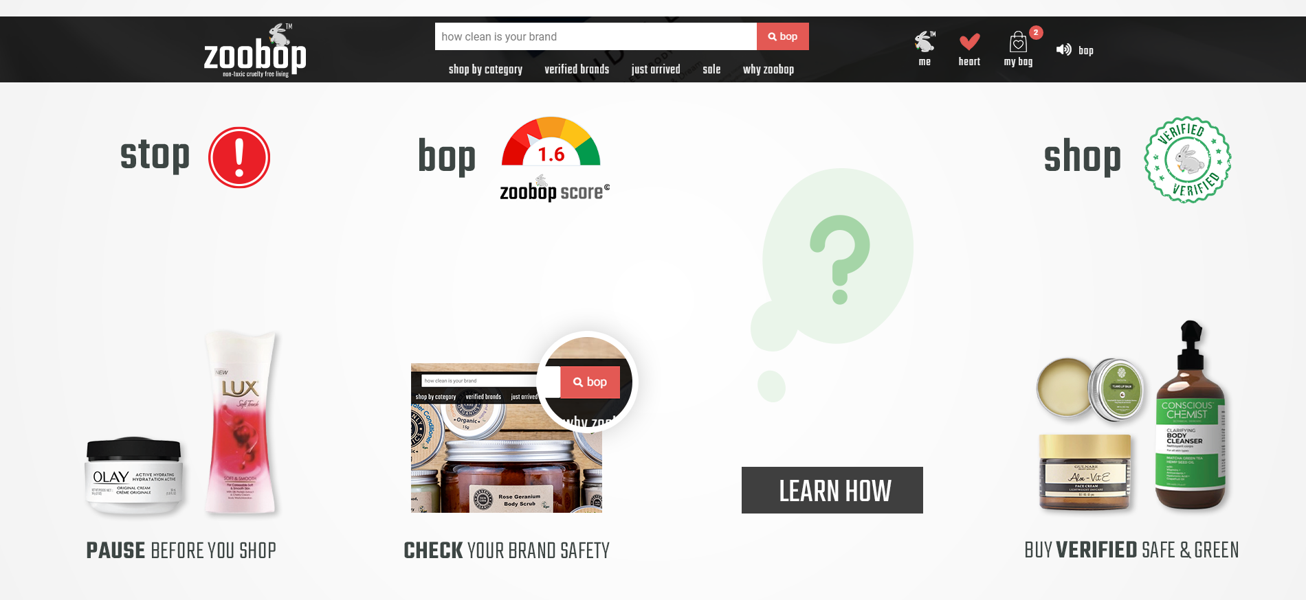
Here are last 2 options I tried:

enter image description here enter image description here

The CTA I feel definitely has problem in terms of aesthetics.

I feel something is wrong that I can't figure out. I don't know what approach I should follow now. So:

i) Is the CTA distracting and crowded here or maybe less noticeable?

ii) Is the alignment of text and products okay in terms of aesthetics? 1st banner has center aligned text and products, 2nd banner has left aligned approach.

iii) Is the font size, weight and color marrying properly with objects near to it? Like stop with alert icon.

iv) Are the 3 groups of products covering more space then needed? I mean are the too big to be distracting the user to read other text and see CTA (The Learn How button)?

8
  • This is too broad in my opinion. You are asking other designers to design for you.
    – Scott
    Commented Apr 15, 2020 at 8:08
  • I didn't intend to do it. Can I fix the question somehow? Please let me know.
    – Vikas
    Commented Apr 15, 2020 at 8:12
  • You need to ask direct, solvable questions rather than broad open "how should I change this to be better" questions.
    – Scott
    Commented Apr 15, 2020 at 8:21
  • 1
    Much better after edit
    – Scott
    Commented Apr 15, 2020 at 8:26
  • 1
    Here are some of my thoughts, for what it's worth. What is the purpose of the stop, bop, shop things? In English "bop" is a kind of pop music dance, so I really don't get it. The stop sign looks like some kind of warning. It's obviously a shopping site, so what's the point of it saying "Shop". I don't get the "Learn How" button either. Learn what? Learn how to shop? I'd just remove these items, and stick with the products.
    – Billy Kerr
    Commented Apr 15, 2020 at 8:55

1 Answer 1

1

My primary issue is that the "product images" have nothing to do with the slogan - stop - bop - shop

  • How is a jar of Oil of Olay/Lux a "stop" image?
  • Or body scrub a "bop" image?
  • Or a bottle of body cleanser a "shop" image?

I feel, for reader clarity, the imagery needs to reflect the given step in the process. Otherwise, why not use images of puppies and kittens? They'd be almost as relatable to the underlying slogan.

Because of all this the CTA is completely lost. Alignment of text/images, font size, etc. are all irrelevant because the "path to purchase" is so indiscernible.

Honestly I have no clue what the actual CTA is.. to learn how? To shop? Since shop is a verb... the natural inclination will be that it is the CTA.

If, in fact, the push is to "Learn More" then it may be worth revisiting concept entirely to deemphasize the 3-steps-to-shopping appearance.

I would show something which clearly depicts "shopping" (cart/bag), then something which clearly depicts your web site, then something which clearly depicts "purchasing" (cashier/register). And put emphasis on the middle image, if that's the CTA, by making it larger, more prominent. -- It seems to me that you are assuming readers will understand all that you understand about the site.. they won't.

6
  • The product images are necessary because we want to say STOP and pause when you're going to buy your favorite product (on very left side). Then BOP on our site for this product to know if it is good or not. If not, which is of course (they have their reasons for it), SHOP our products (very right side). Makes sense?
    – Vikas
    Commented Apr 15, 2020 at 16:30
  • 1
    The thinking is incorrect in my perception. No part of a jar of Oil of Olay and Lux says "Stop before you shop" to me. In short, no one else is going to think of things as you are.
    – Scott
    Commented Apr 15, 2020 at 18:47
  • I think you want to say for stop, the Lux product doesn't make sense because it can be a good brand (which it is). So we need to show the problem along with stop. Right? Why should they stop and bop?
    – Vikas
    Commented Apr 15, 2020 at 18:51
  • 1
    No static product shot makes sense to me. If you must have a product image, then you need it as seen on a store shelf, or someone reaching for it.. in other words you need to show the "shopping" aspect since that is what is being referred to by "stop". Users will not know you are showing "bad products". You are assuming too much.
    – Scott
    Commented Apr 15, 2020 at 18:54
  • 2
    I would show something which clearly depicts "shopping" (cart/bag), then something which clearly depicts your web site, then something which clearly depicts "purchasing" (cashier/register). And put emphasis on the middle image, if that's the CTA, by making it larger, more prominent. -- It seems to me that you are assuming readers will understand all that you understand about the site.. they won't.
    – Scott
    Commented Apr 15, 2020 at 18:55

Your Answer

By clicking “Post Your Answer”, you agree to our terms of service and acknowledge you have read our privacy policy.

Not the answer you're looking for? Browse other questions tagged or ask your own question.